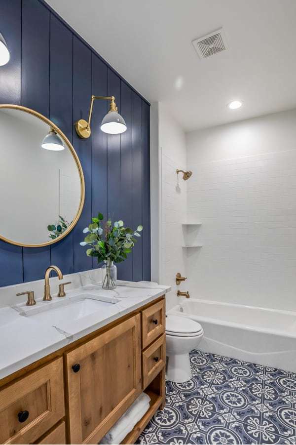
Sherwin Williams Sea Salt
Sherwin Williams Sea Salt is one of the top selling paint colors of all time. Year after year this timeless hue continues to reign supreme as homeowners can’t seem to get enough of this pretty bluish green tone.
Thinking about using Sea Salt in your next project? Make sure you read my full color review before you decide.
What are the undertones of Sea Salt?
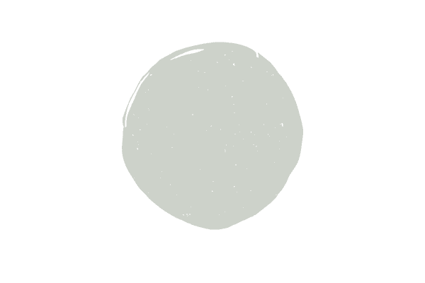
Sea Salt is a saturated bluish green hue with a gray undertone. I like Sea Salt because it can easily look pretty neutral and looks very similar to some of the best green gray paint colors. Compared to a lot of other popular blue green colors, Sea Salt is much more muted, thanks to that gray undertone.
You can also play up the blue/green tones more through decor choices, making this color come to life, reminiscent of a peaceful day on the beach.
Sherwin Williams Sea Salt coordinating colors
Sea Salt is pretty versatile. You can pair it with green paint colors, blue green hues, blue colors or grays with either a blue or green (or both) undertone. Here are some of my favorite coordinating colors:
- SHERWIN WILLIAMS Naval
- Sherwin Williams Fleur de Sel
- Sherwin Williams Silverpointe
- Benjamin Moore Gray Mist
Is Sherwin Williams Sea Salt more green or blue?
You’ll see at the bottom of the post when I compare Sea Salt to other colors, but I’m pretty convinced that Sea Sat is a really good in between color, with nearly equal doses of blue and green.
What trim colors go best with Sea Salt?
Sea Salt looks best with pure white trim colors. The world of white paint colors is beyond complicated, as there are blue white tones (these are typically reserved for ceilings), pure white tones (no undertones) and off-whites.
I choose to pair this color with pure white tones the most, as those allow Sea Salt to shine, popping off of the crisp white trim color. For this application, I like Chantilly Lace and Oxford White.
I also like Sea Salt with Benjamin Moore White Dove, which is technically an off-white but has a gray undertone to it, which makes it fairly easy to pair with tones like Sea Salt. Beyond White Dove, most other off white paint colors are simply too creamy to work well with Sea Salt.
What is a lighter version of Sea Salt?
With an LRV of 72, compared to Sea Salt’s 64, Sherwin Williams Opaline is a lighter version of Sea Salt. If you want a neutral color, that is lighter than Sea Salt, look to Wickham Gray, which is a pretty gray with blue green undertones and looks like a lighter version of Sea Salt.
What is one shade darker than Sea Salt?
Sherwin Williams Rainwashed and Benjamin Moore Palladian Blue are both darker blue green hues.
What’s the LRV of Sea Salt?
Sea Salt’s LRV is 64. LRV stands for light reflectance value and tells you how light or dark a color is. Zero is the blackest black and 100 is ultra pure white.
With an LRV of 64, Sea Salt is definitely on the lighter side, but it’s not as light as another blue green hue, SW Opaline with an LRV of 72. There are also some lighter gray paint colors with blue green undertones that are much lighter, as well.
What’s a neutral color that looks like Sea Salt?
Wickham Gray is a blue/green/gray hue that has an LRV of 69, and Fleur de Sel has an LRV of 72.
What’s the closest Benjamin Moore color to Sea Salt
While nothing is truly quite like Sea Salt, Benjamin Moore Healing Aloe is pretty darn close.
Colors similar to Sea Salt
If you like Sea Salt, I recommend also checking out Benjamin Moore Quiet Moments, Pearl Gray Palladian Blue and Rainwashed during the testing phase.
The only way to truly see a color is to compare it to other colors in person and this is a crucial step I always recommend to clients. Below I’ll compare these colors to Sea Salt.
Sea Salt vs. Quiet Moments

Benjamin Moore Quiet Moments is darker than Sea Salt, with an LRV of 61, vs. that of Sea Salt’s LRV of 64. Quiet Moments has more blue in it than Sea Salt, whereas Sea Salt is a really good blend of both blue and green.
Sea Salt vs. Pearl Gray

Sea Salt and Pearl Gray have virtually the same LRV, so no difference there. They do differ in undertones, though, as Pearl Gray definitely has more green in it than blue. The green presence in Pearl Gray is even more than the green presence in Quiet Moments.
Sea Salt vs. Palladian Blue

Palladian Blue is just a bit darker than Sea Salt, with an LRV of 60, but despite the 4 point LRV difference the hue is significantly more pigmented than Sea Salt. Palladian Blue almost comes off like a robin’s egg blue and has more green than blue to it. Palladian Blue is one of Benjamin Moore’s all-time best selling colors!
Sea Salt vs. Rainwashed

Rainwashed has an LRV of 59 and is more pigmented than Sea Salt. Rainwashed has a bit less blue in it than Palladian Blue. Rainwashed is another very popular color that seems to do well, year after year.
How to decide if Sherwin Williams Sea Salt is for you
Here’s the best 3 tips I can give you in order to help you know if Sea Salt is right for you.
Observe your light
How much light your room gets greatly affects your paint color. Sea Salt is a fairly light color, but it’s not as light as some neutral hues that look somewhat similar, still, if you’re choosing Sea Salt you don’t want the pretty blue/green to get lost.
If you are putting Sea Salt in a room with tons of natural light coming in it’s possible to lose some of the color during the day. Too much light can wash out the color. If you like Sea Salt but realize after testing out the color in your room that it’s getting washed out, no biggie, just look to one shade darker, which would be Rainwashed or Palladian Blue.
On the contrary, if you only have one small window which faces opposite the sun most of the day, you might find Sea Salt to be too pigmented for your space. You might also find that you lose some of the blue/green aspects of the color and only see blue or green rather than the combination. If this is the case for you, I’d suggest sampling Opaline and seeing how that works in your space.
Make sure it complements your decor
Saturated colors are much easier to decide upon, when compared to choosing a neutral color, but nonetheless, paint colors should work to complete your room, rather than be an afterthought.
Many people paint their whole house first and then decorate, but this is actually opposite of what you should do. You should only pick a blue/green hue like Sea Salt if your decor allows it. Don’t just throw up a blue/green on the walls and forget to repeat those colors in the room.
The nice thing about blue/green hues is that you can play up either the blue or the green or both. A good rule of thumb is to pick three saturated hues and one neutral hue when pulling together a room. Repeat the three (can just be two if you want, but no more than three or things start to look a little too eclectic) color in various sizes throughout the room, a minimum of three times each.
A rug and throw pillows are both great items to pull inspiration from and work as good pieces to pull in all of the colors in the room.
Test out your colors
Testing out your paint colors the right way is really key in getting the paint color right. I always suggest to sample several colors in a similar color family, too during this stage.
Rather than seeing some inspiration photos of Sea Salt online and deciding it’s definitely the color for you, test out 5-10 colors at once.
When you sample several colors together you can easily see which colors are darker or lighter, and in the case of blue/green hues, which colors play up the blue or the green more.
I’m a huge fan of the peel and stick samples for a few reasons:
One, being that it’s much less messy than the traditional way of sampling paint. Two, you can physically take the sample and place it behind your pillows, rugs, couches, etc to see how the color interacts with your decor. And, three, you can easily test out multiple colors at once.
Now, regardless of which avenue you go with when you’re testing colors, know that you should never paint your test color directly onto the wall. You don’t want the current wall color to skew your proposed color in any way.
Instead, I recommend getting pure white copy paper or poster board and putting the sample directly onto that, leaving at least a 1 inch boarder all the way around the sample (see below).
Place the sample onto the wall using painter’s tape and observe how the color looks in the room with the light coming int. You might want to look at the color multiple times per day to see what it’s doing.
These blue/green hues will typically change multiple times per day depending on what the light’s doing and you don’t want to end up hating how the color looks at some point in the day.
If Sea Salt isn’t the color for you, perhaps you may want to try out some green gray paint colors or more green blue paint colors.
Need even more info on Sea Salt? Watch my in-depth review below: