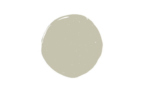
Benjamin Moore Saybrook Sage
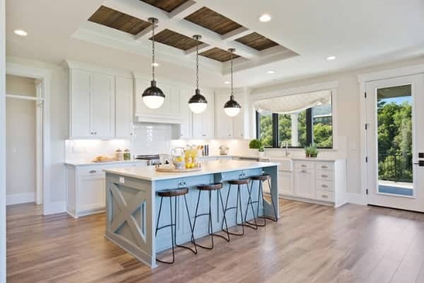
A medium-depth paint color, Benjamin Moore Saybrook Sage is a welcome breath of fresh air, as green-colored hues start to take center stage. Frequently used on kitchen cabinetry, built ins, and smaller areas like powder rooms, Saybrook Sage is olive hue that’s simply stunning.
Thinking about using this color in your next paint project? Make sure it’s right for you with my expert review.
Is Benjamin Moore Saybrook Sage green or gray?
Saybrook Sage is a green paint color with just a hint of a gray undertone. Many sage colors have more gray then green, but this is not the case with Saybrook Sage, as it definitely leans more towards green than grey, and I feel confident classifying it as a greenish gray paint color.
Saybrook Sage color combinations
Sage greens are fairly easy to work with, given the fact that they go with so many hues. Pairing Saybrook Sage with other lighter and darker sage green paint colors is always a win, as is deep navys, terracota color, plums, muted yellows and soft whites and grays.
This sample color palette is more than just wall colors to pair with Saybrook Sage, but think of it as your all over color palette. Bring these hues in through drapery, pillows, fabric, and accessories to complement the sage-toned hue.
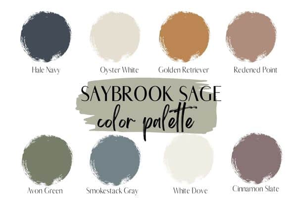
Two of my favorite choices for pairing with Saybrook Sage are Ben Moore Hale Navy and Smokestack Gray.
Oyster White is a great greige with green undertones, pairing nicely with the sage green in Saybrook Sage, and and White Dove would work well as a trim color, as it’s a soft, creamy off-white shade of paint.
A plum color like Cinnamon Slate would be beautiful in accent pieces or fabrics to highlight the calming sage hue.
Don’t forget the elegance a mustard hue brings with it. Look for throw pillows and throws with an Ochre tone to work well with this color.
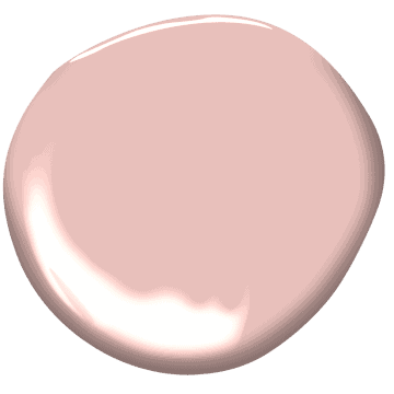
The Sherwin Williams 2023 color of the year, Redened Point, is a pretty terracota color and would be a perfect pairing with Saybrook Sage.
Saybrook Sage vs. October Mist
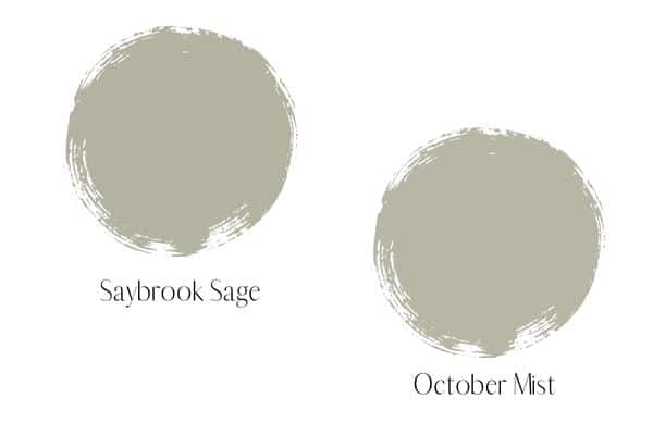
October Mist was Benjamin Moore’s 2022 paint color of the year and the similarities it shares with Saybrook Sage are very striking. October Mist is a hair lighter than Saybrook Sage, but it’s a very subtle difference.
The biggest difference between the two hues is the fact that October Mist has considerably more silvery gray undertones in it than Saybrook Sage, which actually makes it come off as more of a “sage” than Saybrook Sage.
How to decide if Saybrook Sage is right for your home
Here are my top three tips for getting the paint color right the first time!
Observe your light
Saybrook Sage is a medium-depth paint color, meaning it won’t wash out a space and it won’t come across as too dark of a hue under normal lighting conditions.
Now, lighting is everything when it comes to paint colors and can really alter how they look. While I do have some “real life” photos in this post where Saybrook Sage has been used, you should know that most photos you see of paint color online have been edited and artificially lit, therefore the color will most likely look a little different in your home.
As you can see below, Saybrook Sage looks almost like a mint hue on the exterior below, and that’s likely due to editing and the fact that paint colors will always look 2x lighter outside.
If you have a room that doesn’t get a lot of natural light and is positioned away from the sun you might find that Sabyrook Sage is too dark for you. In a dimly lit room, this color is likely to look more like a darker olive green.
Conversely, in a room with a lot of windows that face the sun, you might find this color looks a bit like the one on the exterior.
Make sure you test out your colors and observe how they respond to the light in your room before you commit (more on this below!).
Pay attention to clean vs. dirty
While Saybrook Sage will go with many colors, it is a muted “dirty” color. As opposed to a true green color which is a “clean” color, Sabyrook Sage should only be paired with other muted/dirty hues.
Look at the difference below between a “clean” green and a “dirty” green. If you are pulling a room together and you’re using Saybrook Sage as the wall color, keep this principle in mind when you’re decorating.
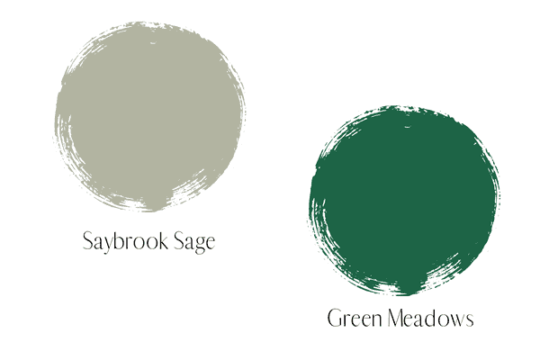
This pretty sage hue pairs well with blues, yellows, purples and terra cottas, just to name a few, but if you’ll notice in my color palette above, it all of the color choices are muted tones.
Test it out
Many, many people skip this very important part in the whole paint color decision process and live to regret it!
Even if you look at a thousand photos of this color used in homes online, you still must test it out for yourself.
Just like with every paint color, I recommend you order several hues within the color family. This is really the only way you can note how light or dark colors are compared to one another, the subtle undertones, etc. You’ll be amazed at what you see when you test out colors together, rather than in isolation.
I like the peel and stick paint samples for ease of testing out colors. I always put the color samples right onto white poster board rather than the current wall color so as not to have anything interfere with how the color appears.
Alternatively, you can paint a large square and leave a white boarder around it. Next, you’ll tape the white paper right onto the wall to test out your color.
Make sure to observe how the color reacts in the light and how well it plays with your fixed elements (anything that would be too expensive to replace) and furniture.
Painting samples on the poster board or getting the peel and stick samples allows you to bring the paint sample to your drapery, furniture and decor to get a good feel for how the colors will mesh with each other.
Are you now convinced Saybrook Sage is the color for you or are you back to the drawing board? Check out more green gray color options or my other paint color reviews for more inspiration!

