Sherwin Williams Opaline
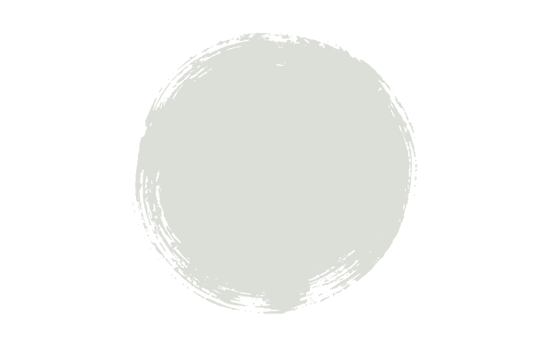
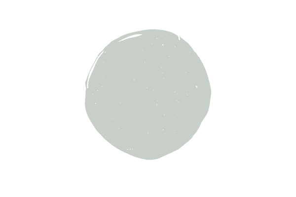
A light sea-foam tone, Sherwin Williams Opaline is stunning. Not the lightest hue in its category, but certainly not a tone with significant pigment, Opaline is a tone homeowners look to for bathrooms, kids rooms and even living rooms.
Thinking about using Opaline in your next home project but not quite sure if it will work well in your space? Stick around, as I’ll go over exactly what you need to know about choosing this pretty paint color and when it works best.
This post contains affiliate links. Read my policy here.
What color is Opaline?
Opaline is one of my favorite shades of blue green, as it’s light enough to work as a backdrop that doesn’t steal the show, but can also be elevated to center-stage with the right decor and accessories.
In terms of light depth, Opaline is fairly light, with a light reflectance value of 72. Light reflectance value refers to how light or dark a color is, with 0 being absolute black and 100 being pure white. To give you a frame of reference, some off white colors are in the 80s, so Opaline is pretty light.
Which colors coordinate with Opaline?
Opaline will work with a lot of different decor schemes as it has both blue and green tones. I like Opaline with darker blue greens, as well as with terra cotta colors and dark blue paint colors.
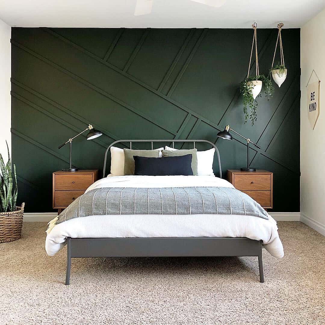
You can also play up the green more in Opaline when you pair it with darker green hues and here’s some of the best dark green paint colors I recommend most.
Opaline also looks fabulous in a bathroom and I’ve recently named this color as one of my top choices for bathroom cabinet colors.
Opaline vs Sea Salt
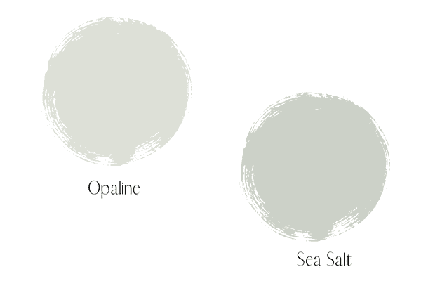
Opaline and Sea Salt are pretty darn close except Sea Salt is a little darker than Opaline. If you really like Opaline but have a lot of natural light, perhaps consider Sea Salt. A darker color will hold its own much better than a lighter one in a room with a lot of sunlight.
Opaline vs. Rainwashed
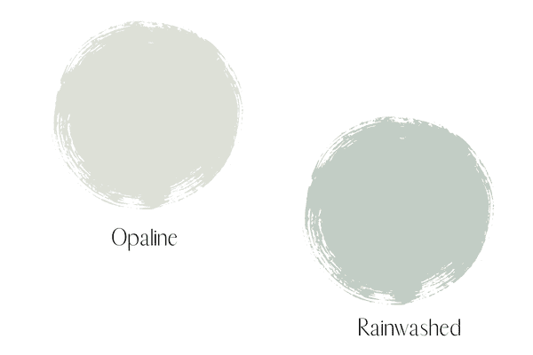
Rainwashed is considerably darker than Opaline, with an LRV of 59, compared to Opaline’s 72. It’s also considerably more pigmented. Opaline doesn’t make quite the statement rainwashed makes, in terms of impact.
Opaline vs. Palladian Blue
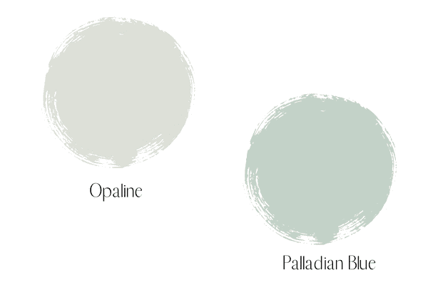
Palladian Blue is the darkest out of the three hues I’m comparing to Opaline and at LRV of 57, this pretty blueish green really makes a statement.
How do I know if Sherwin Williams Opaline is right for my space?
Here’s four tips that will ensure you don’t get the paint color wrong, because we all know how frustrating that is! After you read these tips, if you haven’t read my post on picking paint colors, I highly suggest you do!
Observe your light
By know you know, Opaline is a pretty light color, but what you might not know is how Opaline’s LRV will affect its appearance in a lot or very little light. I love a good blue-green hue…who doesn’t? But if you really want that yummy goodness of bluish green you want to make sure it’s going to pack a punch, not get washed out.
Because Opaline is so light you really have to carefully observe the natural light the room you want to paint receives each day. If it faces the sun and has large windows, you really might find yourself feeling disappointed by how pale it looks. Or, you might like the barely-there mint hue that’s left. This is why testing out a color and observing it throughout the day is really key.
Take note of your decor
When you read my post on picking the right paint colors (that I linked above) you’ll understand when you would choose a blue/green, but in a nutshell, paint is always supposed to accentuate your decor. With non-neutral colors like Opaline (a neutral is white, taupe, beige or gray) you want to make sure the room’s decor scheme can carry Opaline.
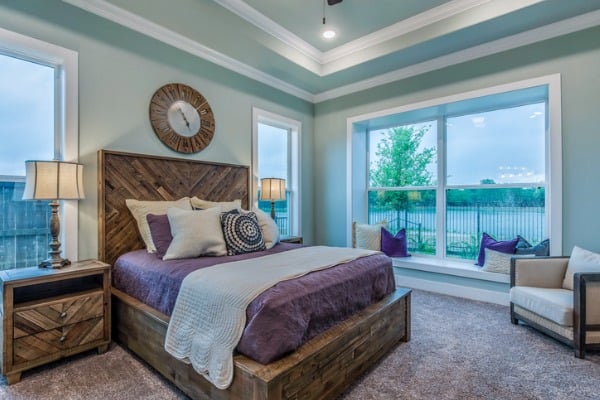
Essentially, if you’re choosing Opaline for your wall color, your room needs to have either a good amount of blue or a good amount of green or both! You don’t want the blue green in Opaline to be the only blue green in the room, as it’s just not going to do anything to enhance your decor. I’ve used this photo before, but can you see how the blue green on the walls really relates to nothing in the room. This is no good!
Compare, compare, compare
I was taught the easiest way to identify the correct color for your project is to compare colors with other colors. It’s also the easiest way to identify undertones. I cannot tell you how hard it is to spot undertones without doing this.
With blue green hues like Opaline, tones in this family will either have more blue or more green, and really the only way to know which color has more of another is to compare it to other blue/greens.
I personally think Opaline has more green than blue, but since it’s technically a blue green, if you play up blue, decor-wise you can pull out more blue from the paint color and vice versa. You might want a blue/green but want something with more blue than green, so that’s why it’s important to not skip this step!
Test it out
I tell my clients never to rely on those tiny paint chips and I’ll share that same advice with my readers! You must observe paint samples in a large scale, and not at the paint store! Either bring a physical can of paint home with you or order those peel and stick samples.
If you don’t want to order the peel and stick, take your paint and paint a large square on a sheet of pure white poster board (as you never should test out a sample without putting white poster board behind it so your current wall color won’t interfere with the color you’re looking at).
Like I mentioned above it’s also a good idea to view other color samples and compare them to each other. You can also take your large scale samples and place them next to other fabrics in the room.
Have more questions about Sherwin Williams Opaline? Please ask below!




I’m looking for a really light green-blue-gray to brighten a northeast facing family room/kitchen. I would like a warm color. Is it possible to have a warm gray-green-blue? I want the gray in it, because I don’t want it to be too saturated. But does that then make it cool? The big hitch is that our trim is (was when we got the house) SW Dover White, so very warm and creamy, and we don’t want to have to repaint all the trim and doors.
Anyhow, I thought this Opaline looked like it might do what I am hoping for, but I just don’t know. I painted it SW Glimmer already, but it is WRONG. Far too blue, and far too saturated. I don’t want to make another mistake like that (and I tried to figure it out using paint samples, but I just couldn’t tell until the whole room was done).
Hi. I’m considering Opaline for the exterior of my beach cottage which faces S/W. I first was considering whites for the exterior, but want a touch of color and like Opaline. Do you think the color saturation will be enough for the exterior of a S/W facing home.
Thank you.
What are your thoughts about painting the exterior of a home opaline?
I love Opaline. It’s very light, though, and as a general rule of thumb, paint colors look 2x lighter outdoors. It may come off as almost white with just a hint of blue/green. Totally fine if that’s the look you were going for, if not, check out darker blue/green colors. Here’s a post I wrote on blue/green colors: https://homelikeyoumeanit.com/blue-green-paint-colors/