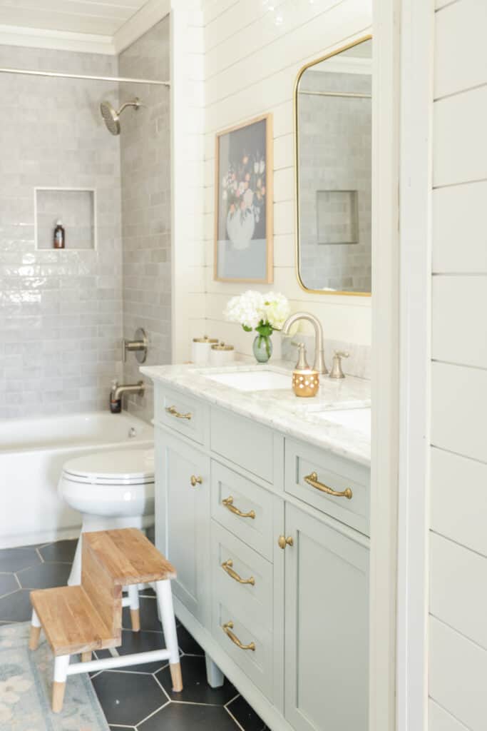
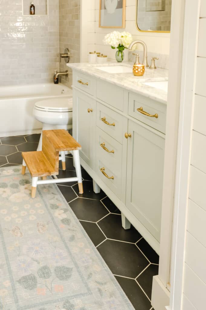
Benjamin Moore Quiet Moments
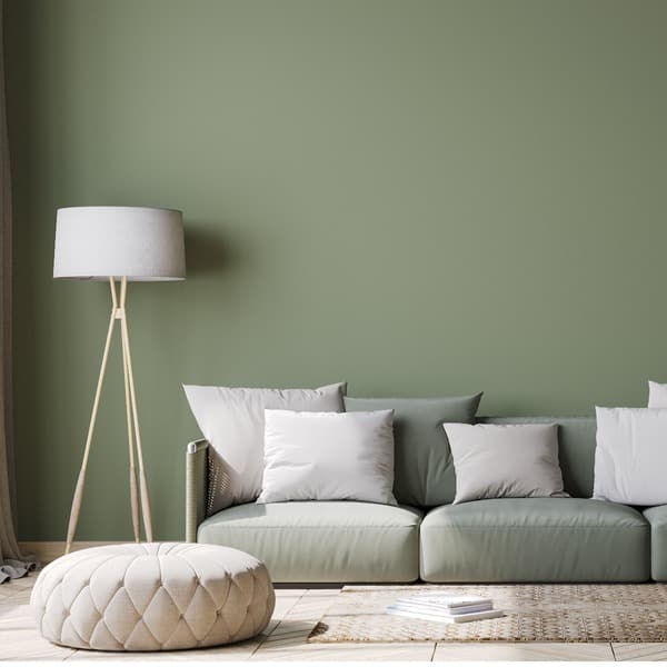
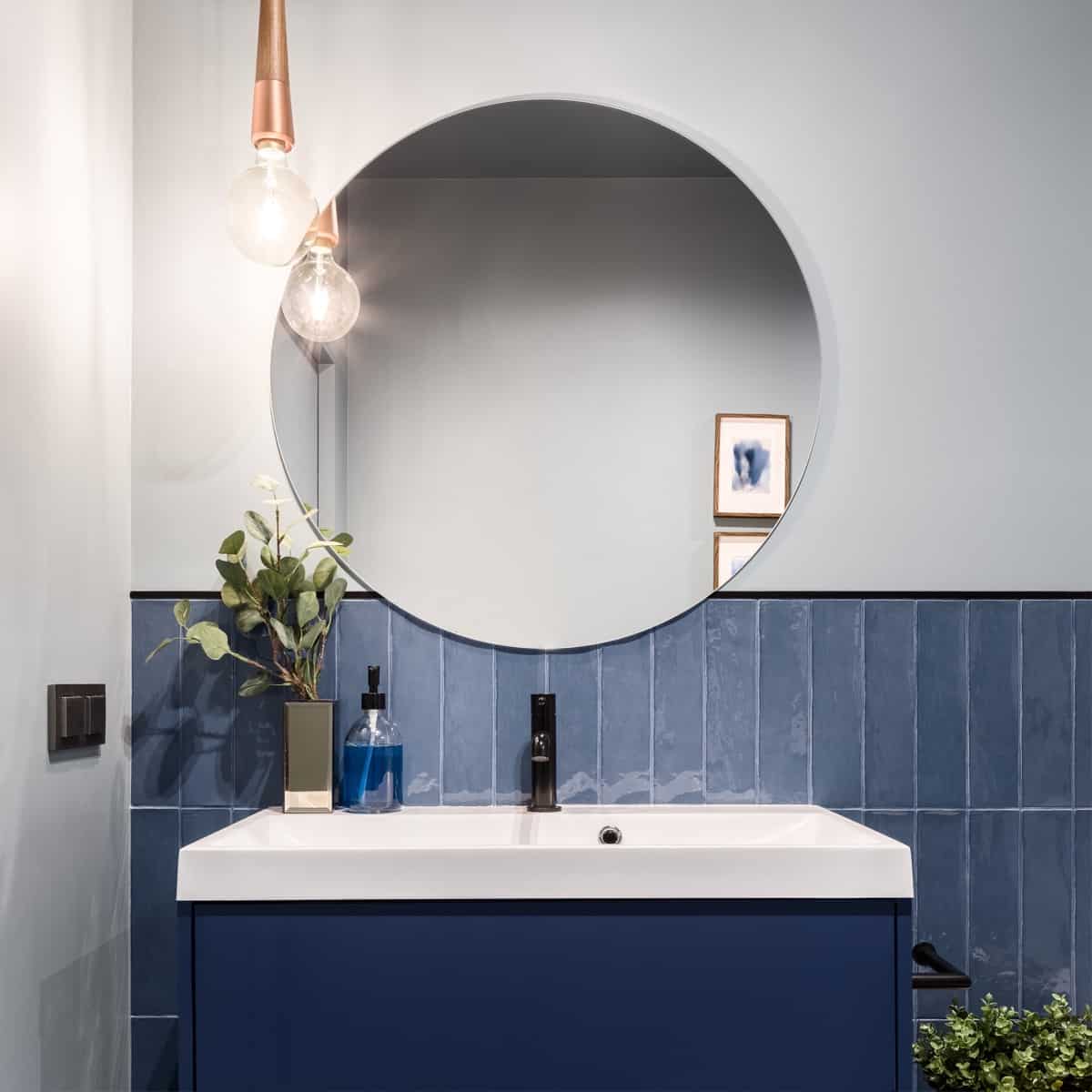
Quiet Moments is a beautiful, spa-like color perfect for bathrooms, living rooms and entries. If you’re thinking about using Benjamin Moore Quiet Moments, today’s review is for you.
You’ll learn about undertone, which trim color works best with Quiet Moments and I’ll even include a video where I compare this color and other colors like it!
What color is Benjamin Moore 1563 Quiet Moments?
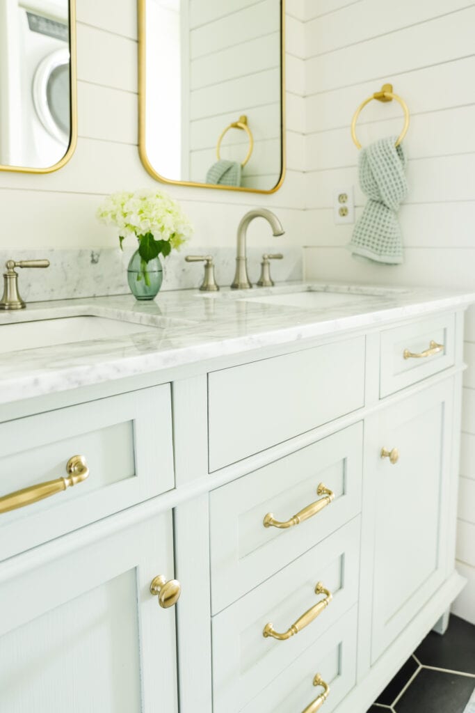
Quiet Moments is considered a blue green color with just the slightest hint of a gray, which works to really mute this pretty color when compared to other bluish green hues on the market. I consider it one of the most “neutral” blue greens on the market.
When compared to other, more saturated blue greens like Palladian Blue by Benjamin Moore, you’ll find that Quiet Moments is much more muted and subdued.
Is Quiet Moments more blue or green?
Depending on what you compare Quiet Moments to, it can either pull more blue or green. Typically speaking, it pulls just a bit more green.
Colors that go with Ben Moore Quiet Moments
Quiet Moments is very versatile when it comes to pairing it with other colors, thanks to its blue/green undertone.
In terms of neutral colors (I’ll cover trim colors below), Quiet Moments looks good with pale grays with blue undertones like BM Owl Gray and SW Passive.
It also looks good with warmer neutrals like SW Fleur de Sel, SW Accessible Beige and BM Edgecomb Gray, just to name a few.
You can’t beat pairing this pretty bluish green with darker blue greens like Gentleman’s Gray and Waterloo. It’s also really pretty with navy blue colors like Hale Navy HC 154.
What is the LRV?
The LRV of Quiet Moments is 61. LRV stands for light reflectance value and tells us how light or dark a paint color is. Zero is pure black and 100 is pure white. Colors that have LRVs in the 60s and up are considered light colors.
Quiet Moments is not the lightest blue green, and if you want something much lighter, check out SW Opaline, as it has an LRV of 72.
What trim color pairs best with Quiet Moments 1563?
Hands down, Quiet Moments looks best when paired with clean whites. If you’re new to the wonderfully confusing world of white paint, you should know that there are whites with blue undertones, true white colors and off white colors.
Whites like Ben Moore Oxford White and Chantilly Lace or even High Reflective White are all true whites that pair beautifully with Quiet Moments.
Now, sometimes your decor demands a softer white, which is totally acceptable! Softer whites will work well with this color, but I’m partial to Simply White, as when compared to other popular off-whites like White Dove or Alabaster it’s cleaner and less yellow.
Quiet Moments vs. Beach Glass
Color-depth wise, Beach Glass is considerably more saturated than Quiet Moments. With an LRV of 49, this is a medium-depth paint color. Beach Glass also pulls a bit more blue than Quiet Moments.
Quiet Moments vs. Tranquility
Tranquility is also a darker paint color when compared to Quiet Moments. With an LRV of 53 it’s just a tad darker than the lighter Quiet Moments. Otherwise, the colors are very similar, as they both pull more green than blue.
I’d sample both and if you find you have a room with tons of natural light, Tranquility may be your winner if Quiet Moments is too washed out by light.
Quiet Moments vs. Sea Salt
Sea Salt and Quiet Moments are very similar. I find that Sherwin Williams Sea Salt pulls a bit more green than Quiet Moments and also has less gray, making it a brighter color overall. It’s also just a bit lighter, with an LRV of 63.
How to tell if Quiet Moments is for you
Don’t be paralyzed with decision; instead follow my three rules for getting the color right. If you prefer video, I’ve got a great review on this color that I’ll link below:
Tip #1 Check your light
Quiet Moments is a light color, so you always run the risk of this being too light for your room if you have a lot of natural light. This is the number one reason why you can’t trust online inspiration pictures of colors because it’s absolutely crazy what light does to a paint color.
Go ahead and read reviews like this and source inspo pictures, for goodness sake, make sure to test out the color in your home with your light.
If it gets washed out, try some of the darker blue greens I mentioned above. If you have one small window that faces opposite the sun most of the day, you might need to get even lighter and try out SW Opaline and colors with an LRV of 65 and up.
Tip #2 Make sure your decor/other neutral colors support this color
Do you know what the secret to wall colors not falling flat is? Repeating the wall color in your room at least two or three other times in various sizes.
In an ideal world you would pick your paint color last. I know that is sometimes not feasible, so if it’s not, just remember to repeat the color and you’ll be amazed at how beautiful the room feels.
I’d also be mindful of pairing this color with other neutrals that have a blue or green undertone (I mentioned a bunch above) as it just cohesively works better!
Tip #3 Test it out
Exhibit A– this is how you should be testing out colors!
Notice how this color is not just slapped onto the wall, but it’s placed on a pure white poster board and then put up against the wall. Testing out colors this way gives you a pure white backdrop, and allows you to see the color much better.
Putting colors up over the current wall color always negatively impacts how the color will actually appear.
Do you have questions about Quiet Moments? I’ll do my best to answer them in the comments below! Here you can browse even more shades of blue and green if you’re not convinced Quiet Moments is for you.