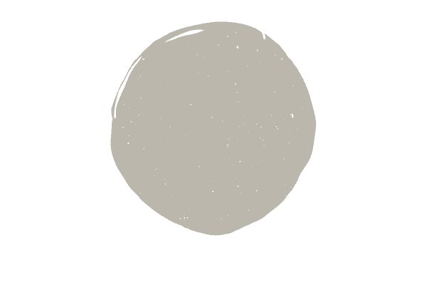
Sherwin Williams Mindful Gray
Is Sherwin Williams Mindful Gray a top contender for your next paint project?
In today’s post I’m doing a full review on this darker color, so you’ll come away either with full confidence that this is the color for you or a clear direction on where to go next!
This post contains affiliate links. Read my policy here.
What color is SW Mindful Gray?
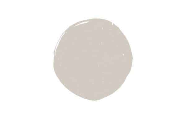
Is Mindful Gray a gray, beige or even greige? It’s technically two of those things, as its classified as a Gray paint color with green/greige undertones.
Greige is a blend of gray and beige, and colors in this can either more gray or more beige. Mindful Gray definitely has more gray.
Mindful Gray really reminds me of the color of wet cement if you’re looking for a really clear picture of what this color looks like in real life.
Essentially you can think of this color as a darker, neutral gray tone.
What are the undertones in Sherwin Williams Mindful Gray?
Mindful Gray has green undertones. Technically speaking, it belongs to the gray green paint color family.
With gray paint colors, you’re either dealing with green, blue, or purple. Sometimes gray colors have a combination of blue and green undertones, as well.
There’s no escaping these undertones either. There is no gray paint color completely free of undertones.
While you can’t get away from undertones you can work with them by making sure your fixed elements (things like furniture, floors, countertops, cabinets, etc) will work with the undertones in the color.
Later on, I’ll go over this in depth. But for now, know that Mindful Gray has green undertones.
Green undertones are the easiest of all the undertones to work with, so that’s good news!
Psst! Did you know you can order a peel and stick sample of real paint of Mindful Gray? Try out this paint color without all the mess of real paint.
What is the Light Reflectance Value of SW 7016 Mindful Gray?
Light Reflectance Value or LRV has to do with how light or dark a paint color is. Colors are on a scale from 0-100, with 0 representing pure black and 100 representing pure white.
Mindful Gray sits at a 48, which would be classified as a medium-dark paint color.
When gray walls were very, very popular many homeowners opted to use this color as a whole room color, but now with the shift to lighter and brighter interiors, many have shied away from this decision.
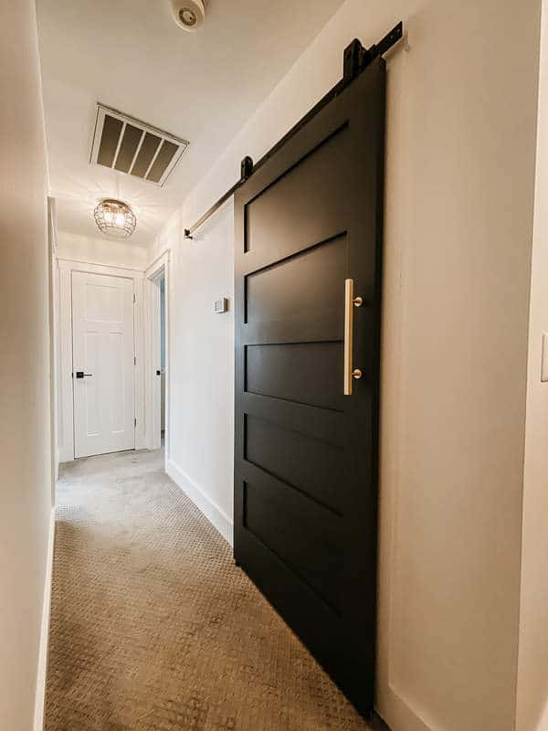
Despite the trend towards lighter and brighter, I still think Mindful Gray is a great color for a whole room, piece of furniture, exteriors and even a powder room.
Now, would I paint an entire downstairs Mindful Gray? No, probably not, as I think it works better for well-defined spaces.
Coordinating colors
When it comes to picking out a color palette that works with Mindful Gray, this color is fairly easy.
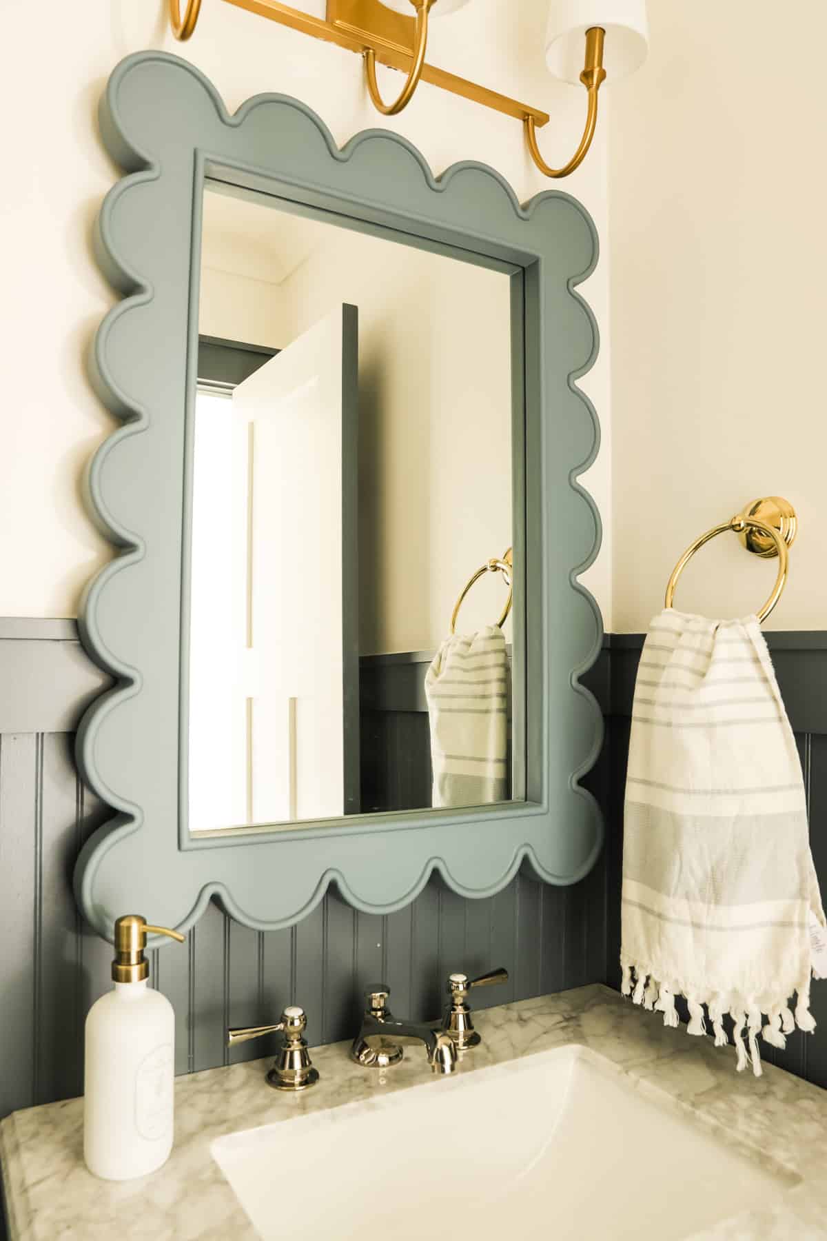
It looks good with lighter blueish/green tones like Sea Salt, SW Silverpointe and SW Fleur de Sel. It also looks good with dark navy blue paint colors.
Lighter gray tones with green undertones also pair well with Minful Gray. Look to colors like Gray Mist and Classic Gray.
Darker sage green paint colors tend to work well with Mindful Gray, as well.
Because comparison is really the only way to get a good feel for paint colors, here’s Mindful Gray compared to some popular colors:
Mindful Gray vs. Dorian Gray
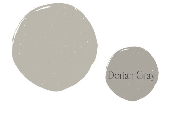
Mindful Gray and Dorian Gray are related in the fact that they share the same green undertone. Dorian Gray is much lighter than Mindful Gray, with an LRV of 39, versus Mindful’s LRV of 48.
Dorian Gray would be a pretty accent color to some of the other lighter green gray tones I mentioned above. I could also see it as a whole room color for a room like a powder bath or office.
Mindful Gray vs. Agreeable Gray
SW Agreeable Gray has been a best selling Sherwin Williams color for years and years. Agreeable Gray and Mindful Gray both share that same green undertone, but as you can see, Agreeable Gray is much lighter.
With an LRV of 60, Agreeable Gray is a better choice for an open concept living space, as it’s significantly lighter.
Mindful Gray vs. Revere Pewter
Another super popular color for decades, Ben Moore Revere Pewter has a green undertone as well. While I’d still classify this color as a medium-toned paint color, it is a bit lighter than Mindful Gray, with an LRV of 55.
Mindful Gray vs. Escape Gray
Both Mindful Gray and SW Escape Gray can be classified as gray/green colors, but as you can see, the green in Escape Gray is much more prominent.
Escape Gray is also darker than Mindful Gray, with an LRV of 40. I like Escape Gray for a muted army green look.
Tips on deciding if Mindful Gray is right for your next project
Don’t spend days second guessing your paint decision when you take cues from my three no-fail paint tips.
#1 Evaluate your natural light
Sourcing photos of Sherwin Williams Mindful Gray online is great as a starting point, but it can’t be the final decision maker.
Many photos online are highly edited and color corrected, making it sometimes virtually impossible to get a really good feel for what the color actually is.
Online photos also tell you nothing in the way of the room’s light orientation. The room in your inspiration photo could have considerable more light than yours or vice versa.
The same goes for when you ask your friends what colors they used in their homes. You won’t actually know how the color performs in your home until you sample the color first-hand in your home.
Rooms that are north-facing and don’t have ample natural light will show Mindful Gray as much darker, and the color may come off as muddy. You may not like Mindful Gray for a whole room color if you don’t have too much natural light.
Rooms with a lot of natural light make colors appear brighter. Sample the color correctly on the walls (this is tip #3!) and observe how it reacts in your space throughout the day for the best gauge on color.
Evaluate your furnishings/fixed elements
Neutral colors are hard to choose because if you don’t pay attention to the other neutral tones in your space, you could accidentally choose a color that majorly clashes with the rest of your home.
Go around your room and observe the undertones in the neutral items you have that cannot be moved. Evaluate things like your countertops, cabinets, backsplash, carpet, flooring (unless you have classic wood floors) couches, rugs, etc.
Ideally you want to make sure that: 1) you are only working with one neutral undertone per space, and 2) the undertones in your paint color match the tones in your fixed elements.
So after completing this exercise, you notice most items in your home are actually beige, you’re in the wrong neutral color family to begin with!
But let’s say you notice gray is the right neutral for your home, but instead of gray with green undertones, most of your stuff leans cooler. Well then, you now know you should be looking at grays with blue undertones.
Hopefully, this is starting to click!
#3 Test out the paint color
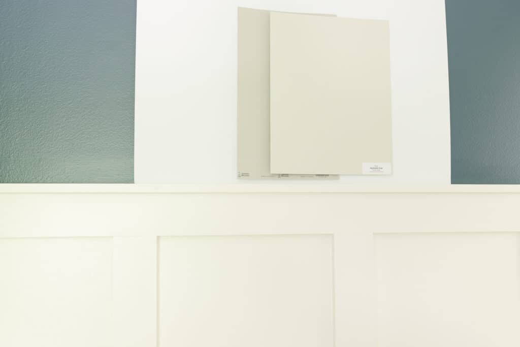
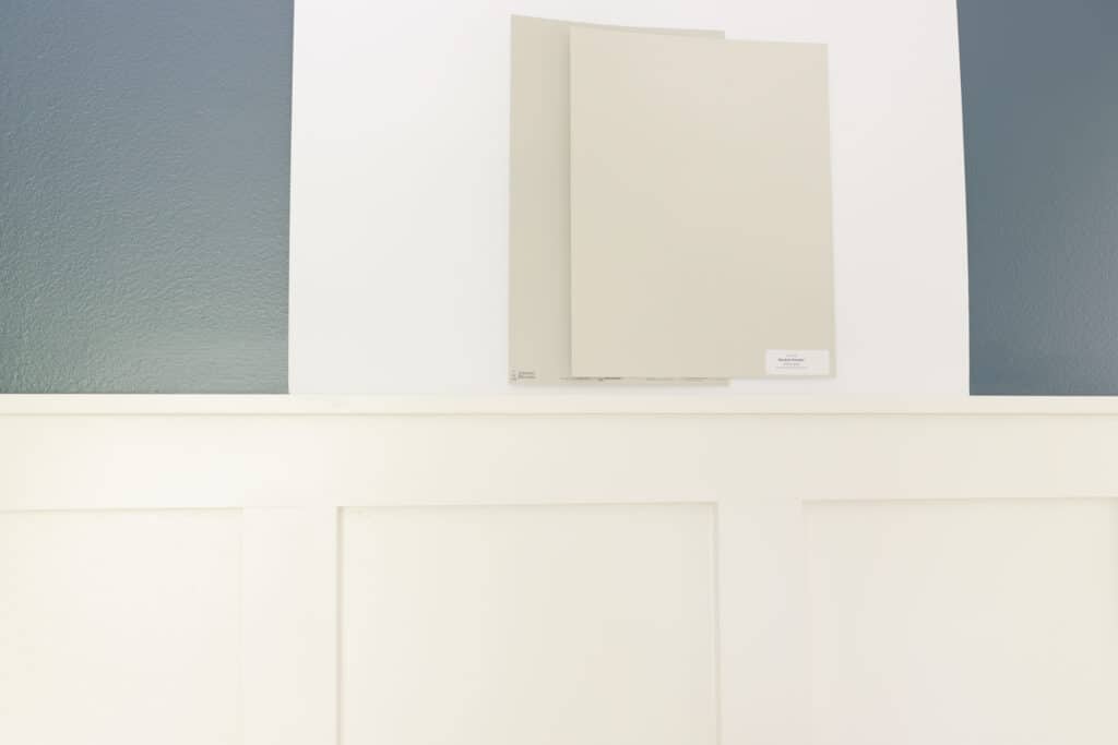
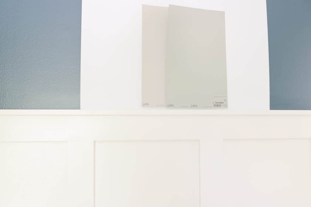
No more choosing the paint color off of internet photos or the tiny paint swatch in the store. You need big paint samples to make the right color decision.
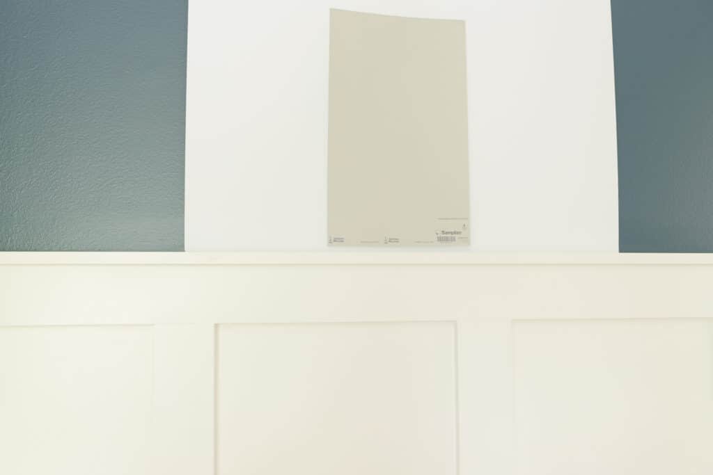
Either paint a large square of paint right on pure white paper/poster board or get those peel and stick samples and place them on poster board.
See the photo below of how I test out paint colors in homes. You do not want to stick the paint sample right onto your current wall color. Doing so will never give you an accurate read on the color.
Beyond testing out the color the right way, I also urge you to sample other colors too. If you’re unclear about whether you need a gray with a blue, green, purple or blue/green undertone. Get samples of all these colors and see which ones play best with your home’s fixed elements.
Comparing colors is really the only way to see undertones, too. To help you with this process, I have a large post on gray paint colors where I go over undertones and identify popular colors within each undertone family.
For reference here are more green grey paint colors to sample, as well.
On the fence about Mindful Gray or have you made up your mind? Let me know in the comments!