The 6 easiest to work with taupe paint colors
Tired of the gray paint trend but not quite ready to bring back the warm beige colors yet? Perhaps a taupe paint color is in your future.
A color in between gray and beige, taupe is a nice warm, neutral paint color that’s fairly classic in terms of popularity.
Is a taupe paint color right for you? In this comprehensive post, I’ll go over several popular taupe paint colors from Sherwin Williams and Benjamin Moore and I’ll explain how to use these colors in your home.
This post contains affiliate links. Read our policy here.
The most important thing to know about taupe paint colors
Before I highlight some of my favorite taupe colors, let’s start with some basics. Taupe paint colors are a blend of grey and beige and they all have either a pink or a purple undertone. So right off the bat, if you know a pink or purple undertone isn’t going to work for you, look at other neutral paint colors.
The 15 best taupe paint colors
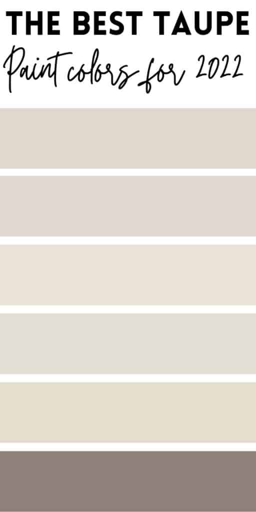
Above shown from top to bottom: Pale Oak, Egret White, Panda White, Fossil, Smokey Taupe, Poised Taupe.
Benjamin Moore Pale Oak
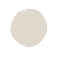
Pale Oak is one of the most popular and most sampled Benjamin Moore paint colors. Pale Oak is a really pretty light taupe greige paint color that has just a hint of a pink undertone that leans into purple. Working well with neutral fabrics that have a slight pink tint to them, Pale Oak also looks really pretty with blue-green paint colors, as well.
Sherwin Williams Egret White
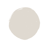
You’d think Egret White would be a white paint color, but oh no, it’s actually a taupe-y greige, with a pink undertone that runs into purple. I like pairing Egret White with a pure white with no undertones like Chantilly Lace. 70
Pale Oak and Egret White are very, very similar with Pale Oak having just a wink more purple than Egret White.
Benjamin Moore Panda White
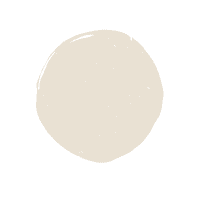
Another paint color called white, but is anything but! Panda White is another very, very light taupe-y greige. Panda White has a pink undertone that really doesn’t lean into purple like the other two taupes I reviewed above. Overall, you’ll notice that Panda White reads more yellowish pink.
Benjamin Moore Fossil

Fossil is a really pretty taupe that’s got more of a purple undertone than the pink you commonly see with a lot of taupes.
Benjamin Moore Smokey Taupe

Smokey Taupe is one of Benjamin Moore’s most sampled taupes and is very light in appearance. Reading a bit like Panda White, Smokey Taupe has a bit more yellow to it.
Sherwin Williams Poised Taupe
Most homeowners are searching for light paint colors these days, but for those instances that call for darker color, Poised Taupe is simply beautiful. Leaning heavily into that purple undertone, Poised Taupe makes a very dramatic statement.
Order a 12×12 peel and stick sample of your favorite taupe paint color here. If you’re interested in a video, below I show several taupe paint colors and talk about them, in-depth:
Benjamin Moore Stone Hearth
One of the best paint colors for exterior walls, as it relates so well to many taupe-toned stone and brick, Stone Hearth is a medium depth paint color with undertones that lean into both pink and purple.
Benjamin Moore Cedar Key

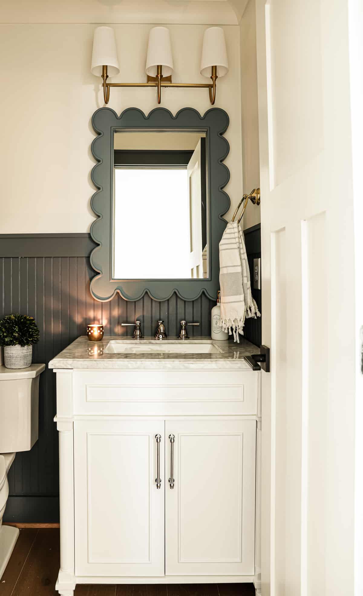
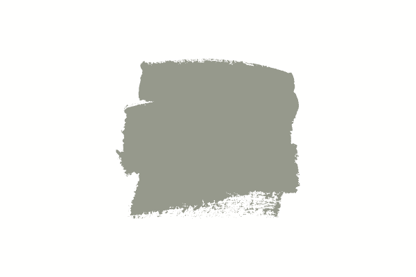
Cedar Key is an extremely popular neutral shade, working well to freshen up spaces when homeowners want something warmer than gray. This lighter taupe works well for living rooms, as a cabinet color in bathrooms and more. I tend to see both pink and violet undertones in this hue.
Benjamin Moore Elmira White
Elmira White is the perfect taupe to freshen up a room while still feeling like there’s significant warmth in the space. Elmira white is a lighter paint color with a pink undertone.
Benjamin Moore Wind’s Breath
Perfect for interior walls where you want some color but not a lot, Wind’s Breath is a barely-there taupe with a soft pink undertone.
Natural Linen

Sherwin Williams describes this light taupe paint color as a yellow, but it’s truly anything but yellow! A warm taupe, natural linen has a pink undertone. This is a great neutral color for a living room with linen colored couches or chairs that tend to lean into pink undertones.
Benjamin Moore Ranchwood

Looking for a darker taupe color for a moody room or exterior? Benjamin Moore Ranchwood is a dark taupe with purple undertones. This is especially a great color to consider if your exterior color palette has stones or even brick that would complement a taupe.
Sherwin Williams Modern Gray

A pretty taupe that’s light but won’t get washed out in too much natural light, Modern Gray is a warm color with a purple undertone.
Sherwin Willams Popular Gray

Very similar to Modern Gray, Popular Gray is just a hair darker with a violet undertone.
Sherwin Williams Shitake
Shitake is on the tail end of being considered a light paint color so it’s got just enough warmth to have a significant presence without overwhelming a space. This pretty color has a pink undertone.
When should I use a taupe paint color?
A bedroom in Pale Oak
If you want something that’s warmer than gray, but not quite as warm as beige, taupe might be for you. But remember, just because you want a taupe paint color, doesn’t mean your home can support it. Let’s dive in to why you might go for a taupe paint color now.
When choosing a neutral paint color like taupe, you need to make sure your fixed elements and furnishings support that neutral. If you notice you have fixed elements that have varying undertones, just choose the largest item that commands the most attention. A fixed element is anything that you can’t move or change easily, i.e. a tile floor, countertop, large couch, etc.
To use taupe as a main wall color, you need to make sure the items in your room support the color. By now you know that taupe is in between gray and beige and has a pink or purple undertone.
The key to making sure you have the right neutral is to compare your fixed elements with paint samples. Make your own 12×12 sample on white poster board (leaving a white boarder around the paint sample) or order one of those peel and stick samples and place it on a white poster board.
If you’re totally shooting in the dark and don’t really know what type of neutral you have, you might order paint samples of beige, gray and taupe to make the best choice.
What colors go with taupe?
Taupe is a little fussy, just like all paint colors, but in order to get it just right, you have to pair it with the correct colors. Otherwise your taupe is left screaming its pink or purple undertone, which is exactly what you don’t want.
Taupe typically does well with grays with violet undertones, blue-green hues, and darker blues. For the most part, you need to pair taupe with softer white paint colors. If you’re searching for the perfect off-white trim color to go with your taupe wall, check out my list of off-white paint colors.
Is taupe grey or brown?
Taupe is neither grey or brown. Taupe is in between grey and beige and has a pink undertone that can lean into purple at times. Blue grays were quite popular for a while (and still work when your interior needs it) but at times, some people felt they were too cold.
In a quest to move into warmer territory, paint-color wise, many people ended up in taupe land, as taupes are warmer than greys but cooler than beige colors.
Taupe vs. Beige
Many people get taupe and beige mixed up but there are key differences in the two colors. Taupe is in between beige and gray and is much cooler than beige.
Taupe has pink/purple undertones. Beige is much warmer than taupe and can either have a gold, yellow, pink or orange undertones.
The only way to really know if you need a taupe vs a beige paint color is to get paint samples of multiple shades of beige and taupe to see which colors your home suits more.
Convinced beige would work better in your space? Check out these popular beige paint colors.
Do grey and taupe go together?
Grays with violet undertones like balboa mist, silver satin or collingwood look good with taupe, but grays with green, blue or blue/green undertones do not pair as well.
Is taupe out of style?
I’m a firm believer that if your room supports the use of a taupe as a main wall color, it isn’t out of style. Taupe is actually coming into style a lot more as people want warmer paint colors and are growing tired of the grays that lean on the cool side.
Increasingly homeowners are opting to repaint cabinets instead of replace, and thanks to the surprising amount of taupe tile, many lighter taupe shades work well for kitchen cabinets like Pale Oak and Wind’s Breath.
Be aware of these neutral colors that are not actually taupe
Agreeable Gray–I’ve seen Agreeable Gray on way too many taupe color lists and this recommendation couldn’t be farther from the truth. Agreeable Gray is a greige color with green undertones, not a taupe.
White Dove–Believe it or not, I’ve also seen this color on a list of light taupe paint colors to try. White Dove is a soft white, not a taupe.
Edgecomb Gray–Just like Agreeable Gray, Edgecomb Gray is a greige with a green undertone.
What’s the difference between greige and taupe?
Taupes and griege colors can sometimes look similar. Taupes are lighter than gray paint colors but warmer than beige, whereas griege colors are blends of beige and gray. A few of the colors on this list are actually considered greige paint colors as well as taupes (like Pale Oak and Wind’s Breath).
Don’t forget to evaluate the Light Reflectance Value of each color
If you can’t tell which color is lighter, just look up the LRV for the colors. Remember 0 is pure black and 100 represents pure white.

I am going to paint the interior of my home Accessible beige and would like to use Alabaster for the ceiling, baseboards, crown molding and interior doors. I am using black hardware on all interior doors.
My wood floors have beige/grey wood tones. My kitchen cabinets are canvas linen and the island is medium brown. My primary bath cabinets are taupe and the other two bathrooms will have shaker white (they are not bright white). Using Misterio Quartz countertops which have black and brown veining.
Don’t want stark white so thought Alabaster would be a softer white
I read your comments – in choosing a white paint color