Benjamin Moore Palladian Blue: a paint color review
Searching for that perfect blend of blue green? Palladian Blue is a beautiful, soft blue-green hue that has a very spa-like feeling. Perfect for palettes with a lot of blue or green or in small spaces like powder rooms, Benjamin Moore Palladian Blue is a beautiful color.
Thinking about using Palladian Blue in your home? Read my full review first so you don’t make any paint color mistakes!
This post contains affiliate links. Read our policy here.
What color is Palladian Blue?
Despite it’s name, Palladian Blue isn’t just a blue, it’s definitely a blue-green hue.
Is Palladian Blue more blue or green?
This one is tricky-Palladian Blue will read either more blue or more green depending on your lighting and the decor in your room. Is your room filled with blue hues? It’s going to read more blue. The color might also change throughout the day, looking more green with more natural light and more blue with less light.
This is why it’s so important to test your colors out and watch them throughout the day before you commit! Don’t slap Palladian Blue on your walls and email me later when you realize the color is more green than you thought or too blue for your space…
Psst! Ready to check out Palladian Blue in your home? Order a peel and stick sample here.
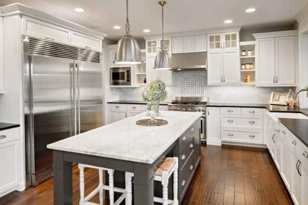
Which colors pair well with Benjamin Moore Palladian Blue?
There’s no denying Palladian Blue is simply gorgeous and since it’s a combo color, you’ve got a lot of leeway when it comes to pairing it with decor and other paint colors.
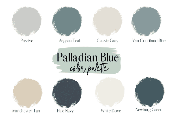
Sherwin Williams Passive: Passive is a good medium-depth gray paint color with a blue undertone.
Benjamin Moore Aegean Teal: A darker blue green hue that some might call a darker teal, Aegean Teal is really pretty with Palladian Blue.
Benjamin Moore Classic Gray: If you need a neutral but have more green undertones, Classic Gray will work well, plus it pairs really nicely with Palladian Blue.
Benjamin Moore Van Courtland Blue: Van Cortland Blue is a beautiful medium-toned blue that will pull just a hint of green if it’s paired with other green hues, but it’s definitely close to a true blue.
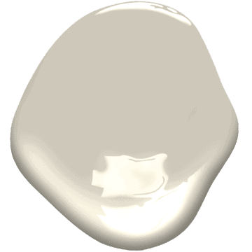
Benjamin Moore Manchester Tan: In need of a beige color that pairs well with Palladian Blue? Manchester Tan has a green undertone, making it a great combination with the spa-like hue.
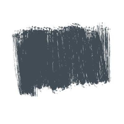
Benjamin Moore Hale Navy: Hale Navy is my favorite navy blue, hands-down.
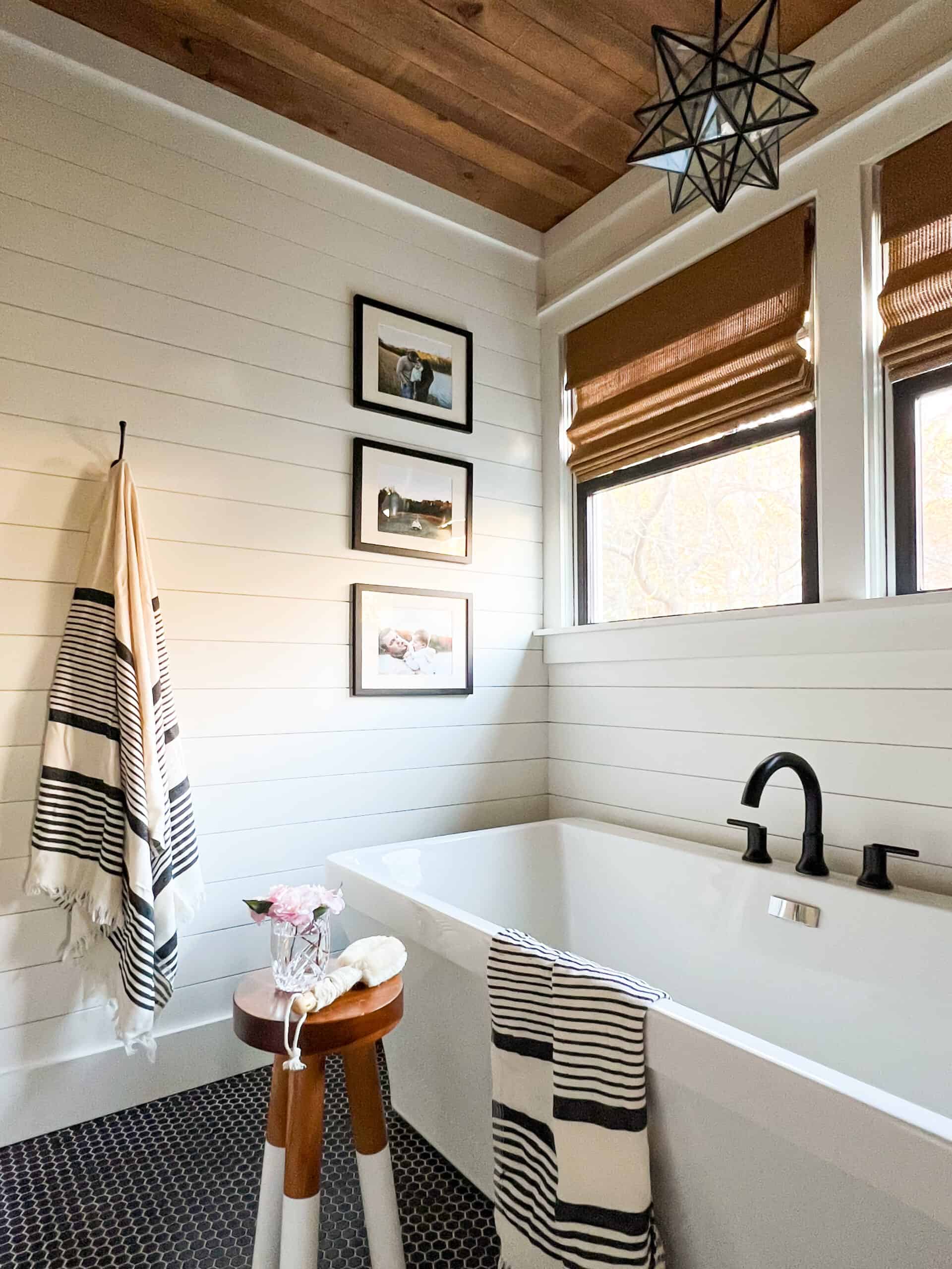
Benjamin Moore White Dove: Palladian Blue is pretty easy to work with when it comes to pairing it with white paint options, but one of my favorite combinations is to pair it with White Dove.
Benjamin Moore Newburg Green: Want to bring out the green in Palladian Blue? Pair it with Newburg Green, a dark blue-green hue that has more green than blue.
Farrow & Ball Stiffkey Blue: This deep blue inky hue would pair perfectly with the blue/green in Palladian Blue
Will Palladian Blue work well in my home?
Blues or blue-green colors are really forgiving. They tend to work well with a lot of decor. However, there are a few tips I want to share when working with Palladian Blue in your home.
If you’re seeking to use Palladian Blue in an open concept space, you want it to go with neutrals that will be in harmony with it. Palladian Blue is really easy to work with when it comes to white colors, but I tend to prefer it with specific neutrals instead of saying it works with everything.
For example, Palladian Blue works pretty universally with most gray paint colors, but I’m not a fan of how it pairs with gray colors that have a purple undertone. Check out my guide on gray paint to see the undertones of a lot of popular gray colors.
Palladian also looks good with beige colors that have green undertones. So Manchester Tan pairs really well, as does Feather Down, just to name a few.
You also want keep in mind that your room’s paint color should enhance your decor, not detract from it. It’s best to come up with a mood board or decorating scheme for your room first and then see what paint color might work best. I wrote a whole post on helpful tips for picking paint colors that you should check out if you’re not sure where to start.
What’s lighter than Palladian Blue?
If Palladian Blue is what you’re searching for, color-wise but it’s just a bit too saturated for your space, check out Benjamin Moore Healing Aloe. It’s very similar with that same beautiful blue green hue, but it’s much lighter. The light reflectance value or LRV of Palladian Blue is 60, while Healing Aloe’s is 68. LRV tells how light or dark a color is and goes from 0-100.
Wythe Blue vs. Palladian Blue
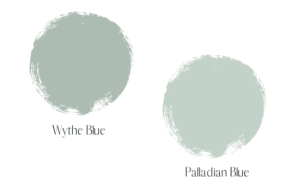
Wythe Blue is very similar to Palladian Blue with that same yummy blue green tone, but Wythe Blue is significantly darker that Palladian Blue. Wythe Blue’s LRV is 48, while Palladian Blue’s LRV is 60. If you have a space that you really, really want that blue green showing up but you’ve got a ton of natural light, you might consider Wythe Blue instead, as it won’t get as washed out.
Palladian Blue vs. Sea Salt
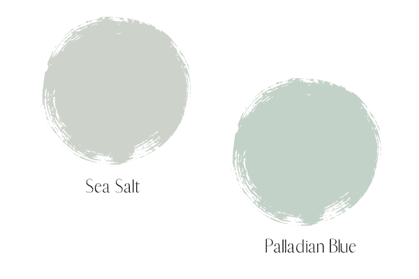
Out of all three, Wythe Blue, Palladian Blue and Sea Salt, Sea Salt is the lightest, but it’s also significantly more green than the blue-green tones you see in the other two. While technically still a blue-green, it just reads more green when compared to the other two, which is why it’s so important to test out your colors in real life!
Don’t forget to test out your paint color!
This is the most important step! Don’t go off a paint swatch (especially for these blue/green hues!) A paint swatch can be a starting place, but you can’t decide on a room color using the swatch alone.
I always suggest either getting the peel and stick (put don’t peel, I’ll explain more later!) samples you can order online, or going to the paint store and painting a large square-sized sample on pure white poster board, leaving a 1-2 inch border all the way around.
If you’re using the peel and stick you want to use painters tape and tape them to a white poster board. You’ll then put the white poster board up on the wall to observe the color. You don’t want to put a paint sample directly onto your wall, as the current wall color will negatively influence the sample color.
Now move the sample around the room to see how it looks at various points and also observe it throughout the day…blue/greens have a tendency to change as the sunlight changes.