Sherwin Williams Agreeable Gray: a paint color review
Sherwin Williams Agreeable Gray has been lauded as the perfect warm gray paint color for years now. While this popular color is certainly versatile, it won’t work for every room and every decor style–which quite the opposite of what you might read.
Agreeable Gray is a neutral color and neutral colors are notoriously hard to get right, but don’t worry–that’s where I come in.
As a certified true color expert, I help people pick the right color for their home every day and today I wanted to give a full color review on this popular neutral in order to help you make the right decision when it comes to choosing a color for your home.
SW Agreeable Gray undertones
Agreeable Gray is a greige/gray that has green undertones. A greige paint color is a blend of gray and beige.
When you’re dealing with gray paint colors you’re either stuck with green, violet, blue or a combination of two of those. Green undertones are by far the easiest to work with and the most neutral.
Just because they’re easy to work with does not mean that they will work in ever situation. For example, if you use Agreeable Gray in a room with a couch that is gray with blue undertones, you will immediately notice that something is “off.”
This is why it’s so hard for people to get neutral colors like Agreeable Gray right because they don’t know that they’re supposed to be considering how the undertones in neutral colors relate to their home’s furnishings and fixed elements (we’ll talk more on this below!)
Now, before you ask, because people always do…is there a gray without any undertones?? I wish I could grant everyone a magical paint color without any undertones, but that’s just not the way neutral colors work.
You can’t escape undertones. If you’ve read other articles on Agreeable Gray and someone said this color didn’t have any undertones, that’s your cue to run for the hills, because you now know that isn’t the case.
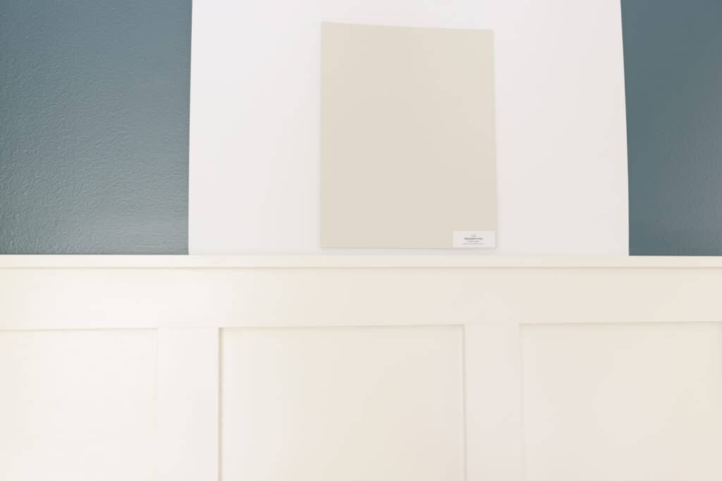
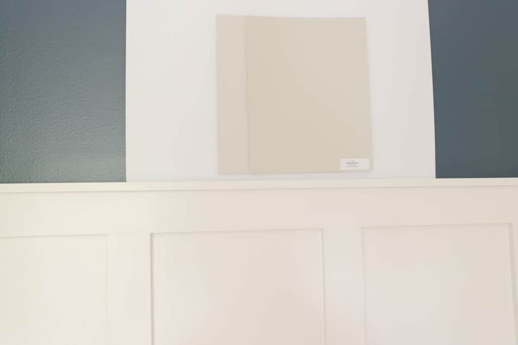
Below is an unedited picture of a real paint sample of Agreeable Gray. The way you see the paint sample on the wall is exactly how you should sample paint colors in your home!
Is Agreeable Gray still popular in 2023?
If you’re asking this question, you’re undoubtedly worried that ‘gray’ is now out and white is in. And while this does seem to be the sentiment in the design world, this isn’t exactly the case.
When people say gray is out they mean whole rooms devoted to gray. I’m talking gray couches on top of a gray floor and gray rug with gray end tables and gray decor and to top it all off, gray walls.
Here’s the thing though: light neutrals will never be out of style if they relate to the rest of your decor. So no, generally speaking, Agreeable Gray is not out and is still very popular, even in 2023.
What is the Light reflectance value?
The LRV of Agreeable Gray is 63. Light reflectance value tells us how light or dark a paint color is.
If you don’t know anything about LRV, all you need to know is that 0 is pure black and 100 is pure white.
I consider colors with an LRV of 63 to be on the light side of the spectrum.
Now, they’re not as light as off whites (which are super popular right now), as those have LRVs in the low 80s.
If you’re looking for something that’s in the same color family as Agreeable Gray but lighter, you need to sample Pearly White (76.5 LRV) and Heron Plum.
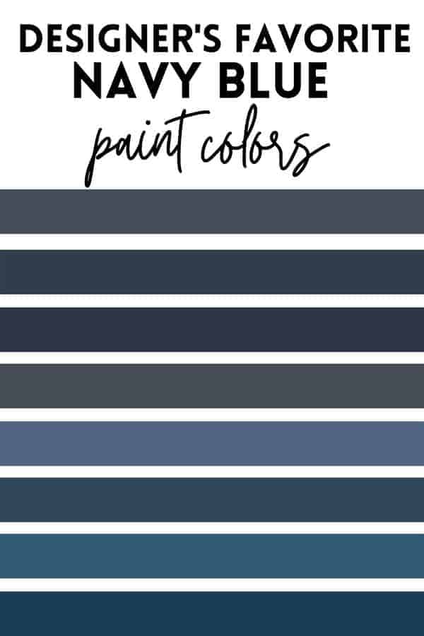
Sherwin Williams Agreeable Gray Coordinating Colors
In terms of coordinating colors, you can pair Agreeable Gray with darker or lighter grays with green undertones and many saturated colors.
You don’t want to use Agreeable Gray and another neutral that’s not in the same color family in close proximity to Agreeable Gray, as the general rule of thumb is just to have one neutral per space.
Lighter colors in the same color family as Agreeable Gray include Pearly White and Swiss Coffee. Darker colors include Rockport Gray, Mindful Gray and Pashmina, just to name a couple.
How does agreeable gray look in natural light? What about north facing rooms?
Agreeable Gray looks great in natural light. You’ll find that in a room with large windows that faces the sun most of the day this color is like a warm hug. Light and inviting without getting too washed out is exactly how Agreeable Gray will look in a south-facing room.
In rooms that don’t have a lot of natural light, at times, Agreeable Gray can come across as a little muddy. The green undertone tends to show itself a little more in less light and some people say they really don’t like how Agreeable Gray looks in north-facing rooms.
To get around this, you can either add more lighting to the room through lamps or try lighter shades of grey-green. I recommend starting with Classic Gray and Gray Mist.
What trim color should I pair with Agreeable Gray?
I really like crisp whites paired with Agreeable Gray. My favorites are Chantilly Lace and Oxford White. If you prefer a softer white, I’d go with Simply White, as it’s an off-white that isn’t too creamy and goes wonderfully with Agreeable Gray.
Agreeable Gray vs. Edgecomb Gray

Both greige, but Edgecomb Grey(right) leans more into the beige side, while Agreeable gray leans more into the gray side of things. Edgecomb Gray is just slightly lighter than Agreeable Grey, with an LRV of 63.
Agreeable gray vs. Repose Gray
Agreeable gray and Repose Gray (right) are very different. While they are both in the grey family, Agreeable Gray is most definitely considered a grey/greige with a green undertone, while Repose Gray is considered a gray with a blue undertone.
Repose Gray is just slightly darker than Agreeable Gray with an LRV of 58. You’ll choose Repose Gray over Agreeable Gray if your home’s fabrics, fixed elements, and decor lean more to the gray-blue family, rather than the gray-green.
Agreeable gray vs. Revere Pewter
Revere Pewter (right) is another super popular color that’s been in high demand for decades. Revere Pewter and Agreeable Gray are very similar, but once you compare the two colors side by side you’ll quickly see that one is darker than the other
With an LRV of 55, Revere Pewter is a good bit darker than Agreeable Gray. For this reason, with the lighter neutrals trend in full swing, many people are gravitating towards using Revere Pewter in open concept or as a whole house color and instead using lighter greige colors like Agreeable Gray.
Agreeable Gray vs. Accessible Beige
While Agreeable Gray and Accessible Beige (right)are in the same color family–gray/greige with green undertones, they are very different when you compare the two, side-by-side.
Accessible Beige heavily leans into the beige side of the greige color combo, while Agreeable Gray stays more in the gray side of the family. Accessible Beige is also darker, with an LRV of 58.
If you’re choosing between the two and you know that you need a grey with green undertones, decide how dark or light your room is first. You may find that your room is very light and receives a lot of natural light, and if that’s the case, you can get away with a slightly darker color.
You might also like grey a bit more than beige, and if that’s the case your answer is simple: go with Agreeable Grey.
Agreeable Gray vs. Worldly Gray
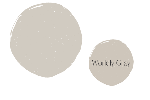
Agreeable Gray and Worley Gray are not too similar, and when you hold them up side by side you can easily see there difference in undertone and light depth.
You know by now that Agreeable Gray is a light greige with a green undertone. When compared to Worldly Gray you will immediately notice that Worldly Gray has a violet undertone. You’ll also notice that the Wordly Gray is darker than Agreeable Gray.
You’d choose Wordly Gray over Agreeable Gray if your furniture and/or fixed elements had a purple undertone. Many fabrics have a purple undertone, so it’s not out of the question for your couch to have a purple undertone!
Agreeable Gray vs. Anew Gray

With an LRV of 47 vs. the much higher LRV or Agreeable Gray, there’s a big light depth difference between these two colors.
Just like Wordly Gray, Anew Gray is also a gray with a violet undertone, which you can immediately see when you compare the two colors side by side.
This is why it never pays to look at colors in isolation! All of the gray colors look way too similar to make a color decision by just looking at one at a time. One must compare colors together to see the undertone differences!
Three tips to help you decide if SW Agreeable Gray is for you
Here are three of my best tips to help you decide if this is the right color for you.
Tip #1 Evaluate your fixed elements and decor
Neutrals are so hard to nail down because you absolutely cannot ignore undertones. With Agreeable Gray you’re dealing with a greige paint color with green undertones. In order to make sure this goes well, you’ll need to evaluate your fixed elements and furnishings.
If you’re thinking about Agreeable Gray in your kitchen, you need to evaluate your cabinet, countertop, floor (unless you have timeless wood floors), and backsplash. For example, you cannot use Agreeable Gray as a wall color if you have a gray tile that has blue undertones, as the two neutrals will clash.
The easiest way to see which neutral is right for you is to order many different grays with various undertones and see which ones relate to your home’s fixed elements the best.
Tip #2 Evaluate your light
Agreeable Gray is pretty light, but that doesn’t mean the light (or lack thereof) will not affect it.
In rooms with tons of natural light, Agreeable Gray might be too washed out for your taste, likewise, in rooms with not too much natural light Agreeable Gray can get too dark, often leaving a “muddy” appearance on your walls.
Tip #3 Don’t overlook the testing stage
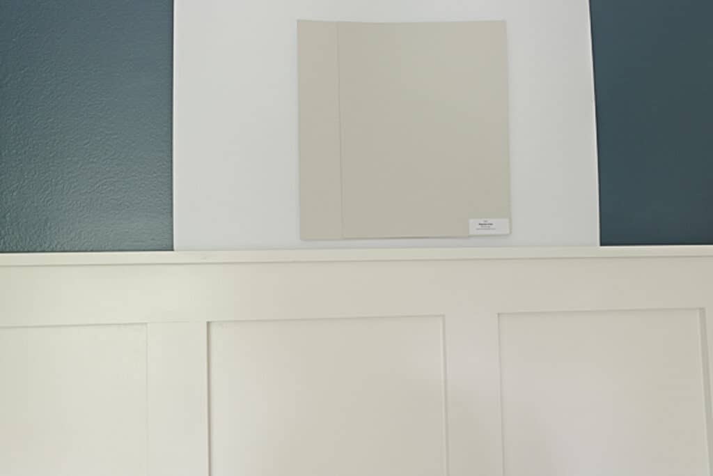
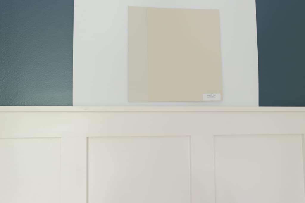
No more slapping paint colors right onto the wall. You will need a pure white piece of paper or poster board to use as a clean backdrop when testing out paint colors. You should test them out exactly as I have below:
The reason behind this method is that you don’t want the current wall color to impact the actual color.
Another important step here is to compare this color with other colors, as we’ve done above. Comparison is really the only way to see the undertones; especially when you’re dealing with gray colors, as they can be ultra tricky!
Have a question about Sherwin Williams Agreeable Gray? Ask in the comments below! You can even browse more Sherwin Williams greige colors here.