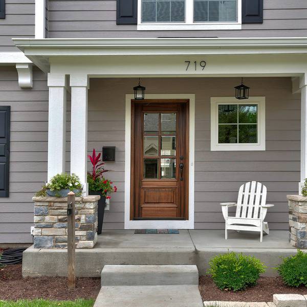
Benjamin Moore Collingwood
Searching for that perfect medium-toned warm gray? Then Benjamin Moore Collingwood should be a color you consider.
Learn about this light gray’s undertones and in what situations I’d recommend using this popular color (plus a sample bedroom mood board!) in my full review below.
What color is Benjamin Moore Collingwood?
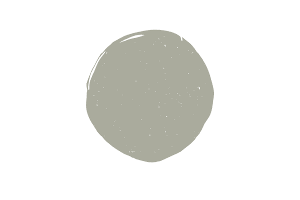
Collingwood is definitely a gray paint color. Whereas many grays are really greiges (a mix of gray and beige) and some are even taupes, there’s no question about Collingwood’s gray hues.
What are the undertones in Collingwood?
Isolate Collingwood and you’ll have a hard time deciding on an undertone, but when compared to other gray colors, you can very easy identify the violet undertone in Collingwood.
Gray paint colors all have undertones. If you think a gray with purple undertones isn’t for you, check out my curated list of light gray paint colors in all undertones.
What trim color works best with Collingwood?
Sometimes paint colors will work with a wide variety of whites, but Collingwood is a bit fussy in the fact that it really, really wants to be paired with a true white. Chantilly Lace and Oxford White are both true whites, but I do tend to recommend Oxford White more over Chantilly Lace. I think it just really works well with Collingwood.
Tips for working with Collingwood

Just because Collingwood looks neutral enough, doesn’t mean it’s going to work in your space. Here’s what you need to know about working with this greige tone.
Know your undertones
If you’ve read my other paint color reviews you may be sick of me saying this, but you can’t really get a paint color right unless you find one that has matching undertones to your room. You need to carefully evaluate your fixed elements and furnishings…which is essentially anything you can’t easily change.
For example, if you notice your rug really doesn’t go with the paint color, that’s much easier to change than your countertops or couch.
Look at this picture below (yes the lighting could be better) but this is an example of getting the right paint color for your space. Do you see how the purple couch and arm chairs are just loving the purple undertone in Collingwood? It’s a dream!
I’ll show a real world application to help you understand how undertones in furnishings/fixed elements and paint colors call all work harmoniously below!
Observe how the color looks in your lighting
Lighting is so tricky. Often people fall in love with a color online in someone else’s house only to hate it in theirs. The two biggest reasons this happens is because the color doesn’t work with the undertones in your home and the lighting in your home doesn’t support the color.
Collingwood is pretty light, but it’s not the lightest. Balboa Mist is definitely lighter and in the same color family if you notice you don’t have enough natural light for Collingwood.
On the flip side, Collingwood might get washed out if you have too much natural light and you might have to go darker. This likely won’t be the case, as most of the time Collingwood doesn’t wash out.
Now, if you have a two story floor to ceiling light, you might find it does wash out, but otherwise, it’s likely not going to be an issue.
Test it out
Don’t miss this step! You’ve got to test out paint before committing. I like to use the peel and stick samples and place them in front of a white poster board, like you see below.
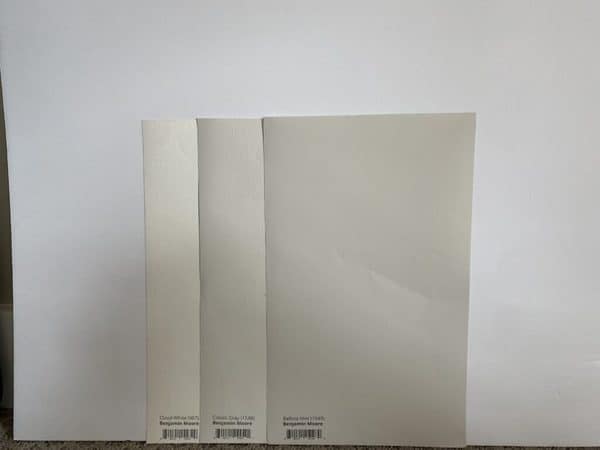
You always need a pure white background, free of undertones so that you can easily see the color for what it really is. If you don’t like the idea of the peel and stick samples, paint large squares directly onto poster board, leaving a white boarder around them.
During the testing phase always get other hues so that you can compare and easily see undertones. You might think you’ve grabbed a gray with just minimal undertones only to pair it with another gray when you can easily tell one is gray blue and the other is gray purple or gray green!
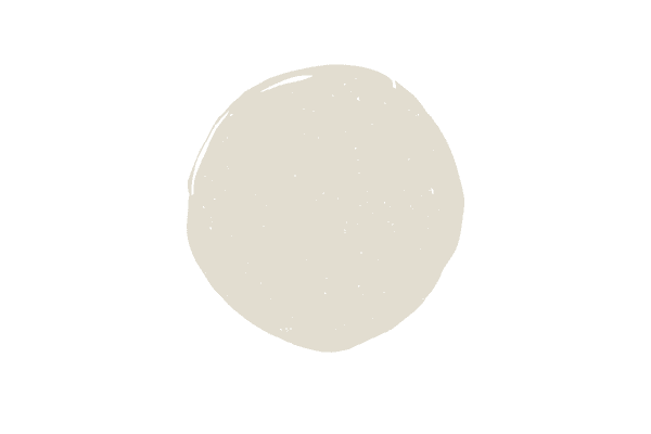
Collingwood vs. Balboa Mist

Now that these two colors are side-by-side, you can easily tell that they are different. As you know, Collingwood is a gray with a purple undertone.
Balboa Mist, on the other hand, is a greige (blend of gray and beige, although I see more gray than beige), with a purple undertone.
Balboa Mist is lighter than Collingwood and also less warm.
If you can’t decide between the two and definitely need a gray with a purple undertone, let it come down to what works best in your space and lighting. Maybe Collingwood is getting a bit too muddy with your lighting and you need to try Balboa mist, or maybe the opposite is true.
Collingwood coordinating colors and sample mood board

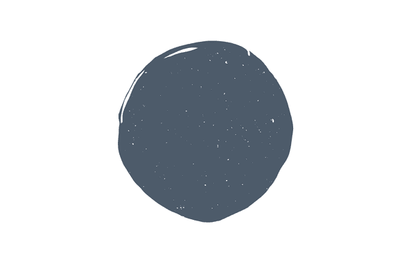
Here I’ve paired Collingwood with Benjamin Moore Oxford White and Carbon Copy, which is a black with a purple undertone (perfect to pair with the purple undertone in Collingwood).
You can see how the purple accents both in the pillows and the rug really work well to pull in that warmth Collingwood has, thanks to its purple undertones. If I had paired this color combo with blue pillows coupled with a rug with blue undertones, the palette wouldn’t have worked as well.
Make your paint color work double time for your room when it’s not an afterthought, but fully incorporated into the entire design aesthetic. Many people paint their entire home before they decorate, only to find that the gray they chose is simply too cold for their decor. If you can help it, I always recommend painting after you decorate to avoid this conundrum.
A note about Collingwood’s undertones
Before I wrap this up, I just want to say a little bit more about Collingwood’s undertones.
Many, many articles you read will tell you Collingwood is one of those near perfect grays that is free of undertones. Please do not take this to be true.
All grays have undertones. You’ve got either purple, green or blue. Sometimes you have a combination of the two of these, for example, there are a ton of grays with blue/green undertones and sometimes you have all three undertones present!
Now, if you’ve read this you know, Collingwood has a purple undertone. Now, the purple isn’t glaring, but it’s present, nonetheless. Just put Collingwood next to a gray with green like Edgecomb Gray or a gray with blue like First Star and you’ll identify the purple almost immediately.
If after reading this and looking at the undertones in your home, you decide you need a green gray or a blue gray, I have tons of ideas for those options, too!