Sherwin Williams Repose Gray: a paint color review
Sherwin Williams Repose Gray has been one of the best selling paint colors for years and years, often recommended as a neutral whole-house color. Today I’m finally unpacking this color because let me tell you, there’s quite a lot of confusion about what this color actually is.
Thinking about using Repose Gray in your home? Read my full color review.
This post contains affiliate links. Read our policy here.
Repose Gray undertones
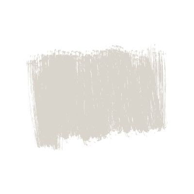
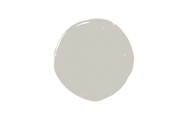
Repose Gray has blue undertones. While this color is often incorrectly described as having brown or even green undertones, when you actually look at painted samples of grays all together, you can clearly see that Repose Gray belongs to the gray blue paint color family.
A note about gray paint colors and undertones–there’s no escaping them! I can’t tell you how many times someone has asked me to recommend a gray paint color that doesn’t have any undertones and I always hate upsetting them, but with gray you’re either dealing with blue, green, purple or a combination of two or three of those!
We’ll compare Repose Gray to other popular grays with actual green undertones below and I promise you’ll start to see the blue undertone.
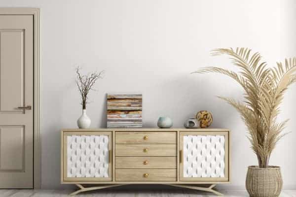
Below is a great shot of what Repose Gray looks like in real life. There’s no denying the undertone there and you can see how great it looks with the pops of blue in the decor.
Want to test out Repose Gray in your home? I always recommend Samplize’s peel and stick paint samples to all of my clients! Order Repose Gray here.
Is repose gray warm or cool?
Any paint color that has a blue undertone is considered a cool paint color, and to that end, Repose Gray is considered a cool paint tone. Now, I will say that the blue undertone in Repose Gray just whispers, whereas other popular cooler gray tones like Gray Owl or Passive, practically scream blue.
What is the LRV of Repose Gray?
The LRV of Repose Gray is 60, which is just kissing the lighter paint colors in terms of color depth. If you want a much lighter color, you need to aim for colors with LRVs of 68+
Does Sherwin Williams Repose Gray go with everything?
Unfortunately, Repose Gray isn’t a paint color that “goes with everything.” While we’re at it, I don’t think there’s one paint color on the market that I would unequivocally recommend as something that works everywhere.
When you read reviews of paint colors online where the writer is describing a paint color that works everywhere, unfortunately that means they haven’t really had too much experience working with paint colors in real homes.
When selecting neutral colors like Repose Gray, if you don’t know what the undertone is and don’t pay attention to it, you will ultimately end up not liking the color you’ve put on the walls. The harmony with paint colors and your decor exists only when you understand the undertones and choose to work with them, rather than against them.
As you can see in the beautiful photo below, The Repose Gray barn door goes perfectly in this room. Blue is echoed in the painting or Frame TV (I can’t tell) and then again on the rug and throw pillow.
In addition to Repose Gray as being labeled as a “color that goes with everything,” Repose Gray has incorrectly been described online as a blend of gray and beige, or a greige.
The color greige is often assumed as going with everything because it’s a mix of gray and beige and therefore it’s a good middle ground if you want a neutral color. What people fail to see is that greige colors also have undertones of green, purple and taupe, and those undertones, as you know now, can’t be ignored!
Because Repose Gray has a blue undertone it is too cold to be described as a greige, and instead is just a gray-blue tone.
Repose Gray vs. Agreeable Gray
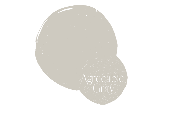
Repose Gray is a gray with a slight blue undertone while Agreeable Gray is a gray with a green undertone. While their undertones are different, their LRV’s are the same and both sit at 60.
Repose Gray vs. Agreeable Gray comes up a lot because I think many people think they are similar, but they are vastly different. Green undertones in gray paint colors are easier to work with because they are more neutral than purple or blue undertones.
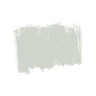
When you put these paint samples next to each other you can quickly see that Repose Gray is a cooler paint color and definitely has a blue undertone while Agreeable Gray is much warmer and has a green undertone.
Deciding between these two colors is easy. Do you have cooler blue tones in your decor and fixed elements? If you do, it’s a quick decision–go with Repose Gray. however, if you sample Repose Gray and you feel like it’s too cold for your space and you do not have a lot of blue tones in your decor, Agreeable Gray might be for you.
Repose Gray vs. Light French Gray
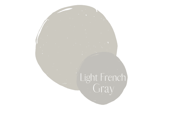
Light French Gray and Agreeable Gray are both grays with blue undertones, but as you can see, Light French Gray has a significantly stronger blue undertone when compared with Agreeable Gray.
Additionally, the name of light French gray is a bit misleading as I wouldn’t classify it as a light paint color, but rather a medium-depth color. The LRV value of Light French Gray is 53.
Repose Gray vs. Mindful Gray
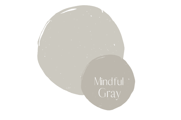
SW Mindful Gray is a gray paint color with green undertones, while Repose Gray is a gray with blue undertones. Beyond the undertone difference, Mindful Gray is also significantly darker than Repose Gray, with an LRV of 48.
While Mindful Gray was very popular for a while, it’s fallen out of popularity recently, as it’s darker than many people want to go in a main living area.
Repose Gray vs. Revere Pewter
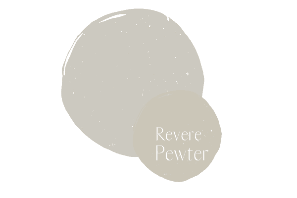
Revere Pewter has a green undertone, while Repose Gray has a blue undertone. For a while Ben Moore Revere Pewter was the color everyone was painting their main living areas, thanks to that green undertone giving way to a fairly neutral background.
Now, is Revere Pewter the color that works everywhere? No! It’s way too warm for cooler toned furniture, countertops and cabinets. Revere Pewter is also darker than Repose Gray, with an LRV of 55.
Repose Gray vs. Eider White
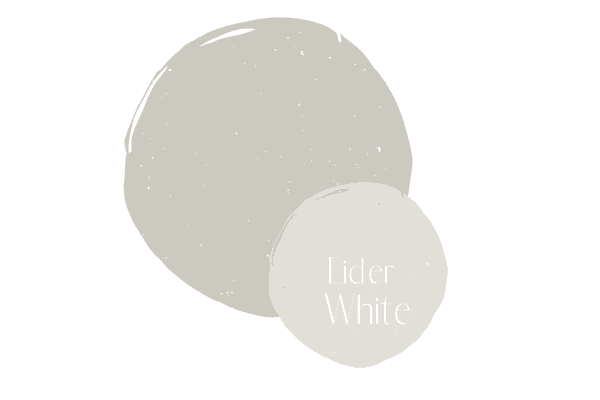
Eider White is actually a greige with a violet undertone, completely different from the blue gray color of Repose Gray. Additionally, with an LRV of Eider White is much, much lighter than Repose Gray. Another thing to note is that despite the name, Eider White is not a white, but a greige.
How does Repose Gray look in a north facing room?
Agreeable Gray looks best in a good bit of natural light and goes a little muddy in a room that is north facing.
This is why it’s so important to test out your colors in your room and observe them throughout the day to see how they work in your space, rather than deciding on a paint color purely from an online photo inspiration.
What trim color looks best with Sherwin Williams Repose Gray?
Repose Gray will work with all true white colors and some off-white colors. If you haven’t read my post on white paint colors yet, get it a read, as white paint colors really run the gamut in terms of undertones!
I like Repose Gray with High Reflective White (true white) and I also like it with White Dove, Simply White and Pure White (all off-whites). I do not like how it looks with off-white colors like Cloud Cover.
Sherwin Williams Repose Gray coordinating colors
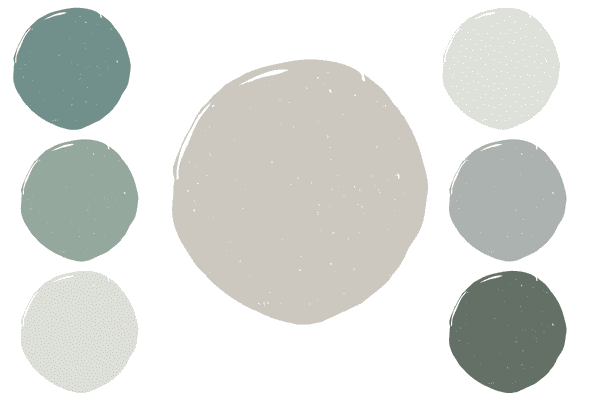
I like to pull out the blue in Repose Gray and combine it with pretty sea foam-like colors, blue, and teal.
(colors noted below are clockwise on image)
Horizon– With an LRV of 73, Ben Moore Horizon is a pale gray color with blue undertones is the perfect lighter color complement to Repose Gray
Boothbay Gray–If you haven’t used Ben Moore Boothbay Gray yet in your home, now is the time to do so. This stunning blue with gray undertones really can’t be beat.
Caldwell Green–A pretty and really saturated green, works well with blues and blue greens.
Opaline– Ben Moore Opaline is a beautiful, barely-there seafood green hue that works really well with Repose gray.
Stratton Blue–A really rich blue tone, works well with all colors on this list.
Avalon–A pretty blue green, medium-depth paint color that blends nicely with this list of pretty colors.
Tips for using repose gray in a living room or main space
Thinking about using Repose Gray in your next project? Here are my three top tips for making sure this color is the one for you.
Know the undertone of Repose Gray and how it relates to your home
Getting neutral paint colors right is really hard, which is often why people turn to designers or paint color experts to ensure they can get the correct color. The best way to get the right neutral color is by one, understanding the undertones in paint colors and two, understanding the undertones in your home.
Say you’re thinking of using Repose Gray in your kitchen. You want to evaluate your kitchens fixed elements and evaluate them. In a kitchen you’ll be looking at your cabinet color, your backsplash and countertop. You’ll even consider your floors if you don’t have a hardwood that goes with everything (like a even-toned medium brown shade).
In keeping with this exercise, let’s say when you hold up your paint sample to your countertops and backsplash you realize you have more of a taupe gray tile and countertop. Well then you need something like Balboa Mist or Pale Oak.
Or perhaps you have a green gray situation going on, well then you need something like Edgecomb Gray. You might even realize you’re not even in the gray world with your fixed elements, but rather you need to look at beige paint colors.
Whether you’re evaluating this color for your kitchen or another room in your home, first figure out what’s going on with your fixed elements (everything you can’t change in the room/the biggest/loudest items in the room) and then start comparing them with your paint color.
Compare Repose Gray with many other paint colors
Many people here a friend say they used Repose Gray in their home or see a photo online of this paint color and then without really evaluating it in their space go ahead and commit to the color without testing it out. This is a sure fire way to hate your paint color.
Repose Gray might simply need to be a starting point for you. Order a sample–I like those peel and stick samples the best– and then see how it compares to the elements in your room. I also suggest ordering other colors that are similar and have different undertones so that you can see which colors relate to your room the best.
Once you order multiple colors you’ll very quickly be able to see the differences in undertones. Comparison is really the only way to see what you’re dealing with, as when you look at neutral colors in a vacuum they all see to just look like what they are, i.e. gray, beige, white, taupe, without undertones and it isn’t until you put them next to other colors that you can finally see the undertones.
Now, once you get the samples in, adhere or paint (if you get them from the hardware store) them to a white poster board and hold that up against the wall. You never want to put samples directly onto your current wall. Your old wall color will impact the new color that you’re testing.
Evaluate your light
Repose Gray gets a little muddy in less light. If you have a room that doesn’t get a lot of sunlight you might not like how it looks or you might find that it’s just too dark. If it’s too dark, you need to go with lighter grays (look for an LRV of greater than 65).
By now your head is likely swimming with all the knowledge you have about Repose Gray. Is Repose Gray the color for you? Or do you need something more in the greige family? View more Sherwin Williams greige colors here.

