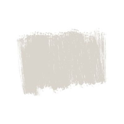
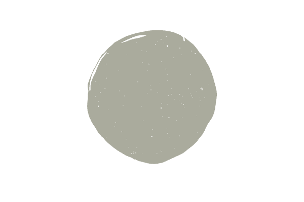
Benjamin Moore Classic Gray
A very light, fairly neutral and easy to work with gray, Classic Gray is a beautiful color. Thinking about using Benjamin Moore Classic Gray in your next project? Find out if it’s right for you in my full color review.

What color is Classic Gray?
While the name obviously points to gray, Classic Gray’s color is anything but obvious, as technically, it’s a very pale gray beige or simply a greige. Despite the fact that Benjamin Moore classifies Classic Gray as an off-white, it’s anything but.
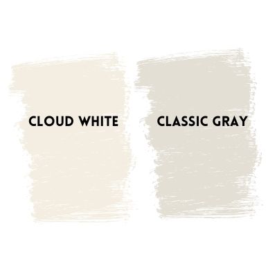
Pair classic gray next to a true off white, like Cloud White, and you can easily see it doesn’t belong in the off-white category. If you’re looking for an off-white, you’ll be disappointed with Classic Gray, as there’s just too much greige in it to be called an off-white.
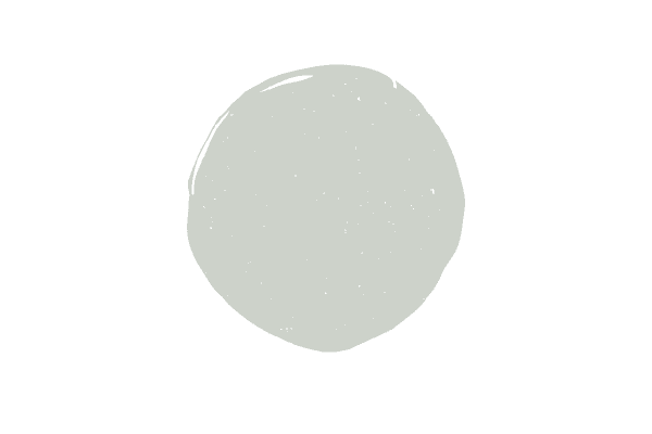
Below, I’ve shown Classic Gray next to Cloud White. Big difference, right?
What undertones does Benjamin Moore Classic Gray have?
Classic Gray has subtle green undertones, which always surprises people when I first tell them, but when they compare the color to other grays, they realize the green can easily be seen.
Did you know that not one single gray is undertone free? Gray paint colors either have a blue, green or purple undertone and some grays will have more than one of these, making things even more complicated.
I’ll explain how Classic Gray’s undertones will play into your decision making towards the bottom of the post.
Tips for deciding if Classic Gray will work well in your space
Follow these three simple tips to make sure Classic Gray is right for your space!
Check the undertones of your fixed elements
As you read above, you know that Classic Gray has a green undertone. Green-gray or gray-greens are much easier to work with than grays with blue or grays with purple, so that’s the good news.
To really make sure Classic Gray enhances, rather than detracts, you’ll want to evaluate it with the undertones in the furniture and fixed elements that you already have.
Classic Gray is also technically a greige, so keep that in mind when going over the undertones in your home.
Personally, I like to pair Classic Gray with warmer neutrals the best–think warm wooden tones, linen, beige, and off-white. If your home has cooler undertones like blues, I really prefer to choose a gray with blue or even blue/green undertones.
I’ve named Classic Gray to one of my five favorite living room paint colors, if you’re interested in checking the rest of the neutral hues out!
Evaluate your light
Classic Gray is a very light paint color. On the light reflective scale, with 0 being the blackest black and 100 being ultra pure white, Classic Gray is a 74. For reference, many off-white paint colors are in the low 80s. So, as you can imagine, Classic Gray does have more depth than an off-white, but it’s still very pale.
In a room that gets a ton of natural light, you might not like how Classic Gray looks, as it will likely be washed out. The only way to really know for sure is to test out the paint color in your space and observe it throughout the day.
If you still like idea of a neutral gray with green undertones, but need something darker after observing your light, try Edgecomb Gray–it’s still fairly light, but has more depth to it than Classic Gray.
Test out Classic Gray the right way
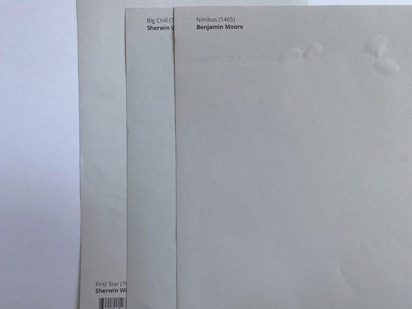
The worst thing you can do when testing out paint colors is to paint a new color over an old color. It’s impossible to see undertones and evaluate the color for what it really is on anything other than a true white background.
I love using a poster board and placing the peel and stick samples (without removing the sticker) like you see below. This allows you to correctly asses the color.
I’d also recommend ordering darker and lighter grays as well as grays in the purple and blue undertone family to make sure a gray green is right for your space. It’s so much easier to make the right call when you compare the paint color to others.
What trim colors work well with Classic Gray?
Personally, I like to pair Classic Gray with Chantilly Lace. Chantilly Lace is one of Sherwin Williams’ true Whites, and given the lightness of Classic Gray, I’m more inclined to pair it with a white that will make it pop, rather than an off-white.
If you prefer a more muted look, you can pair it with an off-white, I just perfer the pop of contrast that happens when you pair Classic Gray with a true white…try out both Chantilly Lace and White Dove and see which combination you like better.
Classic Gray vs. Pale Oak

Classic Gray and Pale Oak are both greiges, but when you look at each color’s undertones you can see where the differences are. Pale Oak is technically a taupe. Taupe colors are combinations of grey and beige and characterized by a purple or sometimes pink undertone.
Classic Gray vs. Balboa Mist
Balboa Mist is also a greige like Classic Gray, but instead of a green undertone that’s present in Classic Gray, with Balboa Mist you can spot a purple undertone.

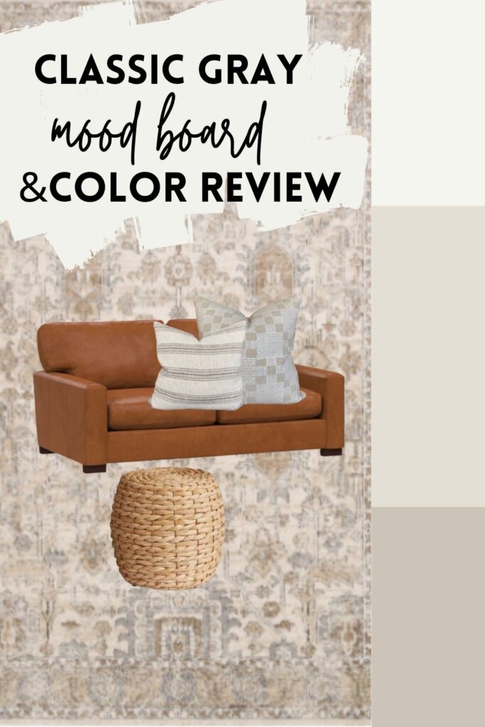
Classic Gray coordinating colors and mood board
Now that you have a sense of Classic Gray’s undertones, let’s go over how to select furnishings and decor that complement the colors warm tones and green undertone.
For starters, I’ve paired Classic Gray (middle color) with Chantilly Lace (top color) and Revere Pewter (bottom color).
Chantilly Lace is a crisp white that doesn’t have any undertones. Because Classic Gray is so light already, I really think you need a true white, rather than a soft white, to really make Classic Gray shine.
The accent color I’ve chosen is Benjamin Moore Revere Pewter as it’s really beautiful when paired with Classic Gray and also has a green undertone, making the two color selections really harmonious.
Moving on to a sample decor strategy with Classic Gray, I’ve started out this quick mood board with a rug, as it’s typically easiest to design a room around a pattern (that can be a rug, or textiles like drapes or throw pillows). As you can see, the greige tones in this rug work perfectly with Classic Gray.
I selected a classic leather couch for this decor plan as I really like using warm leather tones with Classic Gray (classic leather couches go with any paint color, btw). To add warmth to the couch, I chose greige accent pillows that relate to the rug, overall decor scheme and again, the paint colors.
Still stumped on choosing a neutral tone for your space? Read more about greige here, where I cover what color is greige, plus 17 greige colors to try out in your space.

So helpful!!! Thank you!!!
Torn between classic gray or pale oak. Do you feel like one is more versatile?
Classic gray is a greige with a green undertone…green undertones are the easiest to work with of all the neutral undertones. Pale oak is a taupe with a pink undertone. The most versatile color for you will be the one that best matches your furniture and hard finishes…if that makes sense. Have you taken large paint samples and placed them next to your furniture/fixed elements like countertops, etc?