Accessible Beige, the best warm neutral for your home
For a moment, gray paint colors were all the rage, but now, designers are leaning towards beige paint colors again. So if you’re looking for a neutral beige paint color that goes with virtually anything, it’s time to consider Accessible Beige by Sherwin Williams.
What are the undertones of Accessible Beige?

This post contains affiliate links. Read our policy here.
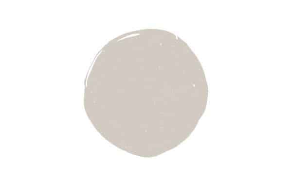
Accessible Beige is widely touted as one of the best neutral paint colors. It’s definitely not too beige and lacks yellow undertones that a lot of true beige paint colors have.
Additionally, and quite surprisingly, Accessible Beige also has a slight green undertone and you can really see this when you pair it with things that have pink undertones like terracotta tiles. Don’t worry though, this green undertone isn’t glaring in the slightest.
If you’re interested in seeing how accessible beige works in your home, you can order a 12×12 peel and stick sample of the color, here.
Is Accessible Beige a warm or cool color?
Accessible beige clearly has grey/green undertones in it and is even classified as one of the most popular greige paint colors, but despite its undertones, it’s actually a very warm color, and is on the opposite end of the spectrum than cooler grays like Repose Gray.
Depending on where you paint accessible beige in your home, it will appear slightly cooler or slightly warmer in color.
For example, in rooms that are north facing, where there’s not a lot of natural light, Accessible Beige leans more towards a grey color, giving off a more cool color.
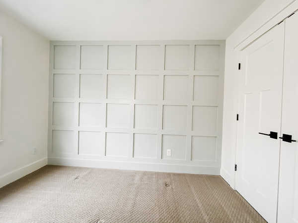
What colors go well with Accessible Beige?
The first thing you want to do when deciding what paint color works for your home is to look at your fixed elements and see how they will pair with the paint color.
For example, consider items like trim, counters, floor, built ins, etc. first, and compare those elements to your paint color in question.
For trim, Accessible Beige works really well with a true white. If you’ve ever sampled white paint colors, you know most are rarely a true white, and many have hints of yellow, beige or grey in them.
For a crisp clean look, I suggest pairing with Simply White by Benjamin Moore. If you’re looking for a softer white, I also think White Dove by Benjamin Moore pairs really nicely with Accessible Beige.
For flooring, like carpets, hardwoods or tile, make sure to see how Accessible Beige stacks up next to them. Many carpets and some tile and hardwood have pink undertones, and if that’s the case for you, I’d wouldn’t use Accessible Beige, as it often brings out the pink undertones to an undesirable level.
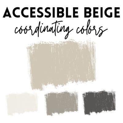
- White Dove– a soft white with a greige undertone.
- Fawn Brindle–a dark gray with green undertone (perfectly coordinating with the green undertone in Accessible Beige.
- Iron Mountain–A dark, warm brown/black.
Other colors I’d pair with Accessible Beige include, Evergreen Fog, Hale Navy or any other charcoal gray navy hue, and Urbane Bronze.
FAQ on Accessible Beige
Is Accessible Beige a good color for open concept homes?
While Accessible Beige is a very neutral paint color, it does have undertones that might not work for every home and space. If your home does not have a lot natural light, I would not use Accessible Beige, as this color looks much darker and browner in less light.
On the contrary, if you have abundant natural light, and your floor and other fixed elements like your countertops pair well with Accessible Beige, I’d go for it!
I love using Accessible Beige on interior doors when paired with a soft white wall color. Check out my other choices for interior door paint colors here.
Accessible Beige vs. Revere Pewter
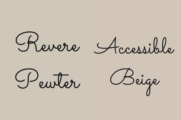
Revere Pewter by Benjamin Moore is a neutral paint color that’s been popular for years, and is still gaining popularity thanks to its wide versatility.
Comparing the two colors side by side, you’ll quickly see that Accessible Beige is much warmer than Revere Pewter, and it also has more of a beige tone, while Revere Pewter looks darker. The colors both have grey undertones, so it can be tricky to compare the two just using paint chips.
Make sure to get samples of these two paint colors and compare them side by side and with adequate lighting.
Accessible Beige vs. Agreeable Gray
Accessible Beige and Agreeable Gray are both in the greige family of paint colors, but compared side by side, there are noticeable differences.
Whereas, Accessible Beige is a nice neutral beige that has a gray or greige undertone to it, Agreeable Gray is a neutral grey paint color that has a beige undertone to it.
Accessible Beige is definitely more of a warmer color than Agreeable Gray. While Agreeable gray isn’t a cool color because of the beige undertones, it is noticeably less warm of a paint color when compared to Accessible Beige.
Related reading: The best farmhouse colors of 2023
What finish of Accessible Beige should I choose?
When deciding on a finish, choose a low-sheen finish for your walls. In terms of low-sheen, Sherwin Williams has flat and eggshell options–with flat having less of a sheen then eggshell.
I like eggshell because we have a toddler who likes to color on the walls, and it’s easier to wipe off stuff with an eggshell finish than it is with a flat finish.
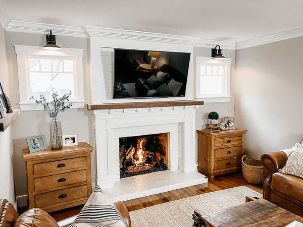
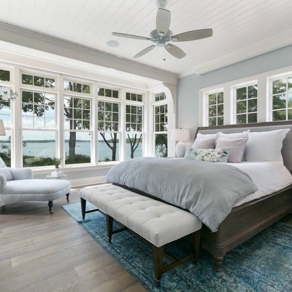
Accessible Beige in a living room
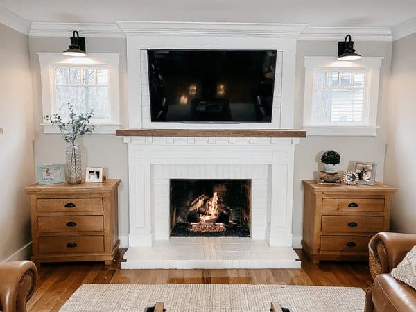
We painted our living room in Accessible Beige and I’m pleased with how it turned out. The natural light in our living room is adequate enough so that the color doesn’t feel too brown in the space. Thanks to the abundant light in the family room, the color looks more grey, than beige, which is what I was hoping to achieve.
Tips for painting with Accessible Beige
Don’t go off a paint chip sample
Many people select a paint color solely on what the paint chip sample looks like, only to be unhappy when they finish painting their room.
Rather than using a paint chip sample, select a sample size of paint and paint a 12×12 square on a white poster board, leaving a 2 inch border of white showing.
You don’t want to paint your sample on your current walls, as they are most likely not a true white and the undertones of your old paint color will not reflect the new color’s true hue.
Compare Accessible Beige with other colors
Even if you really think Accessible Beige is the color for you, it’s best to compare it with other similar colors to see what really works the best in your home. Paint similar colors next to your 12×12 sample, making sure to leave a 2 inch white border.
Alternatively, you can order a sample of Accessible Beige to be shipped right to your door!
Determine how Accessible Beige looks in different rooms
Because of its gray undertones, Accessible Beige can really morph into a true beige or more of a gray beige depending on the lighting present. Make sure to hold up your sample of paint in each room you’re considering painting.
A South facing room with a lot of natural light will show Accessible Beige’s true colors, while a north facing room will cause it to look darker, and almost brown.
Make sure to see how it looks in daylight and at night with your lights on, too.
Always compare your paint color to your fixed elements
Paint color is relatively easy to change, your flooring is not. Remember to put your sample paint board next to your floors, countertops, tile, etc and look for undertones in your fixed elements that might clash with Accessible Beige.
Just because it works well in someone else’s house, doesn’t mean it will work in your home
A lot of neutral greige paint colors are widely touted as colors that will literally work in anyone’s home. Do not believe this! You must go off of a paint sample and look at all elements in your home, while considering the lighting, before you make a decision.
Accessible beige is a warm, neutral greige paint color that works well in homes with adequate natural light.
Have a question about painting with Accessible Beige? Let us know! In the mean time, make sure you read my guide on choosing paint colors.