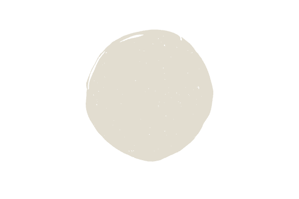
Sherwin Williams Oyster White
Sherwin Williams Oyster White is a warm paint color, but contrary to what the paint name applies, is anything but white! If you’re considering using this paint color in your next project, now’s the time to read my full review on this beautiful hue.
Is Oyster White a gray or beige?
Oyster White is a light greige color. Greige is the marriage of gray and beige. Greige paint colors can have varying degrees of gray or beige in them, with some greige colors having more grey than beige and others having the opposite combination.
In terms of Oyster White, especially when compared with other greige colors, you’ll very quickly see that there is more beige in Oyster White than there is gray.
Is Sherwin Williams Oyster White warm or cool?
Because Oyster White has a green undertone, it is considered a warm paint color.
What are the undertones of Oyster White?
Oyster White has green undertones. All paint colors have undertones and Oyster White is no exception, so before you ask, no there are no greige or gray paint colors without undertones. With gray paint colors undertones can either be green, blue or purple or can be a combination of two or more of those colors.
With greige paint colors you see taupe, violet or green undertones. Green is the most neutral of all undertones and the easiest to work with.
What colors compliment Oyster White?
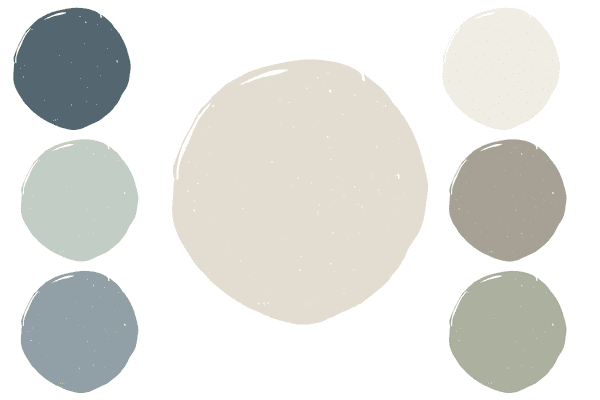
(Colors below are listed in clockwise order)
Benjamin Moore White Dove: I love pairing Oyster White with a creamy trim color, and White Dove is an off-white tone that works really well with Oyster White. If you want more of a pop between wall color and trim you need to look to true white paint colors, not off white tones.
Sherwin Williams Fawn Brindle: Fawn Brindle is an excellent pairing for Oyster White, as it’s also a greige with a green undertone. As you can see, Fawn Brindle is significantly darker than Oyster White, so it works as a great accent color. Some other colors in this same vein to try out would be Pashmina and Revere Pewter.
Sherwin Wiliams Cascade Green: Oyster White looks really pretty with muted sage green paint options and Cascade Green is a favorite of mine.
Sherwin Williams Debonair: Medium toned muted blues work nicely as accent or coordinating colors with Oyster White. Debonair is an underused color for sure, but an absolutely stunning one at that.
Sherwin Williams Rainwashed: Brainwashed is a pretty blue green color that works well in the overall palette with Oyster White.
Sherwin Williams Needlepoint Navy: You don’t hear too much about needlepoint navy, as it’s more popular counterpart, Naval, steals all of the attention. I happen like Needlepoint Navy much better than Naval, and it especially works well with Oyster White, as it’s more muted.
You’ll notice how the colors on this list are more muted tones rather than bright/clean colors, and that’s by design. Keep this in mind when you work on decorating your room in terms of fabric selection and accessories.
What is the LRV of Oyster White?
The LRV of Oyster White is 72. LRV stands for light reflectance value and let’s you know how light or dark a paint color is. 72 is pretty light in the saturated color world, but not light enough that I’d classify it as a white paint color or even an off white color.
Just to give you a frame of reference, while Oyster White certainly looks like an off white color by itself, once you compare it to an actual off white color, you’ll see that it’s considerably darker.
For example, Oyster White has an LRV of 72, compared with White Dove, a true off white wall color that has an LRV of 84.
Another popular off white color, Snowbound has an LRV of 83. Just for fun, let’s compare it to yet another popular off-white, SW Alabaster, which has an LRV of 82.
Which trim color pairs best with Oyster White?
Depending on the vibe you’re going for, you can either pair Oyster White with an off-white tone or a true white. Let’s get in to the ins and outs of choosing the right white trim color for Oyster White.
Oyster White, as you now know, is very light. It’s not quite white, but it really gets very close to the off-white category in terms of light depth, so keep that in mind.
If the overall vibe you’re going for is a more relaxed, very creamy neutral look, pair Oyster White with off white paint colors like Simply White or Pure White. I do not think Oyster White looks good with all off-white hues, as some are just too creamy and not enough of a contrast. Start out with the two I mentioned and see how you like those.
If you want a more defined look between wall and trim, you’ll need to go with a true white color. I like Oxford White or High Reflective White for this application.
Does Oyster White work as a trim color?
Unfortunately, Oyster White is way too dark for a trim application, as it will just end up making your trim look “dirty.” You want to stick with off whites or true whites for trim colors and you should never use cream or beige colors on trim.
Sherwin Williams Oyster White exterior
I love Oyster White for an exterior when you are going for a “white exterior” but don’t want it too stark.
As a generally rule of thumb, paint colors always look two times brighter outside. So while you can clearly see a pale greige inside with a hint of a green undertone, outside you’ll see a creamy hue.
This color reads white outdoors, unless of course you are neighbors with someone who has painted their home in an off-white or true white tone.
The color I referenced above, Fawn Brindle works as a beautiful accent color for an Oyster White exterior.
Oyster White vs. Alabaster
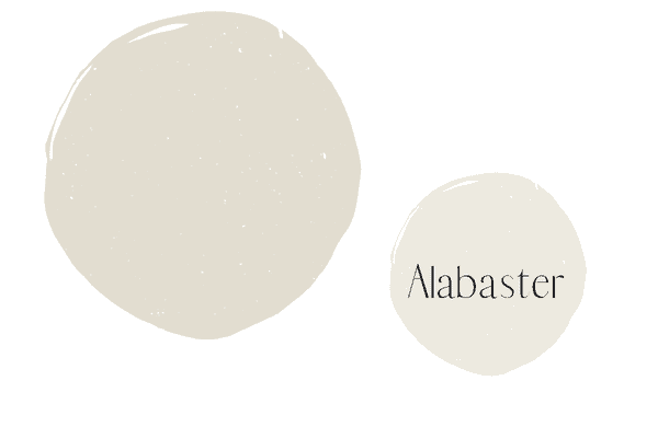
Alabaster is much lighter than Oyster White, and is actually considered an off-white paint color. While Alabaster is an off-white, it does have a good bit of a yellow undertone to it, when compared to other colors like it.
Oyster White vs. Shoji White
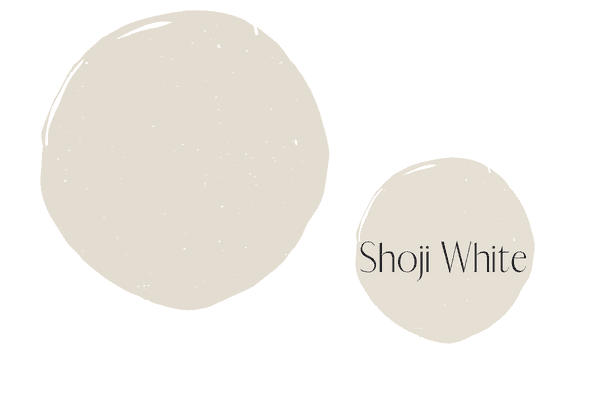
Shoji White is in an entirely different direction, color-wise than Oyster White. While oyster white is a greige, Shoji White is a beige/cream. Now, the the two hues do have something in common and it’s the green undertone that they both share. Shoji White is just a hair lighter than Oyster White.
Oyster White vs. Pearly White
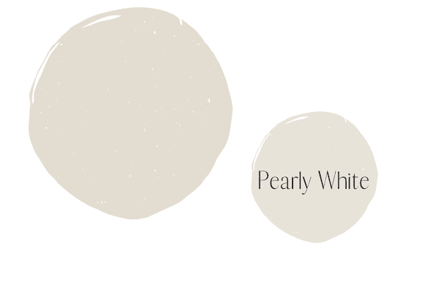
Just like Shoji White, Oyster White and Pearly White both have green undertones. Pearly White is like a lighter version of Shoji White, as it’s LRV is 76 and it’s also a beige/cream tone.
Oyster White vs. Greek Villa

Greek Villa is a true off white tone, whereas Oyster White is definitely a greige. Compared to the other off-white tone on this list, Alabaster, Greek Villa is far less creamy than Alabaster.
Oyster White vs. Gray Mist
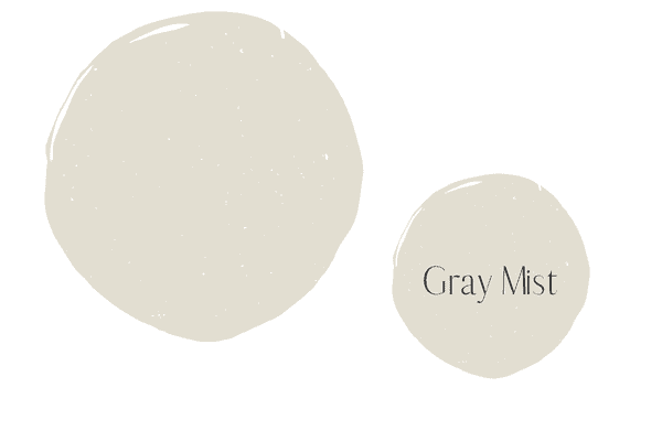
Oyster White and Gray Mist are very nearly the same color, as they are both within a close LRV range and they are both greige paint colors with a green undertone. The only slight difference is while Oyster White leans more in to the beige, Gray Mist leans more into the gray.
Oyster White vs. White Duck
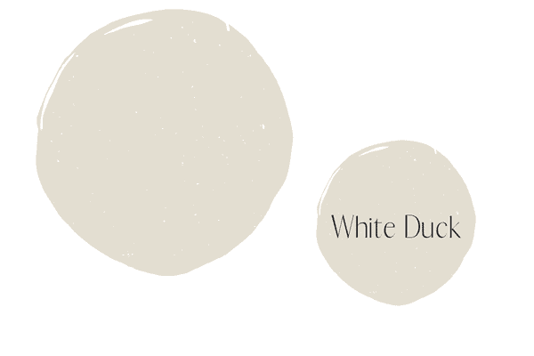
Just like Oyster White, White Duck is not a white color either! White Duck is a pale greige color with a hint of a green undertone, just like Oyster White. With an LRV of 74, White Duck is just a hint lighter than Oyster White.
Oyster White vs. Pale Oak

Pale Oak and Oyster White are both considered greige paint colors, but that’s where the similarities end. Pale Oak is just a hair darker than Oyster White and it also has a taupe undertone.
3 no fail tips for deciding if Sherwin Williams Oyster White is for you
If I was giving you paint color advice in person, here’s what I’d tell you:
Make sure the undertone of Oyster White matches the neutral undertones in your room
Most people don’t pay attention to undertones in neutral colors when choosing them. This often leads to desperate emails telling me “they had no idea that such and such color would read blue or purple or green.”
When I get these emails I immediately know they didn’t actually know the undertones of the color they put on their walls.
You now know Oyster White is a greige with a green undertone, so knowing that, you must make sure that your fixed elements and furnishings (i.e. anything that’s too costly to replace) work with the green undertone.
Look at neutral colored items, you don’t need to worry about a neutral color like Oyster White matching your blue couch, I’m talking if you have a beige, taupe, gray, white or cream piece of furniture or flooring you need to consider how it relates to Oyster White.
The easiest way to do this is to take your paint sample and hold it right up to your carpet, your drapes, furniture, countertops, etc. You’re doing this because really you only want one neutral per room.
You don’t want to end up with a greige with a purple undertone couch paired with a greige/green wall color, if that makes sense.
Observe the light in your room
Neutral colors are notoriously tricky! Their undertones can be super prominent or they can be relatively hidden and this all depends on lighting and your decor. To tackle the lighting issue with Oyster White you need to test the color in person in your home and observe.
Take your time with this process. Don’t google a bunch of images of people using Oyster White and decide you like it enough. Online images are heavily edited and you have no idea if the natural light in their home is the same as yours.
You must see how the color reacts in your space. If you have a lot of natural light, Oyster White might get too washed out, and you might need to go darker. If that’s the case, consider Accessible Beige. It’s a slightly darker gray with a green undertone.
Here you can read more about Accessible Beige paint.
Test out the color
See the photo below for the correct way to test out the paint color. I recommend the larger peel and stick samples you can easily get online. Instead of painting your current wall with the new color, instead paint a pure white poster board with the color, leaving a 1 inch boarder around the entire color.

This allows you to look at the color objectively, without the current wall color negatively impacting what you see. You also want to compare Oyster White to other colors, so you can get a sense for what you’re really at. Colors by themselves are very hard to nail down in terms of light/dark and undertones.
I suggest you order some other colors on this list to see how Oyster White compares to them in person before committing.
If Oyster White isn’t for you, here are more greige paint colors to check out.