Is Sherwin Williams Alabaster right for your space?
Sherwin Williams Alabaster has been one of the most popular off white paint colors for years and years, but is it right for every home? Let’s find out as we unpack everything you ever wanted to know about this softer white paint color.

What’s the undertone of Alabaster?
Alabaster has a yellow undertone.
I like to start by answering this questing right off the bat, as you can go ahead and rule out paint colors based on undertones your home can’t support. Can every home and every space support a white with a yellow undertone? No. Keep reading and I’ll explain exactly why this is!
What color is Sherwin Williams Alabaster?
You might wonder why I’m even answering this question, because obviously Alabaster is a white paint color. But is it??
Alabaster is actually an off-white paint color, as that soft yellow undertone is waaaaay too present to put it in the ‘true white’ category.
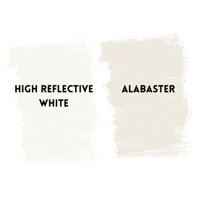
Now if you just go check out Alabaster by itself, you’re going to have a hard time making a case for the fact that it’s anything but white, but stick it next to an actual white, like Sherwin Williams High Reflective White and wow, there’s no question about where Alabaster stands.
Just look at the glaring difference between this true white (a white without undertones) and Alabaster!
How do I know if Alabaster is right for my space?
Feel confident with your decision to use (or not use) Alabaster in your next project when you follow these three simple tips:
Identify the undertones in your home
Before you commit to Alabaster, or any paint color, you must know your space. A lot of people consider using Alabaster on their kitchen cabinets so we’ll go through this as an example.
Look at this kitchen:
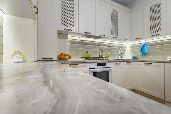
When choosing a white, you need to look at your fixed elements. So in the photo above, if we’re selecting a white for our cabinets, the fixed elements are the countertops and the backsplash. The countertops clearly have a blue/gray undertone and the the backsplash is gray.
Would this kitchen look good with a white that has yellow undertones? No!!! In the case of this kitchen you need either a true white (like Ben Moore Oxford White) or a blue white (like Ben Moore Pure White).
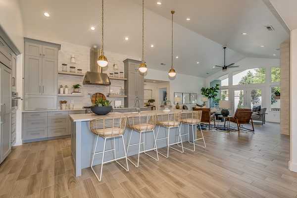
Now look at this kitchen:
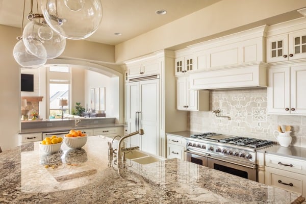
The fixed elements in this kitchen (backsplash and countertops) are very warm, and overall they seem have a creamy brown/beige undertone. Alabaster is too white for this kitchen and, as you can see, a cream paint color works in this kitchen. Alabaster would have been simply too stark for this space.
Now, here’s a kitchen that used Alabaster. This kitchen has warm elements, but it’s not to the point where it demands a cream. The grout used for the brick backsplash is an off-white, matching the off-white tone in Alabaster.
Are you starting to get a feel for how you would decide if a soft white like Alabaster works for your space?
Observe your light
Before you make the call to splatter your walls or cabinets in Alabaster, you must take into consideration your light.
In rooms with a lot of natural light, Alabaster will look more like a true white. In rooms with typical natural light, it will look like the soft white that it is, but in rooms with not a lot of light, you’re going to observe that yellow undertone more.
Test out your paint sample (you’ll learn the correct way to do this below), and observe how your light affects the color.
Test out a sample of Alabaster correctly
You always, always, always want to sample a paint color before you commit. And rather than painting a small patch directly onto your wall, I’d advise to get those peel and stick samples and place them in front of a white poster board (like you see below)
Painting the color directly onto your current wall color is never a good idea, as you need a pure white backdrop to accurately observe the color and its undertones. I always like to compare colors too, as you can quickly see the undertones that way.
Alabaster vs. White Dove
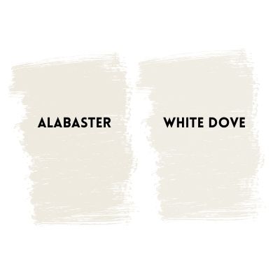
Alabaster and White Dove are both off-white paint colors, but as you can see, White Dove is considerably less yellow than Alabaster. White Dove does have a hint of yellow in it, but it’s also got some gray undertones, too–making it easier to work with.
Alabaster vs. Cloud White
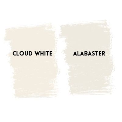
Cloud White is one of the most creamy off-white paint colors you’ll find without getting into cream territory.
This paint color needs to be extensively tested to make sure it works well with your decor. If considering using Cloud White as a trim color, you need to make sure it doesn’t make your wall color look muddy. Some light grays really look positively awful when used next to Cloud White.
Alabaster vs. Snowbound
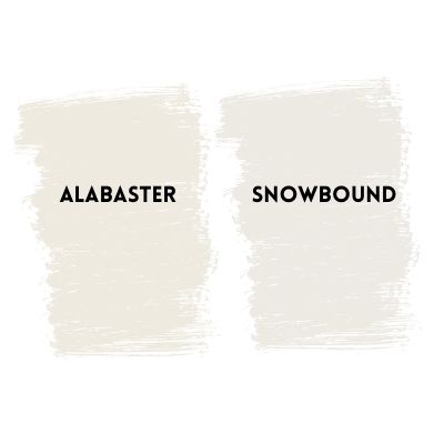
Alabaster and Snowbound are both off-whites, but Snowbound actually has a purple undertone in it, making it a bit harder to work with. You can check out my full review on Snowbound here.
What colors go with Alabaster?
I like pairing alabaster with warmer tones like Edgecomb Gray and I think it looks really pretty with darker tones like Iron Mountain or even Evergreen Fog.
Does Alabaster go with gray?
As you know by now, Alabaster is a very soft white with a good bit of yellow in it, and because of this, it doesn’t play well with every single gray, but it does work with some.
In particular, if you’re searching for a more muted combination and less of a pop, Alabaster pairs well with Edgecomb Gray (a medium gray with green undertones) and I’ve also seen it look nice with Gray Owl ( a gray with blue/green undertones).
Just make sure to test out Alabaster with the particular gray you’ve got in mind, because, as I said earlier, a lot gray paint colors just don’t play well with every single white.
Is Alabaster right for you or a little too yellow? Don’t sweat! I have even more of my favorite off white paint colors reviewed here.


I love the advice in your posts. I have alabaster all throughout the house. I’m considering using on our cabinets: Edgecomb gray, Collingwood, agreeable gray or revere pewter on the cabinets-is there any reason I shouldn’t use one or all of those? Thanks!!
Hi Jessica!
Read my blog post “how to choose paint colors first.” You need to first identify the fixed elements in your home and figure out what their undertones are. Then and only then should you think about paint colors. Edgecomb gray is a grey with a green undertone. Collingwood is a grey with a violet undertone. Revere Pewter is another grey with green undertone, as is agreeable grey. You want your neutrals to coordinate, undertone wise. Hope this helps!
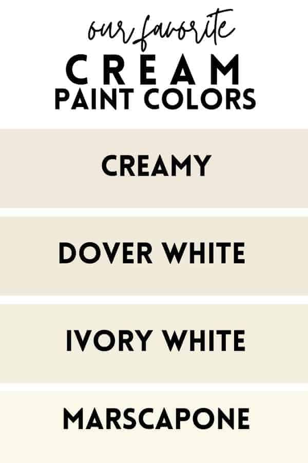
This was helpful. I read many reviews that said Alabaster is perfect for creamy interiors, but I lt too sure about it. I have white with soft yellow undertone furniture and creamy yellow bedding and white pillows. I was wondering if I should go for CREAMY but fearing it’s too yellow I said maybe alabaster. Now I’m not sure…