Van Courtland Blue: a beautiful, medium-toned blue by Benjamin Moore
Looking for a good middle-of-the-road blue? Van Courtland Blue might be just what you need. Not too dark and not barely-there, either, Van Courtland Blue is a medium saturated color. Thinking of using this hue in your next project? Find out if it’s right for you with my full review.
This post contains affiliate links. Read our policy here.
Does Benjamin Moore Van Courtland Blue have any undertones?
Undertones are one of the trickiest things about paint colors, and lucky for you, Van Courtland Blue doesn’t have any undertones. A lot of blues get into the blue-green territory pretty quickly, and this blue hue really isn’t one you have to worry about with that.
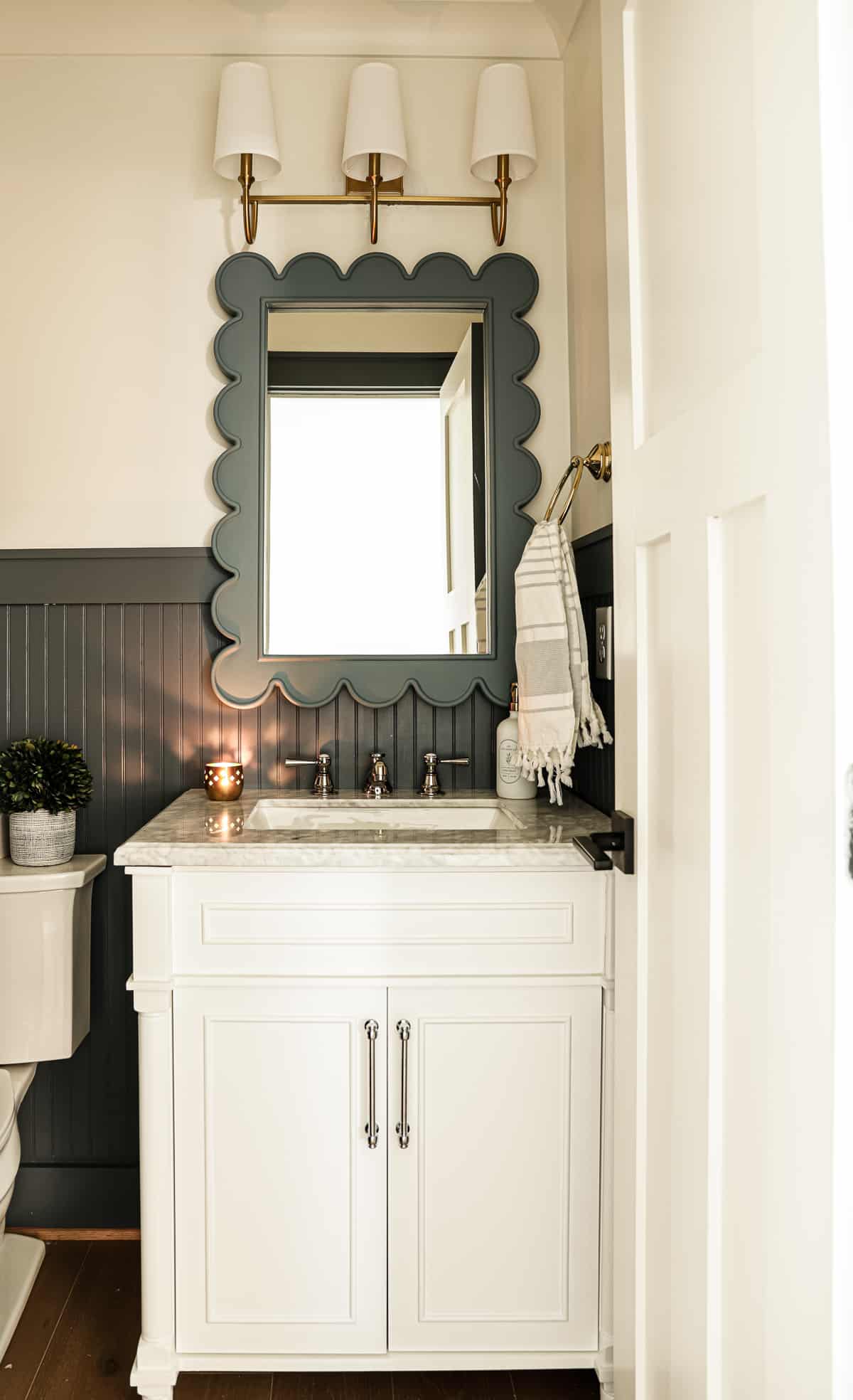
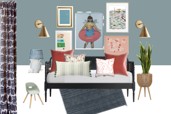
Just look at how stunning Van Courtland Blue is, if this photo doesn’t convince you to use this color, I don’t know what will!
Psst! If you like this color, you can order a 12×12 peel and stick sample!
What trim color works best with Van Courtland Blue?
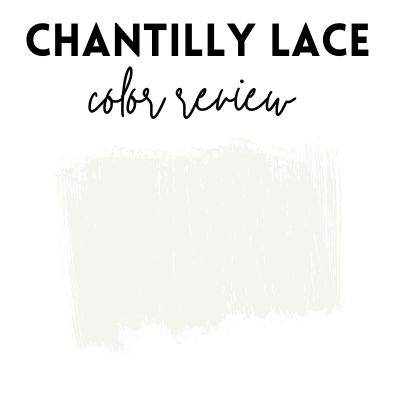
Some paint colors are finicky and they really only look good with one particular type of white trim color, but not this one. Van Courtland Blue will work with an off white color like White Dove just as easily as a crisp white paint color like Chantilly Lace paint.
Side note: Be sure to check out my guide on choosing white paint colors, as picking a white hue is one of the hardest paint colors to nail down!
How do I know if Van Courtland Blue will work in my home?
You want to properly test out the color, make sure it matches your overall decor scheme and observe your light to make sure this is the color for you. I’ll go over all that in-depth, below.
Observe your light
A lot of times people end up unhappy with paint colors for several reasons, but one of the biggest issues is they didn’t take into consideration the lighting the room gets. Van Courtland Blue is by no means a light color. In fact, the Light Reflectance Value of the color is 31, on a 0-100 scale with 0 being black and 100 being white.
If you wanted a light and airy blue, this color might be too saturated for you; especially if you only have one tiny window in the room. As you can see in the two photos above, both using Van Courtland Blue, the color looks slightly different, and a lot of that has to do with the lighting differences in each room.
On the contrary, if you really wanted a strong blue tone and you have floor to ceiling windows that face the sun most of the day, you might be left feeling like this color is too soft.
Test out the color and observe how it looks in your space at various times during the day, and at night with overhead lighting.
Plan a mood board
Blue is pretty versatile, but don’t just slap up a blue paint color because you don’t know what else to do, instead, make sure the wall color relates to the room. Ideally when planning a room you want to have one neutral color and 2-3 solid colors. If you’ve got a neutral and two colors that aren’t blue as your main decorating colors, maybe Van Courtland Blue will look out of place.
If you go the route of planning a mood board, either online (using a service like canva) or by simply ordering fabrics, make sure to bring around your paint sample, too. Sometimes you’ll find that paint colors are too “clean” or “dirty” for the fabrics you’ve chosen for the room, and the only way to know this is if you plan everything out ahead of time.
Test out the color, correctly!
I saved the best tip for last! No doubt up until this point you’ve tested out a color by looking at a paint swatch or by painting a small square right onto your current wall color. Both of these ways typically end up in disaster!
The current wall color will always influence the color you’re testing out. Unless your walls are painted in a true white tone (a white free of any undertones), you need to paint a large sample on a piece of pure white poster board. Next use painters tape to put the poster on the wall or hold it up next to fabrics.
Alternatively, you can use those peel and stick samples you can get online and put them on poster board or hold them up to fabric samples.
Compare the color with other similar colors

Probably one of the biggest mistakes when choosing paint colors is to single out one paint color specifically and just go for it. You really don’t know what you’re working with in terms of undertones, and depth until you compare the color with other colors. For example, with Van Courtland Blue, you might really want a more of a blue-green hue and you’ll find out upon comparison with other colors that it’s more like a true blue.
You might also think that you want a darker hue and then once you compare it with other colors that are similar but lighter, you’ll realize the room needs a lighter tone. I say all of this to say, when ordering paint colors, get multiple tones in the same hue family and maybe one or two in the next hue family over. So for this one, you might get a navy, a blue green in various color depths, a dark green and a light blue-gray, etc.