7 of the best contrasting kitchen island colors
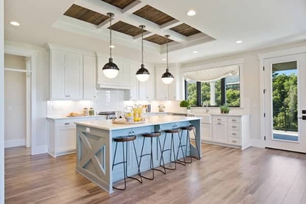
Kitchens with contrasting countertops has been a trend for years and is a great way to add color to an otherwise white kitchen. Blue has long been a favorite hue for kitchen islands, but other colors like earthy green are starting to gain in popularity.
How do you choose a kitchen island color?
Beyond choosing a contrasting color for your kitchen island, the color you select should complement your kitchen countertops, and work within the overall aesthetic of your home; especially if your kitchen opens to other rooms in the home. I’ll share my tips below as I reveal some of my favorite hues for a contrasting kitchen island.
My top choices for kitchen island colors
If you’re interested in any of the below colors, make sure you check out full color reviews, too. Currently, I’ve reviewed each color in depth minus Newburg Green (that’s on my to-do list!)

Evergreen Fog
Green is quickly becoming popular for kitchen island colors and if a true green is too much for your room, why not dip your toes in this new trend with a more earthy-toned green. Sherwin Williams Evergreen Fog is a soft green with grey undertones, giving it a more muted appearance than typical green colors. This color works better with a muddier color palette, and I really like pairing it with colors like Accessible Beige, Urbane Bronze, Neutral Ground and White Dove.
Find my full review on sw Evergreen Fog here.
Hale Navy
If you’re searching for the perfect kitchen island color to accent white cabinets, Hale Navy should be at the top of your list. Hands down, one of my favorite navy hues, Hale Navy is not your typical navy. Far moodier and more complex, Hale Navy is the perfect marriage of charcoal and blue. This island color looks best with countertops that have a blue undertone. You could go with Chantilly Lace, a clean white, or White Dove, a soft white with gray undertones for your other cabinets.
Boothbay Gray
Benjamin Moore Boothbay Gray is one of those colors that you wouldn’t think twice about just glancing at it on the color swatch, but trust me when I tell you it’s one of the prettiest blends of blue gray ever. Many gray paint colors have blue undertones, but the blue tones in Boothbay Gray are creamy grays, making this hue simply breathtaking.
To me, this reads more like a blue color than a gray, but your lighting will influence which hue you see more of. For perimeter cabinet colors to coordinate with this blue gray you need to go with Chantilly Lace or White Dove.
Here you’ll find other blue gray paint options
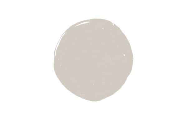
Accessible Beige
Sometimes the contrast between island and peremiter cabinets can be more subtle and if that’s the vibe you’re after, do yourself a favor and try Accessible Beige on your kitchen island. Sometimes this color gets a bad wrap because of the name, but two things: one, beige is back, baby, and two: accessible beige is actually a blend of gray and beige.
Pair an Accessible Beige island with a soft white, not a stark white, and my top choice would be White Dove.
Here you’ll find more tips on putting together an Accessible beige color palette.
Slate Tile
Say you really got excited when I mentioned Hale Navy as a top choice for kitchen island colors, but you wanted something just a hint more dramatic…Slate Tile is your answer. Right in the middle between black and blue, you’ve got this dramatic hue. Find my full review on Sherwin Williams Slate Tile here.
Newburg Green
I haven’t yet done a full color review on this stunning blue-green hue, but I need to because Newburg Green is positively divine. On the other end of the spectrum compared to Evergreen Fog, if you choose Newburg Green for your island color, you’re all in with green.
This is a very, very rich greenish blue and I’ve seen it first-hand paired with black and gold finishes and cognac leather accents and let me tell you, this combo is a shows stopper! I’d go with a true white perimeter color like Chantilly Lace. If you need other greenish blue color options, I have tons!
Iron Ore
I wasn’t going to wrap up this list without including one black hue, because as far as I’m concerned, black will always be in style. I generally like softer black hues when used in large format like a kitchen island and Iron Ore is this perfect blend of charcoal black, making it very easy to live with.
I’d go with White Dove for your other cabinets when choosing Iron Ore for the island color. Check out my full review on Sherwin Williams Iron Ore here.
Tips for choosing a contrasting kitchen island color
Your kitchen island color can’t be an afterthought, it must be included in your overall design concept. You need to consider your whole home color scheme, and the finishes and fixed elements in your kitchen/adjoining rooms.
Take the suggestion of Boothbay Gray. You now know that it’s a blue with gray undertone or gray with blue undertone, depending on how you look at it. Given this, you can’t pair it with a counter color that has a beige undertone, as it just won’t coordinate well. You need to look for counter colors that have undertones that complement your island color.
The same goes for picking an island color when you already have your perimeter cabinet color set. Say you want to go with Accessible Beige for your island color, but already have your other cabinets painted a stark white like Chantilly Lace. As you know from above, Accessible Beige requires a soft white pairing, not a stark or true white.
Testing out contrasting countertops paint colors
Admittedly, it’s hard to test out colors for kitchen cabinets when you’re building or renovating because your countertops don’t arrive until after your new cabinets are in. Here’s how you can ensure you get the color right:
- Go visit a slab yard to get a full view of the countertop. Bring paint samples with you and see how they coordinate with your paint samples.
- Don’t you dare bring those 1 inch paint swatches. Spring for the large peel and stick paint samples and if you want to go with a gray order many grays in varying shades to determine which one works the best.
- Bring a stone sample home to further test the color with the lighting in your home in relation to your paint sample.
Other kitchen island articles you’ll find helpful:
Kitchen island design tips
Pendant lights for a kitchen island: tips and tricks