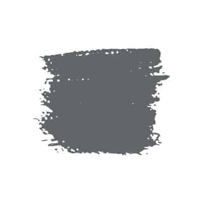
Van Deusen Blue: A colour review
A darker navy blue color with slight gray/purple undertones, Van Deusen Blue is a striking hue.
Ready to test out this deep blue in your home? Here’s everything you need to know about Benjamin Moore Van Deusen blue.
Is Van Deusen Blue warm or cool?

While not as dark as some tried and true navy blues like Hale Navy or Naval, Van Deusen Blue is still considered a cool color.
Van Deusen Blue coordinating colors
Van Deusen Blue and Simply White
Want a big contrast? Go with a crisp, clean white with minimal yellow undertones like Simply White. You could also try the favorite farmhouse paint color, Alabaster, too.
Make sure you test your white colors next to each other, this way you can see the undertones in each color. Whites are not all the same!
Van Deusen Blue and Gray Owl
Benjamin Moore Gray Owl is one of my favorite gray paint colors and would look simply stunning with Van Deusen Blue.
While the search for the perfect gray paint color will always be a thing, Gray Owl might just fit the bill. Light and airy with subtle blue undertones, Gray Owl brightens a space without making it too cold, which is sometimes an issue with cooler gray tones.
Van Deusen Blue and Light Pewter
As far as I’m concerned, greige paint colors will always be in style. And while Benjamin Moore Light Pewter is technically greige, it’s got way more gray than beige in it–making it a perfect match for Van Deusen Blue.
Van Deusen Blue vs. Newburyport Blue
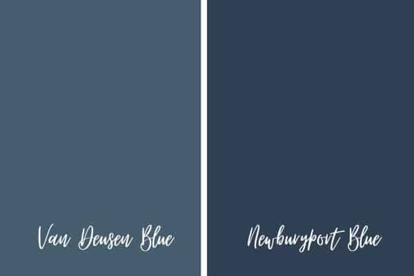
If you’re deciding between these two navy blue hues, here’s some specifics to help you make your decision:
Looking at light reflective values, we can see that Van Deusen Blue is a lighter color than Newburyport Blue.
Newburyport Blue is more of a navy blue paint and reminds me of Old Navy, also by Benjamin Moore. Compared to Newburyport Blue, Van Deusen Blue has just a slight blue-green tint to it, which works to lighten up the color slightly.
Tips for painting with Van Deusen Blue
Make sure Van Deusen Blue is right for you (hey, that rhymes!) with these tips.
Look at your fixed elements
Before you do anything, you must look at the room around you. If you don’t want to repaint all of your trim work, make sure Van Deusen Blue is going to match well.
I do think Van Deusen Blue will work well with bright whites and with slightly more creamy whites, but you need to test the color with the trim color to make sure.
Compare the color with your floors, furniture and countertops. Paint is inexpensive to change, your countertops and large pieces of furniture are not.
For the most part, you’re taking into consideration the undertones in Van Deusen Blue and seeing what those do with your surroundings.
Sometimes undertones in paint colors bring out negative colors in floors, counter tops or trim work and you want to make sure everything will flow nicely.
Decide what you like by testing multiple blues
The best way to find out which blue will work for you is to test out multiple blues at a time. Compare them side by side to see which colors are darker and to observe the undertones in each color.
Some blues will have more of a black undertone, while others will have a purple or even gray undertone. The undertones are much, much easier to pick up on when you’re looking at multiple colors in the same hue at once.
The easiest way to do this is by ordering 12×12 peel and stick paint samples through Samplize. Honestly, it’s an amazing way to test out paint samples. I’m pretty upset I didn’t think of this genius concept, ha!
Factor in the amount of light you have
Even if you make sure Van Deusen Blue works well with your fixed elements, if you forget about factoring in the lighting in your room, you’ll be unhappy with the color.
Lighting is monumental when it comes to choosing a paint color that you actually like. Be realistic about how much light your room has and observe it throughout the day. Rooms opposite the sun will always show colors darker and will play up undertones.
What’s bright and airy in one room facing the sun is likely to be dark and drab in a room opposite the sun with only a small amount of windows.
In the case of navy blue hues, a room opposite the sun without too much light likely make your navy blue color look almost black, or at the very least, much darker than it appears on the paint chip.
Are you sold on Van Deusen Blue? If you’re not quite in love with this hue, check out Farrow & Ball Stiffkey Blue.