Iron ore by Sherwin Williams: a colour review
If greige is the new beige, then black is the new neutral. I’ve been absolutely loving using black paint throughout our home and my new favorite paint color is Sherwin Williams Iron Ore. Iron Ore is absolutely stunning–it’s not too cool and not too warm, it’s a soft black that almost looks like a dark charcoal or gray.
If you’re thinking about paining something Iron Ore, but aren’t quite sure if it will work for you, hopefully my color review can help you decide.
This post contains affiliate links. Read our policy here.
What color is Sherwin Williams Iron Ore?
Iron Ore is member of the black paint color family. While on the lighter side of most black paint colors, depending on the lighting situation, Iron Ore can read either black or dark gray. This color is on the other end of the spectrum from a true black paint color like Onyx.
Order a 12 x 12 peel and stick sample of Iron Ore.
What are the undertones of Iron Ore?
Iron Ore has gray undertones in it, which make the paint color look like a very creamy dark charcoal.
How to use Iron Ore in your home
Many interior decorators that I pull inspiration from have always said each room should have something in the black paint color family. Black paint colors give your room depth and personality.
When I suggest black paint to homeowners many of them are a bit scared to dip their toes into such a dark color. Iron Ore is the perfect color to use if you’re at all scared of painting something in your home black. Because of the soft gray undertones found in Iron Ore, the paint color comes across as more of a dark, milky charcoal color.
Iron Ore looks absolutely stunning when paired with any and all wood tones and just beautiful when used alongside gold hardware in a kitchen or bathroom.
I often suggest Iron Ore to be used in a study or office, and it makes an absolutely beautiful statement when used on built ins in those rooms. I’ve even seen it used on the ceiling in formal dining rooms, as well.
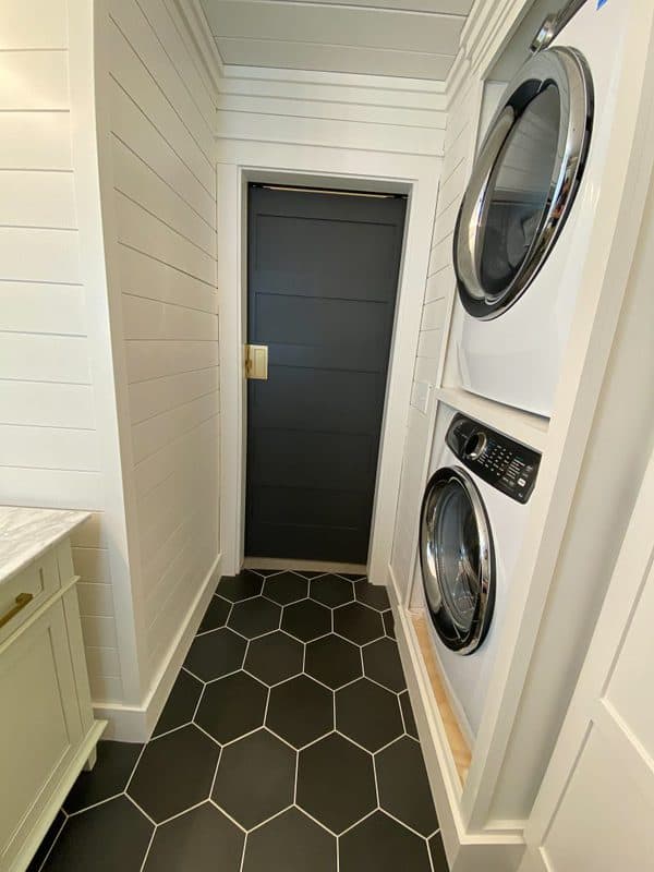
Some homeowners choose to paint all of their interior doors with Iron Ore, paired with gold or antique brass hardware.
Iron Ore in our home
We recently ordered new windows and will be painting the interior sashes in Iron Ore. Once our windows are in and fully trimmed out using our signature farmhouse style window trim, I’ll post an updated picture here!
To update an old piano, we used Iron Ore to give it a much needed facelift. We’re thrilled with how it turned out.
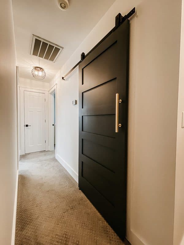
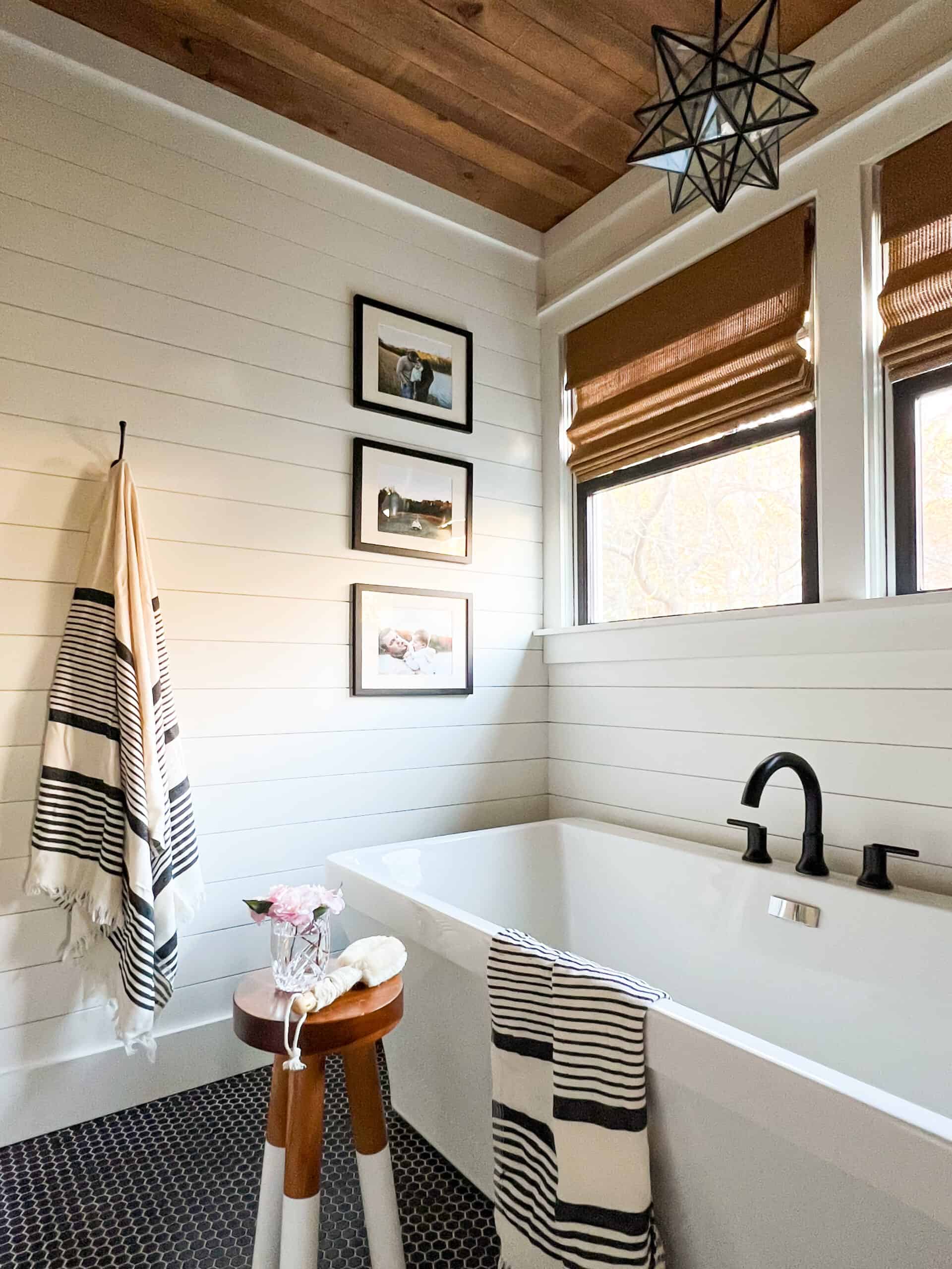
Perhaps my favorite uses of Sherwin Williams Iron Ore in our home is on our barn door leading to our kids’ bathroom. It was a last minute decision, which typically turns out in me regretting things, but honestly, this barn door turned out more stunning than I even anticipated.
The dark, rich color that Iron Ore gives off completely changed the look of our hallway. We finished off the door with gold hardware, which is a beautiful combination and makes the already rich color look even richer.
Sherwin Williams Iron Ore vs Peppercorn
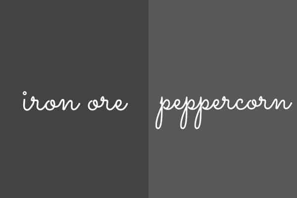
Iron Ore and Peppercorn are very closely related, color-wise, but there is a slight difference between the two. While Iron Ore and Peppercorn both have a gray undertone to them, as you can see from the photo above, Peppercorn is significantly lighter than Iron Ore.
Comparing the light reflective values, Iron Ore has a LRV of 6, and Peppercorn has a LRV of 10. Overall, Peppercorn reflects significantly more light than Iron Ore. If you’d like to try a black paint color in your home but you’re too scared to go too dark, Peppercorn is a great starting point.
Tips for painting with Sherwin Williams Iron Ore
Sherwin Williams Iron Ore is quickly gaining popularity among homeowners. Iron Ore is dark enough to create drama and depth, while still acting as a neutral paint color. Because of its neutral characteristcs, Iron Ore goes with virtually anything.
Look at the light reflective value: If you’re having trouble deciding between two dark paint colors, you can always tell which one is darker when you compare their light reflective values. For example, above we compared Peppercorn with Iron Ore, and just based on LRVs, Peppercorn was much lighter than Iron Ore.
Test it out: Always, always, always paint a sample on the wall. There are two ways to do this– one, use a 12 x 12 sample of peel and stick paint that you can find here, or you can run to the paint store to get samples and paint them on a piece of white paper and hang them on the wall you’re thinking about.
Take into consideration your light: I used to regret the paint colors I chose, but now I choose paint colors with confidence because I’ve finally been honest about the amount of light I have in the rooms I’m painting. You’ll always be unhappy with a color that doesn’t work well with your lighting.
Most colors look different in different lighting situations. In my own experience, I painted Sherwin Williams Accessible Beige in my very light-filled living room and loved it, as it looked like a very warm greige paint color.
Without thinking, I painted a room in our upstairs that has only one small window the same color and it looked like a brown/green color-ugh! Look at the sample multiple times per day as the daylight changes and see what you think. Don’t forget to look at the paint color at night with overhead light on, too.
What questions do you have about Sherwin Williams Iron Ore? Ask me in the comments below!
You may also like: Sherwin Williams Urbane Bronze and Charcoal gray paint colors for your home.


Great post!!! I just had my new media room painted in Iron Ore flat and love it but used it in the room next to that on built ins in semi gloss and it’s a medium gray that I dislike. What would you do? Thank you.
Why did you dislike it? it’s too light for what you were going for? It’s likely you have a lot of light in the room causing the color to read much lighter. If you want a darker color, you’ll have to go darker. Onyx, black magic, caviar and tricorn black are much closer to actual black, so you could try those out. You might also look at dark blacks with blue undertones that are really pretty like Ben Moore Witching HOur.
What’s finish of pain better to use inside the house doors ,satin, semi gloss?which one you used?
Typically, your trim and doors would be the same sheen. We prefer the more muted look, so we used satin for trim and doors. A lot of people like the more glossy look so they use semi-gloss.
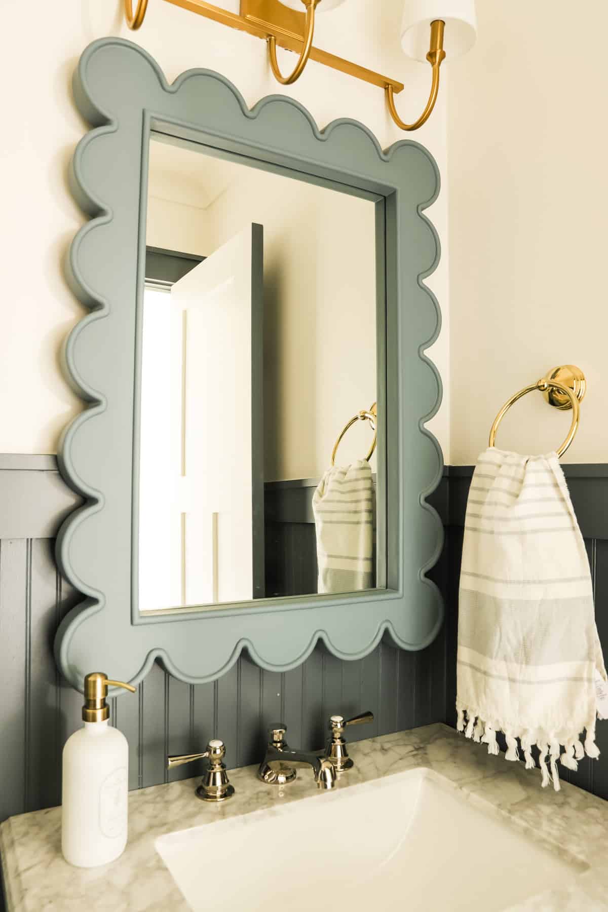
Does Iron Ore pair well with any white? I have Benjamin Moore White Dove on my cabinets and thinking about Iron Ore for my Island. My counters are Polarstone Quartz-Olympia. I was looking for a dark gray but can’t seem to find one.
Not any white. I do like it with white dove, which is an off-white but it’s a unique off white because it has a grey/greige undertone to it, so it’s not too yellow. Other soft whites are too yellow for iron ore. A true white like Chantilly Lace looks really pretty with Iron Ore, too. We have white dove trim/wall color in our kids bath and it’s paired with an Iron Ore door and it’s really pretty. make sure the space is well-lit. –Ashley