How to choose paint colors like a pro
Need help picking paint colors? I’ve reviewed tons and tons of individual paint colors, but it occurred to me that my readers need help on how to choose paint colors in the first place.
As a True Colour Expert, I live and breathe paint colors and help homeowners choose paint colors that work for their home day in and day out, so stick around and hopefully this post will guide you as you choose color for your home.
What color should I paint my room? Your guide to choosing paint colors!
Choose paint colors last
I’m going to start off by flipping everything you thought you knew about paint colors on its head. To get the paint color just right you need to choose the color last. I’m talking about decorating your entire room and then, and only then, should you choose a paint color.
For many reasons, people absolutely hate this piece of advice. And honestly, I get it. Most of the time you hire someone or you do it yourself, but regardless, many people want to get the walls painted before they move in and move all of their furniture in the room.
How though can you choose a color that’s going to complement and even enhance your decor if you choose a paint color first? What if you haven’t even found a couch yet? How can you even know what your overall color scheme is going to be?
Many, many people (myself included before I learned all about paint) just choose a neutral wall color that’s in line with the current trends. For the last decade people have been choosing gray. Now everyone’s choosing white.
There’s nothing wrong with gray and white, they just don’t always work with everyone’s decor. And then there’s the issue of which gray and which white? There’s hundreds of shades, each with varying undertones that are pretty limiting when you actually get right down to it.
Okay, now that I’ve dashed your dreams and let you know you need to choose color last, let’s move into the decisions going in to choosing wall color for your home.
If choosing a neutral paint color, start by evaluating your fixed elements and furnishings

Many people stick with neutral colors (beige, gray, taupe or white) for main rooms, so to that end, we’ll go over selecting those first.
Understand this first: All neutral colors have undertones. There’s no way of getting around it.
If you’re getting really confused, take a break to read all about gray paint colors, taupe paint colors, white paint colors or beige paint colors. After you digest those posts, you’ll know what types of undertones you’re dealing with in choosing a particular neutral.
Paint isn’t supposed to be an afterthought; it’s supposed to enhance and bring your home design to life. And yes, believe it or not, even neutral paint colors can either add or detract from your overall color scheme.
The key to choosing the right neutral for your space is to find a hue complements the room’s most demanding items.
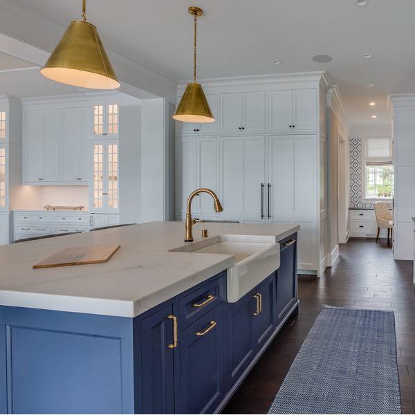
Say you’re choosing color for your living room. What are the elements in that room that are fixed? Look at the floors. Floors that aren’t classic hardwood colors that go with everything should be evaluated in terms of undertone. Do you have a gray floor? Or maybe you have a tile floor. Either way, evaluate the undertones.
Now move on to other items that might need to be evaluated in terms of undertone. Do you have a stone fireplace? Or something else that’s dominating? Try to see what type of undertone it has. You don’t want any more than one neutral tone in a room or things start to go sideways pretty quickly. Remember, when I say neutral I’m talking about white, gray, taupe or beige.
Look at this couch, for example:
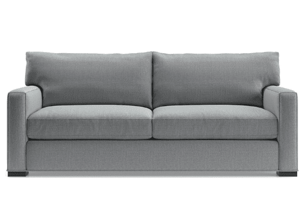
This couch has a gray fabric, and upon further investigation, the gray fabric has blue undertones. So if you wanted to choose a neutral paint color, you’re looking at whites that are on the cooler side or grays with a blue undertone. Stick this couch with a gray that has a green undertone and you’re just not going to like how it looks.
Neutrals are very, very hard to get right and the key to getting them right every time is to correctly match the undertone in your bossiest elements to a paint color.
Remember! Undertone matching does not apply to saturated colors; just neutral colors. We’ll get into choosing saturated colors in a bit.
Alright! Do you think you’ve got your neutral color selected yet? We’ll get in to ordering samples and how to correctly test out colors below, but for now, let’s move on to selecting non-neutral colors.
When choosing saturated color, make sure the color relates to the room
Above you learned that when choosing neutral color, you need to match the undertones of your room’s biggest and hardest to change elements to the undertone in the neutral color.
When choosing saturated colors, you don’t have to match undertones BUT you do need to make sure the wall color relates to the room.
The best way to show you this is to highlight some real world examples.
Here’s what not to do:
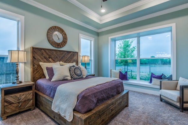
Here, this homeowner has chosen a blue/green hue for the room. I’m not sure exactly what color this is but it does look like palladian blue, which is a very popular blue green.
The bedding is very rustic and brown, carpet has a bit of a purple/gray going on and the bedding and accent pillows are purple. I see one tiny blue accent pillow. Why did the homeowner choose a blue/green for this room?
As you can see, the blue/green relates to almost nothing in this photo and therefore doesn’t really enhance the decor, in fact, in my opinion, it just makes the color or the decor (depending on how you look at it) out of place.
I would have chosen a warm greige with purple undertones for this room. I’m thinking of Balboa Mist, as it’s a greige (blend of beige and gray) with a purple undertone. It would help to marry the purple tones and the wooden tones in this room. Alternatively, the homeowner could have opted to change out the bedding and accent pillows to reflect blue/green hues. An area rug and curtains could help a lot, too.
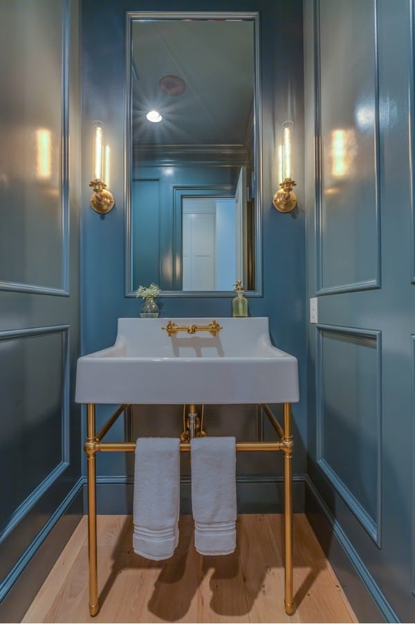
Now look at this photo:
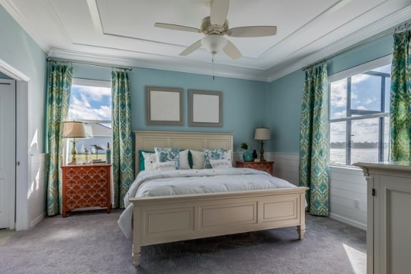
Let’s ignore the fact that the nightstand color is a little out of place without it being repeated in the room elsewhere, but just look at what an improvement this is in terms of choosing wall color that relates to the elements in the room. The blue in the walls is repeated in the drapery, throw pillows and some accent elements.
You can tell that either this person chose the decor with the paint color in mind or they chose the paint color last, which is what I recommend.
Another point I want to point out, which you can see in the example of what not to do, is the fact that the wall color should be repeated in the room in various sizes, a handful of times. Above, we observed how out of place the blue looked when it was only repeated in one small pillow that was tucked away.
In the photo of what to do when choosing color, we see the blue/green repeated in the drapery, bedding and one accent piece. I would find a rug that has blue, green and terra cotta all together to tie everything together and add just one more instance of blue/green, too.
Okay, just one more ‘what not to do:’
I’m all for these deeply saturated dark blue/greens, but what is this random dark blue/green doing in this kitchen?
It doesn’t relate to the drapery (which looks like a cream) it relates to nothing in the dining room, and nothing in the kitchen. Now, maybe it relates to some tones in the living room that we can’t see, but even still, to pull this hue off, it needs to be very present in the space.
The blue/green could have been totally fine for this space if it was repeated at least two times in sizable elements. Don’t just throw one blue/green vase on the counter and call it good. I’m talking perhaps the color would have shown up on the barstools, in the drapery, in some of the accents on the countertop and perhaps even in a floor runner between the island and cooktop.
Is this starting to make sense yet?
So, now that you know what to look for when choosing a saturated color and a neutral color, let’s move on to ordering samples.
Order paint color samples and test it out
Do not skip this step! In addition to not ordering or picking up actual paint samples at the store, don’t choose color from a color strip without testing it, either.
Say you want to go with Gray Owl. Great, order a sample and bring it home to see exactly how it works in your space with your furniture.
I like those paint and stick samples because it’s just really easy to take the large-scale sample around to my furnishings/fabrics and see exactly how it works or doesn’t. If you go this route, stick the sample onto a white poster board and cut it so that you leave a 2 inch boarder around the entire thing.
Alternatively, you can take paint samples and paint them on large poster board, leaving about 2 inches of white around the entire poster board.
Do not paint color right on the wall. Unless of course your walls are painted a white that doesn’t have any undertones. Painting right on walls won’t give you an accurate reading of what the color actually is because the current wall color negatively impact the color, almost altering what it really looks like.
Make sure to bring the paint color sample to the elements that it needs to match. If you’ve decided your floors are very bossy and the paint needs to be the same undertone as your floors. put your paint sample right up to your floors. Same goes for drapery or upholstery.
Hold up the paint sample exactly as it would naturally go. For example, for testing how paint would look with a couch, don’t put it on a cushion and look down, hold it behind the couch vertically.
Now that you know how to test color, I’ll leave you with one final tidbit that really pulls everything together.
Bonus tip: Paint always looks better when decor is more pulled together.
Let’s take a look at this room using a neutral paint color:
Here’s a case where someone picked a good neutral color for the tones in their room, but it just looks kind of drab. Do you know why that is? Because the room isn’t really decorated! Curtains, colorful accents in the kitchen a rug that injects more color and more neutral chairs dressed up by throw pillows could have pulled this room together and made the neutral color really shine!
Now I know what you’re thinking, but isn’t the all neutral aesthetic in? Yes, it is, but here’s an all neutral aesthetic done right:
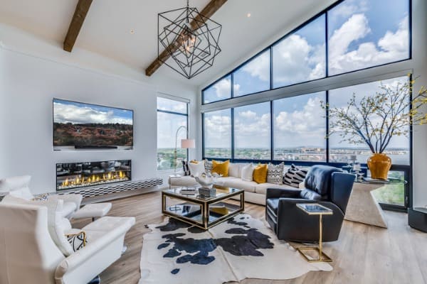
Here you have white walls and white furniture. They’ve added many layers of visual interest, though to really pull off this all neutral color scheme. First they have the stunning windows, then the beautiful beams and chandelier.
They then chose a vibrant yellow to break up the neutral, which I personally think could have been injected once or twice more. But do you see how this room could have easily been very boring without all of these elements because of the neutral color palette?
How to pick interior paint colors cheatsheet
This was a long post so I just want to quickly recap the most important points:
When choosing a neutral wall color (white, taupe, gray or beige) you need to chose a neutral that coordinates with your furnishings and fixed elements. You’ll do this by observing the undertones in your furniture and finding a neutral paint color that has corresponding undertones.
When choosing a saturated color, focus on choosing a paint color that corresponds to the overall color scheme of the room.
Pick paint color last!! Completely design your room first and then chose a color that corresponds and enhances your decor. If you absolutely must paint first, at least make a mood board of furniture you’re purchasing so you can get a feel for what paint colors might work. You can make mood boards in canva.
Order samples and test the paint colors correctly!
Find more suggestions on what to paint your bathroom browse my best bathroom paint colors guide. I’ve also got a living room paint colors guide, too if you’re interested.
Lastly, if you need to choose a white paint color for your cabinets or need some inspiration on kitchen wall colors for white cabinets check out my guides.