Beautiful home office paint colors
As the work from home trend isn’t going away any time soon, many homeowners are ready to trade the kitchen table for a dedicated space to work.
Decorating a home office can be fun but most people get hung up on the paint color, which is why I’m giving my favorite home office paint color ideas, plus how to make sure the color you choose flows with the rest of your home!
9 home office paint colors to create a timeless home work space
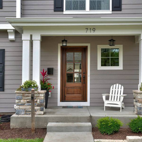
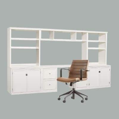
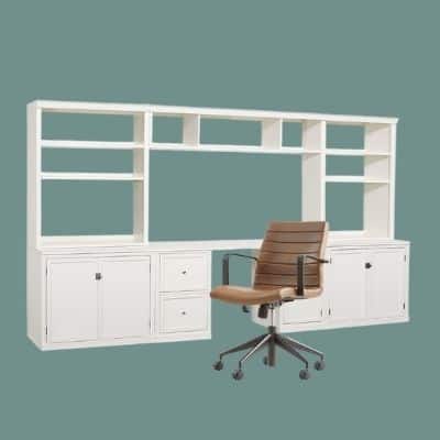
Hale navy pictured on built ins
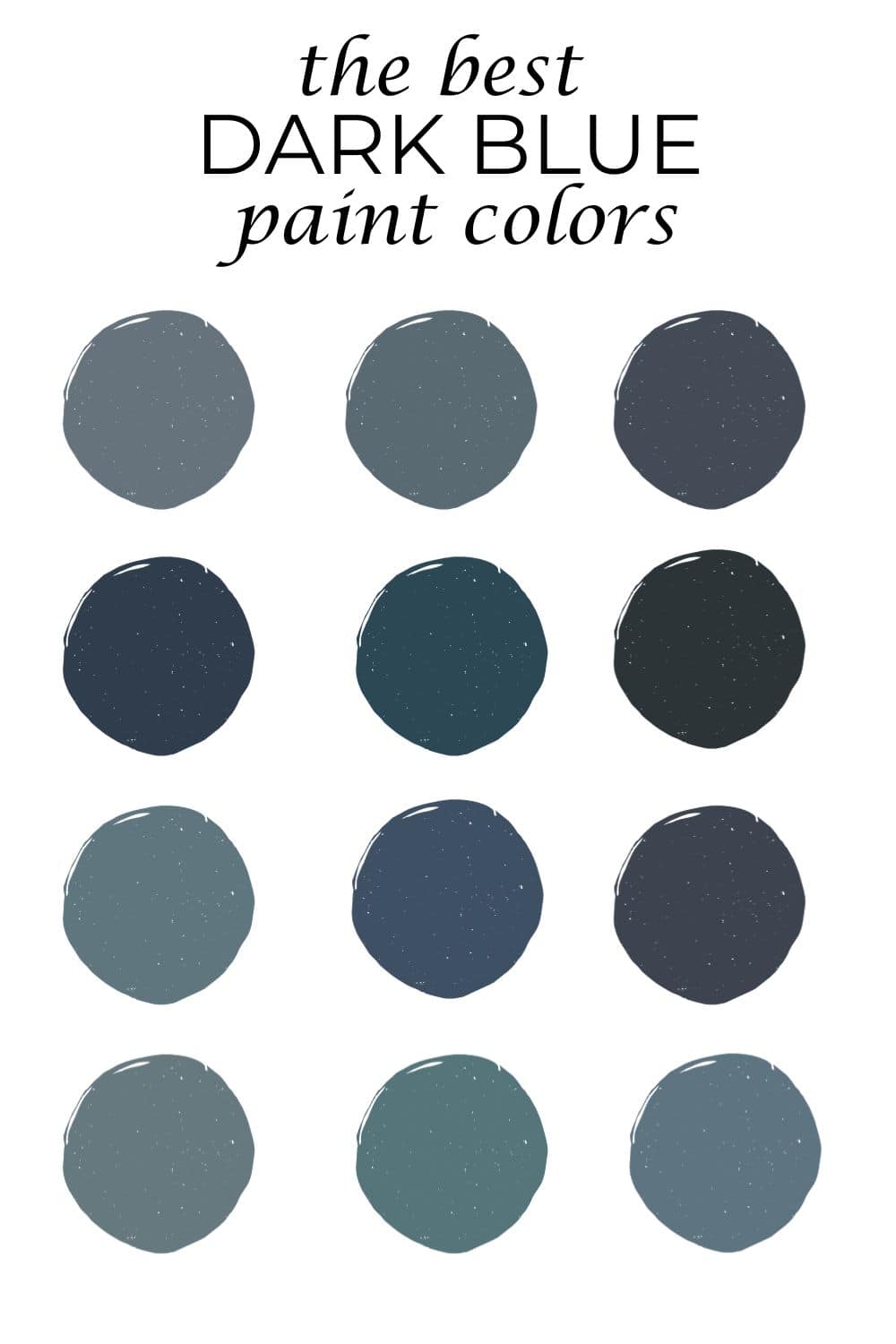
You’ll notice a lot of blues on this list, and that’s by design. Blue is the most popular hue when it comes to painting your office, as this color is associated with a sense of calming.
As you’re mulling through these home office color options, think through your home’s current color scheme. Often, home offices are on the first floor, sandwiched in between the kitchen and living room, so you’ll want a color that creates a choesive flow within your home.
Hale Navy

I’m going to make a bold claim and say that Benjamin Moore Hale Navy is hands down the best navy paint color. It’s hard for a navy color to not give off that nautical vibe and many times that’s really not the feel you’re going for in a home office.
Hale Navy is a deeply saturated navy with a good bit of charcoal in it. I’d describe the color as smoldering. Perfect for an entire room color or really pretty on office cabinetry when paired with a crisp white like Chantilly Lace or it also works with a creamier white, and the one I recommend the most when pairing with Hale Navy is White Dove.
Boothbay Gray
If you’re over grays, don’t worry: Boothbay Gray is anything but. Almost an equal mix of blue and gray, I’d classify Boothbay Gray as a gray blue paint color. A lot of times you get this baby boy blue when you mix blue and gray, but not with this beautiful hue.
If you want to choose this color, you’ll have cooler undertones throughout your home, and you’ll also want to pair this color with a true white, free of any undertones. Think Benjamin Moore Oxford White or Chantilly Lace.
Tate Olive
If you haven’t picked up on it yet, green colors are very appealing to homeowners these days. I’ve seen green used on kitchen cabinetry, for whole rooms and now, even offices. Tate Olive is a beautiful army green hue that would work perfectly in a home office.
If you’re just stepping your toes into the green pool, perhaps choose a green like Tate Olive for office built ins. Complement this type of green with a creamy white. I like Sherwin Williams Alabaster for the best pairing.
De Nimes
Farrow & Ball’s De Nimes is absolutely breathtaking. It’s this beautiful hue that’s a beautiful marriage between green, blue and gray and perfect for a sophisticated office. Like any paint color that has multiple undertones, this color is a bit of a chameleon, either favoring blue or green more depending on the lighting. I’m really partial to featuring this pretty color on built ins and letting them really set the tone for the hole room.
Gibraltar

Looking for a steely blue/gray? Gibraltar by Sherwin Williams might be for you. Technically a gray paint color with strong blue undertones, Gibraltar is a lesser known blue/gray, but it’s one of my favorites.
Depending on your lighting, Gibraltar will look more like a navy in rooms with low light and more like a medium-toned blue gray in rooms with ample light. This deep hue pairs best with a true white like High Reflective White. Here you can find other dark blue grey paint colors.
Rocky River
If you’re looking for a green, but didn’t want to go in the army green direction, Rocky River is a really soft, medium-toned green that might work great for your home office. A slight blue undertone can be found in Rocky River, so it is a cooler color. I’d describe this color as a forest green. Rocky River pairs really well with with creamy whites and true whites.
Silhouette

I felt like this list needed a dark, moody plum, and so I’ve included Benjamin Moore Silhouette. This rich plum shade is perfect for a more feminine office, and if you’d like to do something a little unexpected, plum is the perfect hue. Because this color is pretty dark, in order to make sure it comes off as plum and not dark purple, use this color in a room that has a good bit of light.
Avalon
Searching for a really pretty teal? Benjamin Moore Avalon might be perfect for your home office. Equal parts green and blue, this color will change throughout the day and depending on your lighting. I prefer to pair Avalon with a true white hue like Chantilly Lace.
Kendall Charcoal
If you’re looking for a smoky charcoal color, this deep gray hue is perfect for you. You’ve likely heard of this color as many designers and DIY enthusiasts recommend it over and over again, but that’s because 9.9 times out of 10, it works really well. Although Kendall Charcoal is not technically black, it is very dark.
To really be able to observe the moody gray that it is, you want to use this color in a room that does get a good bit of light, otherwise it just comes off as black, and it’s likely that’s not what you were going for in choosing this hue. Looking for something a bit darker? Check out other black paint colors.
Tips on picking a home office paint color and deciding on an office color scheme
Starting from scratch in your home office may sound like fun to some and daunting to others. Here’s how to simplify the process if you’re just getting started.
Observe the fixed elements in the room
You’ll need to work around what you have in the room first, before deciding on a paint color. Large items that cannot be ignored when decorating an office typically include: floors (unless they are classic wood flooring colors), and furniture.
Say you have a blue couch that will absolutely be a fixture in the room, you’ll need to take that into consideration when deciding on a paint color.
Make note of undertones already present
Instead of choosing the paint color first, you need to choose it last. As you observe the rooms fixed elements make note of their undertones. For example, those custom drapes you want to go with need to be analyzed for color and undertone when making a color decision.
Pick one neutral and no more than 3 colors
Make your room look like a designer was there when you choose just one neutral (white/gray/beige/taupe/) and no more than three colors. Then, repeat these colors at least three times in various sizes. Say you want navy blue and chartreuse to be your accent colors, and you choose a gray as your neutral.
Ideally you’d choose a gray with blue undertones to correspond with navy blue. You’d then want to repeat the navy blue and chartreuse three times each in various-sized items. Think curtains, rugs, lamps, artwork, throw pillows and accent pieces.
Tips on choosing a home office paint color to complement the rest of your home
The key to creating a choesive color scheme in your home is to thoughtfully pull colors together that all work well and are strategically placed throughout your home.
For example, if you’re choosing Hale Navy for your home office, it shouldn’t be the only navy blue in your home. Perhaps its found in your living room throw pillows, in accents in your kitchen and in your curtains in the primary bedroom.
Now, do you have to use the same exact shade of navy throught your home? No, but, the varrying hues of the color do need to relate to each other in some aspects. For example, if you have a lot of muted greens in your home, you can’t really throw a bright apple green in the mix and expect it to look like it belongs.
When you’re choosing color you need to evaluate if it’s clean or dirty. When you compare Army green to apple green, you can clearly see that army green is the “dirty” color and apple green is the “clean” color. When carrying hues throughout your home make sure they are all “dirty” or all “clean.”
If you want to go bold with a color like plum in your office, see if you can easily carry it throughout your home. If you can’t or if you can just do it in very small doses, reconsider this choice if you’re trying to achieve a whole home color scheme that’s very cohesive.