Beautiful dark blue paint colors for your home
Dark blue paint colors have always been a popular choice for home interiors and exteriors. The color blue is actually calming and is frequently used in bedrooms as well as throughout the home.
In year’s past, darker colors were used sparingly, but now, as color is being more embraced, homeowners are gravitating towards using these bolder hues in offices, powder rooms, bedrooms and more.
The following dark blue colors are the most frequent navys that I recommend through my online color consulting business. If you have any questions about the blue colors below, please feel free to leave a comment on this post!
The best navy paint colors at a glance
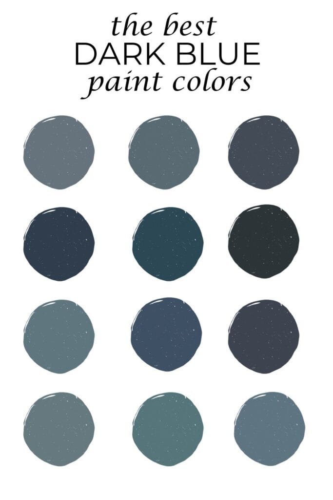
For quick reference, I’m including all 18 dark blue paint colors below and quick facts about them.
Please use the links to jump to a section if you want more info on a specific paint color and to see photos.
LRV stands for Light Reflectance Value and tells you how light or dark a paint color is (0 represents pure black and 100 represents pure white).
- Benjamin Moore Providence Blue: LRV=19, slate blue with a green undertone
- Benjamin Moore Hamilton Blue: LRV=18.25, blue with a slight gray and strong green undertone
- Benjamin Moore Britannia Blue: LRV=18, dusty blue
- Benjamin Moore Bella Blue: LRV=17, dark blue-green paint color
- Sherwin Williams Slate Tile: LRV=15, chalky slate blue
- Benjamin Moore Thousand Oceans: LRV=13, slate blue, slight green undertone
- Sherwin Williams Waterloo: LRV=13, blue with a green undertone
- Sherwin Williams Needlepoint Navy: LRV=13, saturated slate blue with a green undertone
- Benjamin Moore Van Deusen Blue: LRV=12 pretty blue with no undertones
- Benjamin Moore Newburg Green: LRV=10.58 dark blue with green undertone
- Benjamin Moore Newburyport Blue: LRV=10.3 dark blue
- Benjamin Moore Hale Navy: LRV=8, deep navy with a strong black undertone
- Sherwin Williams Indigo Batik: LRV=8, looks like a true dark blue
- Benjamin Moore Gentleman’s Gray: LRV=7.2 dark blue with very strong green undertone
- Sherwin Williams Sea Serpent: LRV=7, deep dark blue (almost black) slight green undertone
- Sherwin Williams Charcoal Blue: LRV=6, looks like a blend of blue and black
- Farrow & Ball Hague Blue: LRV=3 or 4, very dark blue with slight green undertone
- Sherwin Williams Naval: LRV=4 deep navy, no undertone
Below, I’ve included photos of large paint samples held up in natural light. These photos are unedited and are a great representation of what the navy colors look like in natural light.
I’ve also included inspiration photos, but as you’ll read below, remember to take these inspiration photos with a grain of salt, as your lighting conditions will never be the same as the ones in the photos.
Benjamin Moore Providence Blue

If you want a moody blue with some spunk, Providence Blue is perfect. Beautiful for a front door or dining room with a lot of personality, Providence Blue has gray undertones and then just a dash of green, which works to set this color apart from other blue gray paint colors.
With an LRV of 19, this color reflects a bit more light than other darker colors on this list. This is a great color to sample if you want a dark paint color but don’t quite have enough natural light to pull off some of the darker colors on this list.
Benjamin Moore Hamilton Bleu

With an LRV of 18.25, Hamilton Bleu is one of the lighter colors on this list, perfect for rooms that get less natural light.
Hamilton Bleu is a combination of colors. It’s equal parts blue and green and then there’s a subtle gray undertone to it.
Benjamin Moore Britannia Blue

Benjamin Moore Britannia Blue is a dark blue color you don’t hear too much about. I was happy to discover it as I was on a quest for the perfect dusty blue paint color for my home office.
With an LRV of 18, this is a pretty dark paint color, but definitely much lighter than some darker navy colors, like the popular Hale Navy.
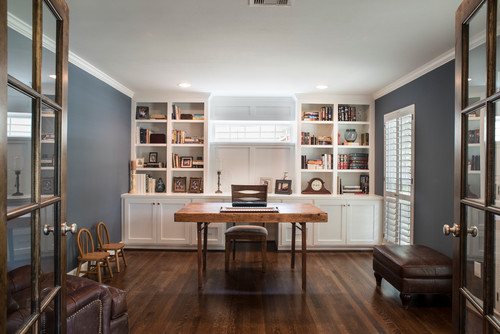
Photo by Penberthy Custom Builders – Discover home office design inspiration
Benjamin Moore Bella Blue

By itself, Bella Blue looks like a pretty slate blue paint color. When you compare it with other blues (which you should always do when testing out colors) you can very quickly see that this color is a blue-green color and actually has a good bit of green to it.
In terms of blues on this list, Bella Blue easily has the most green undertone. Bella Blue has an LRV of 17.
Sherwin Williams Slate Tile

Often paint names can really throw you, but in this case, Sherwin Williams was right on the mark naming this pretty color Slate Tile.
With an LRV of 15, if you want a moody, chalky blue gray hue, Slate Tile is a perfect color to sample.
Benjamin Moore Thousand Oceans

Thousand Oceans is definitely not in the same category as some of the other navy paint colors, as it’s just much too light, but it is a pretty, darker slate blue with a gray undertone. Thousand Oceans has an LRV of 13.
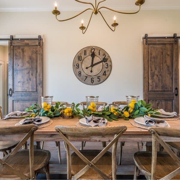
Sherwin Williams Waterloo

Waterloo tends to catch my eye every time I sample it. It’s simply stunning! Waterloo has an LRV of 13, so it’s fairly dark, but again, it’s no where near Hale Navy or Naval in terms of light-depth.
Photo by Maven Home Interiors – Search laundry room design ideas
This pretty color is technically a blue, but it’s got a pretty strong green undertone. It honestly looks very much like Newburg Green, except it’s a hair lighter and maybe has a bit less green to it. I love dark blues with green undertones, as they’re very versatile, design-wise.
Sherwin Williams Needlepoint Navy

Just like Britannia Blue, Needlepoint Navy does not get the recognition it deserves. I practically never see this beautiful blue color on a roundup of best navy colors, but here I am, including it because it deserves some recognition!
Needlepoint Navy has an LRV of 13, so in terms of this list, it’s not too dark, but not light like Britannia Blue. I heavily considered Needlepoint Navy for my office renovation, as it checks many boxes. Dark blue, check. Slate-tile like appearance, check.
I ultimately chose Britannia Blue over this color because Needlepoint Navy has a bit more of a green undertone to it, moreso than Britannia Blue’s very subtle green. This color is also darker, and while I have good natural light in my office, I don’t feel like I have enough for a color with an LRV of 13.
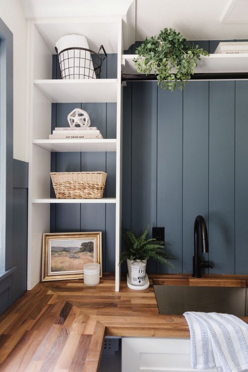
Photo by H. Bero Interiors – Discover home design
Benjamin Moore Van Deusen Blue

If you’re looking for a very dark blue and you don’t want a navy or a blue that has a hint of a green undertone, Van Deusen Blue is likely the color you want.
This moody blue has an LRV of nearly 12 and will look best when used in rooms with more natural light. Van Deusen Blue is a great, even, undertone-free blue.
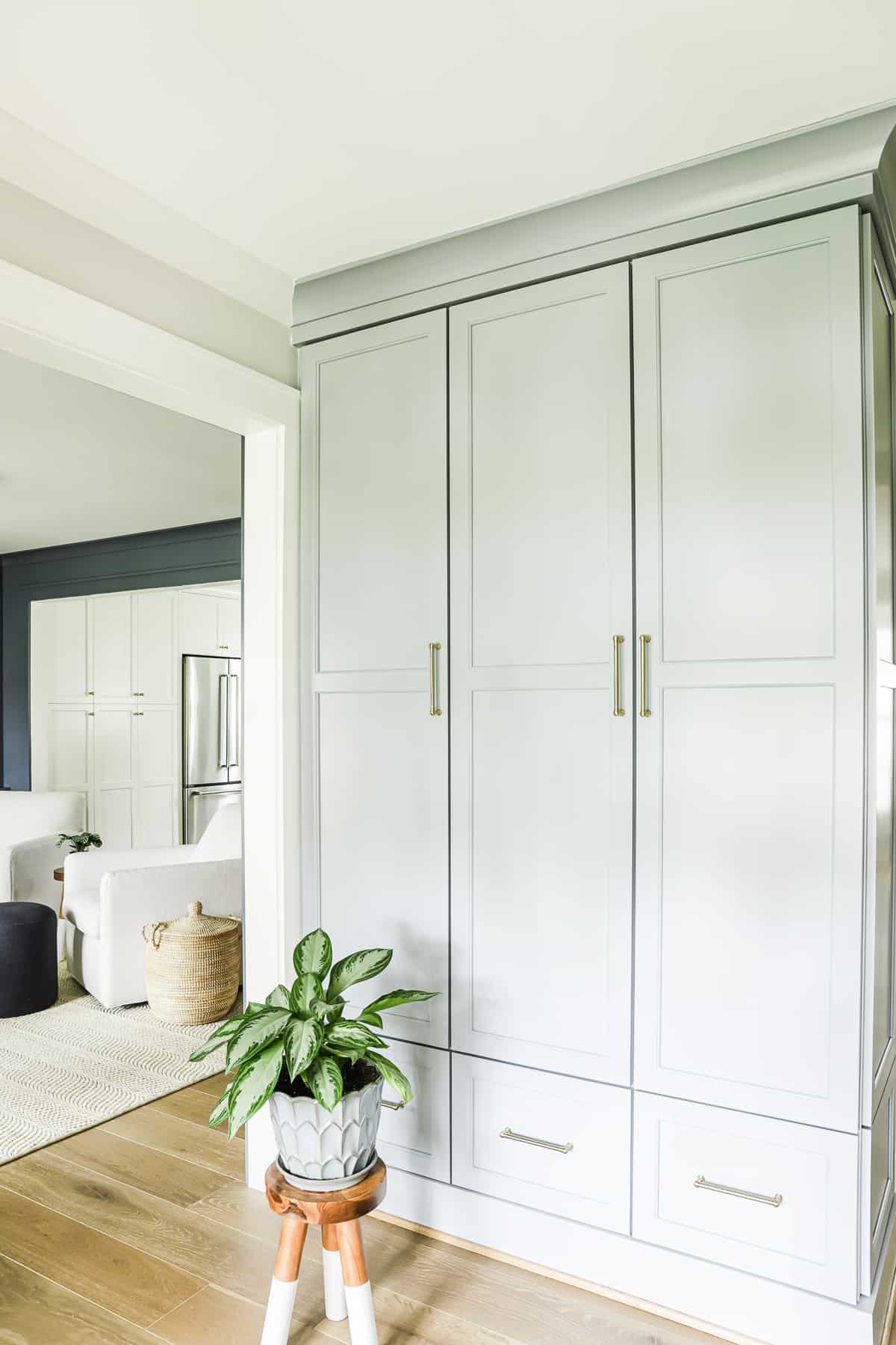
Benjamin Moore Newburg Green

Newburg Green will always be a favorite of mine, and while it’s not a traditional navy color, it still deserves a spot on this list of dark blue hues. Newburg Green is a dark blue with a green undertone.
The green undertone will be more prominent in rooms with more natural light, so if you like that aspect of the color, make sure the room you paint this in has plenty of light. Newburg Green has an LRV of 10.58.
Benjamin Moore Newburyport Blue

Newburyport Blue is a blue with an LRV of 11.97 and no visible undertones. This is a good color to sample if you want a true blue that isn’t too dark and doesn’t have undertones of green or charcoal.
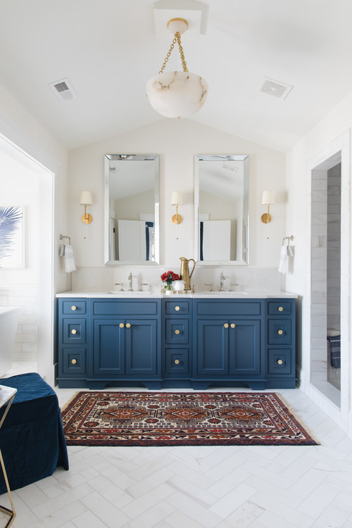
Photo by Timber Trails Development Company – Discover bathroom design inspiration
Benjamin Moore Hale Navy
Hands down, my favorite deep dark navy paint color is Hale Navy. It’s totally balanced and perfectly moody. A great backdrop for a study or home office, Hale Navy has a strong (and I mean strong!) gray undertone, making the color look like a dusty, charcoal blue.
With an LRV of 8, Hale Navy is very dark and will come across as even darker, perhaps black even, in a room without too much natural light. You’ll want to pair this color with a crisp whites, in terms of trim colors.
Photo by Topnotch Design Studio – Browse kitchen photos
When I have clients that come to me and want a navy but don’t have too much natural light I don’t recommend this color, as it just comes out too dark, and you’re left with seeing the dark undertone of the color, rather than the pretty blend of blue and charcoal.
Above, we used Hale Navy on built ins for a client. You can see how the paint color almost looks black with just a hint of blue (which is what the client wanted in this case.)
Sherwin Williams Indigo Batik

Indigo Batik is a dark blue that wants to be a navy, but it’s just not quite in that category. I’d say it’s in between a true blue and a navy.
Photo by GOLDEN GATE KITCHENS – Search kitchen design ideas
When you compare Indigo Batik with Hale Navy, you’ll see the stark difference between the two, as there’s no charcoal undertone in Indigo Batik. With an LRV of 8, this is a pretty dark color.
Benjamin Moore Gentleman’s Gray

Gentleman’s Gray has a misleading name for sure. This very dark blue has a pretty strong green undertone.
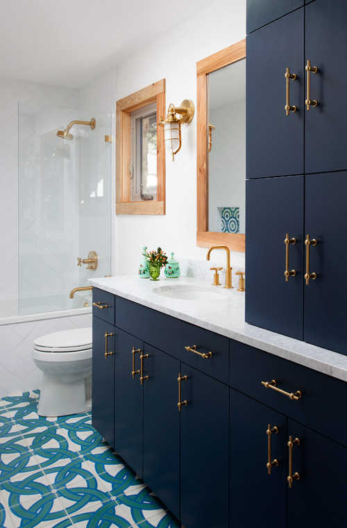
Photo by Merzbau Design Collective – Discover bathroom design ideas
The green will be more apparent in rooms with more natural light, so if you like this angle of the paint color, make sure your room is south-facing.
Sherwin Williams Sea Serpent

If dark is what you’re after, you might be in luck with Sea Serpent. With an LRV of 7 this deep, dark blue can almost come across as black it’s so dark! Because this color is so dark and can easily go darker in rooms that aren’t well lit, I strongly suggest you use this in rooms with a good bit of natural light.
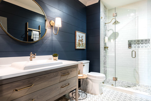
Photo by Hart & Lock Design – Discover bathroom design ideas
Otherwise, you’ll lose that pretty dark blue tint and this color will come off as a black. When comparing this bold color to other deep blues, you’ll notice that there’s a slight green undertone to this color, so technically this color is a deep blue-green.
Sherwin Williams Charcoal Blue

With an LRV of 6, this is the darkest shade of navy blue on this list. Coming off as almost black, thanks to that strong black/gray undertone, Charcoal Blue is exactly as the name implies. This color is best used in a room with tons of natural light.
If you like Charcoal Blue, make sure to check out my list of blue-black paint colors.
Farrow & Ball Hague Blue
Hague Blue by Farrow & Ball is a deep dark blue paint color with a slight hint of green. Farrow & Ball does not publish their LRV numbers, but I suspect this color to have an LRV of 3 or 4.
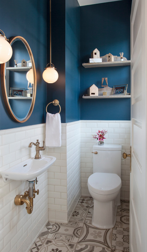
Photo by TreHus Architects+Interior Designers+Builders – Search powder room design ideas
This color will look black in the absence of a good bit of natural light, so make sure you take that into consideration before choosing this color.
Sherwin Williams Naval
Along with Hale Navy, Sherwin Williams Naval is often thought of as the best navy paint color. While these colors do frequently get compared, they are fairly different.
Photo by Vivid Interior Design – Danielle Loven – Discover home design design inspiration
Naval is actually darker than Hale Navy, with an LRV of 4. However, Naval doesn’t have that deep black/charcoal undertone that Hale Navy does. Naval is more of a dark, true navy. Hale Navy is more of a black paint color with a strong navy blue undertone.
How to pick dark blue paint colors
With so many options available I hope my curated list of navy blue colors helps you find a few colors that might work well for your space. Here are some tips I advise my clients when narrowing down the right color.
Observe your light
Dark blue walls are beautiful, but choosing a blue or navy paint that’s too dark for your space will end up looking like you chose a black paint color.
Don’t go off of online inspiration photos alone when making your color decision. You need to see how the color reacts in your light.
Often times your inspiration photo will not translate to how the color reacts in your space and light and this is why I always advise my clients to use inspiration photos as a starting point, but never a deciding factor.
Testing out the colors, (and I always recommend you paint large 12’x12′ sample) is truly the best way to see how they will react in your lighting conditions.
The darkest navy hues on this list (those with LRVs in the 1-10 range) should only be used in rooms with south-facing light for best results.
If you are choosing a blue-green color, make sure you have ample color as well, or the blue-green combo will be lost and you’ll be left with either a color that appears blue or green, but not both.
Repeat the paint color in the room
The easiest way to achieve the interior-designer-was-here look is to choose a color palette of no more than 3 saturated colors and one neutral and then repeat those colors in various shapes and sizes throughout the room.
If your room is classic navy, you need to repeat that color at least two other times. You also want to pay attention to the other colors you incorporate, too.
Darker blues are muted colors, so the other colors you add in need to be muted colors, too. You don’t want to pair a dark navy blue with a vibrant red, but rather a muted red, green, yellow, etc.
Test out the colors correctly
The best way to test out your paint sample is to either paint a large enough sample or get the peel and stick samples and place them on pure white poster board.
You don’t want to paint samples directly on your current wall, as your wall color will negatively influence the color. You want a crisp white backdrop to truly see the color for what it is.
You also want to compare colors to each other, just like we have on this list, as this is really the only way you can see undertones and color depth.
What colors go with navy paint colors?
It’s hard to go wrong when decorating with navy or dark blue, but there are some thing you should take into consideration.
I like to pair navy with light gray blue blends, lighter green-blue blends and crisp white paint colors. Navy also looks good with burnt orange, coral and ochre.
If this list falls short for you, check out my other paint color reviews here.