A color expert’s guide to the best living room paint colors in 2022
Landing on the perfect living room paint color can be challenging. What comes first? Living room furniture or deciding on a paint color?
I always advise that you completely decorate your room first, and then pick a paint color. Sometimes that’s not always possible and you must choose a paint color before you’ve decorated your space.
Regardless of when you choose a paint color during the decorating process, this article will help you narrow down the right color for your space.
What colors are popular for living rooms?
Warm, very light neutral colors are popular today. White has been popular for a few years now, but warmer hues are starting to come back in style. Expect to see pale beige, tan and cream gracing living room walls both now and in the future.
My top choices for living room paint colors
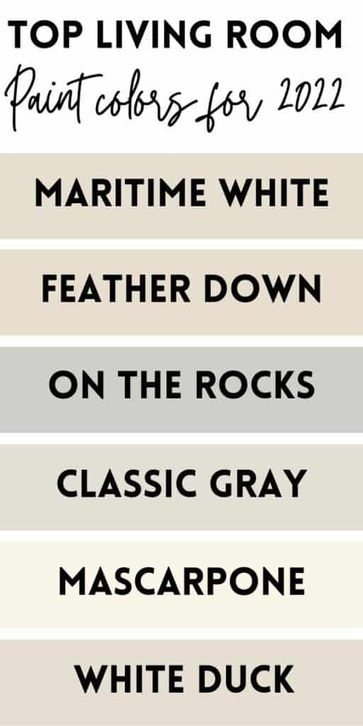
Maritime White
If you would have looked up top paint colors for living rooms in 2015, you wouldn’t have found Maritime White or the next color on the list, and that’s because everyone wanted a gray paint color. With the gray trend slowly exiting the design scene, beige is slowly taking its place.
Maritime White is a very pretty pale beige. This beige works really well with neutral couches that have a linen-like color. On the paint chip, Maritime White looks really yellow, but when compared to actual beige colors with yellow undertones, you’ll quickly see that it’s got a soft pink undertone.
A far cry from the beige colors of the 90s, like Shaker Beige and Grand Beige, Maritime White is considerably lighter and has a light reflectance value of 73. Be warned–Maritime White is a beige, not a white, despite the name. If you want a soft white, check out my off-white paint color recommendations.
Feather Down
The next beige on my list is Benjamin Moore Feather Down. This pale beige is similar in color depth to Maritime White, but differs in color makeup, as the two colors have different undertones. Feather Down has just a hint of a green undertone that typically makes itself known in situations with less natural light.
I’m starting to see a lot of gold and ochre accents used in decorating and it’s a trend that I hope is here to stay, as it’s just beautiful and classic, and works beautifully with paint colors like Feather Down.
Studio McGee recently did a bathroom with Feather Down cabinets, and it was just breathtaking. So soft and beautiful.
On the Rocks
This gray paint color doesn’t get quite as much attention as it should, but I’m a huge fan of Sherwin Williams On the Rocks. Many cooler gray paint colors have a significant blue undertone, but not On the Rocks.
If you need a gray with a blue undertone to it, but don’t want something with screaming blue undertones, On the Rocks is really nice.
I know I said earlier that gray paint was on its way out, but I firmly believe that the right color for your space is always ‘in,’ which is why I’m still recommending this paint color, even in 2022.
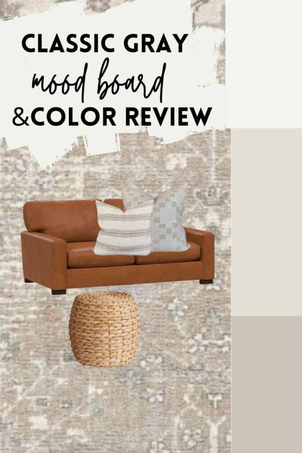
Classic Gray
Some people classify Classic Gray as a warm white paint color, but when you compare it with actual off whites, like White Dove, you’ll quickly see that it’s a warm gray paint color.
This super light gray is lightened up considerably from the more mid-toned grays that dominated the last 10 years. Classic Gray has a green undertone and looks really good when paired with warmer tones, like you see on the mood board below.
Mascarpone
Just like beige paint colors are coming back, people are going to start leaning in to creamy tones, too. A departure from the stark white paint colors that have been gracing walls lately, Benjamin Moore Mascarpone really lightens things up without being too cold.
Creamier that some of my favorite whites, Marscapone is a fairly soft white hue with a good bit of cream in it.
Just look how beautiful this cream paint color looks below:
While Mascarpone is a beautiful creamy hue, it should not be used as a trim color, as it will just end up looking too yellow and dirty. You need to go with an off-white paint color like Alabaster to use as a trim color when you have Mascarpone on the walls.
White Duck
Closing out this list with a lesser-known paint color, Sherwin Williams White Duck. Just like with Maritime White, White Duck is anything but white. White Duck is actually a barely-there greige paint color.
I really like White Duck because of its versatility–it’s not a true cream, but it’s not a cool color either. It sits right in the middle. Sometimes a cream color can be too yellow for your walls, but you don’t want a gray or a beige, and White Duck might be the answer to your color conundrum.
How to test out your living room paint color ideas
Getting a feel for which color might work well on your living room walls is just the beginning. You then need to test the color out before you commit. Never go off of a small paint chip or an inspiration photo you find online.
Here’s how you can test out a paint color for your living room:
Do you see how I’ve put the paint sample (these are those peel and stick paint samples) against a white poster board and on the wall behind my couch? This is how you should sample the color.
Really a paint color should perfectly finish a room. This is why when people hire a painter to come in and paint their whole interior before they’ve even moved in or decorated they are rarely satisfied.
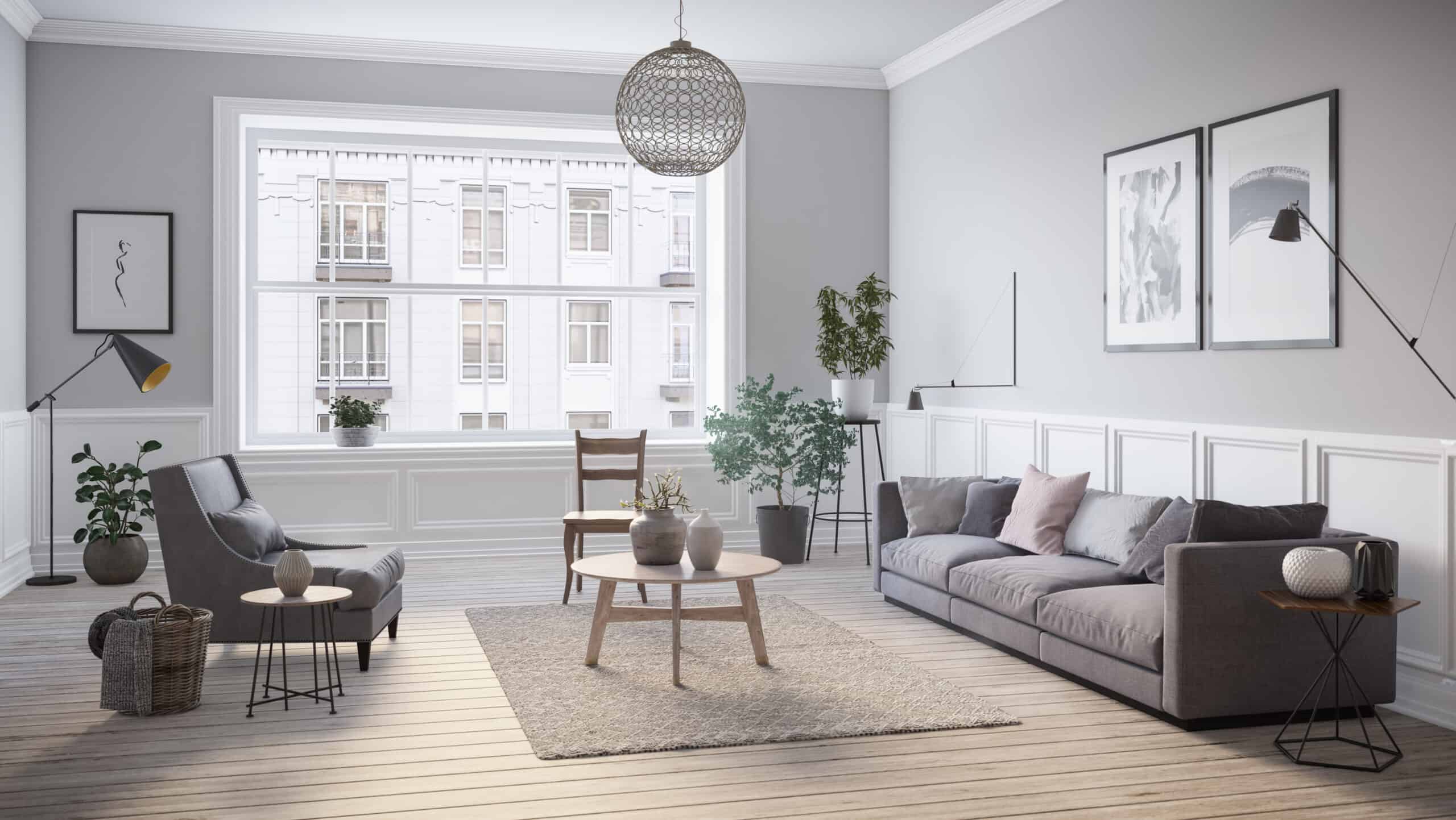
Paint colors need to relate to a large element in the room. In a living room, most people do a neutral color these days, which is something from the gray, white, beige or taupe families.
For example, if you have a gray couch, you’d likely go with a gray paint color, but which gray? That’s when sampling grays in varying undertones will come into play.
What about accent paint colors for living rooms?
If you got to the end of this list and you hoped I would provide you with some more dramatic hues, this section is for you.
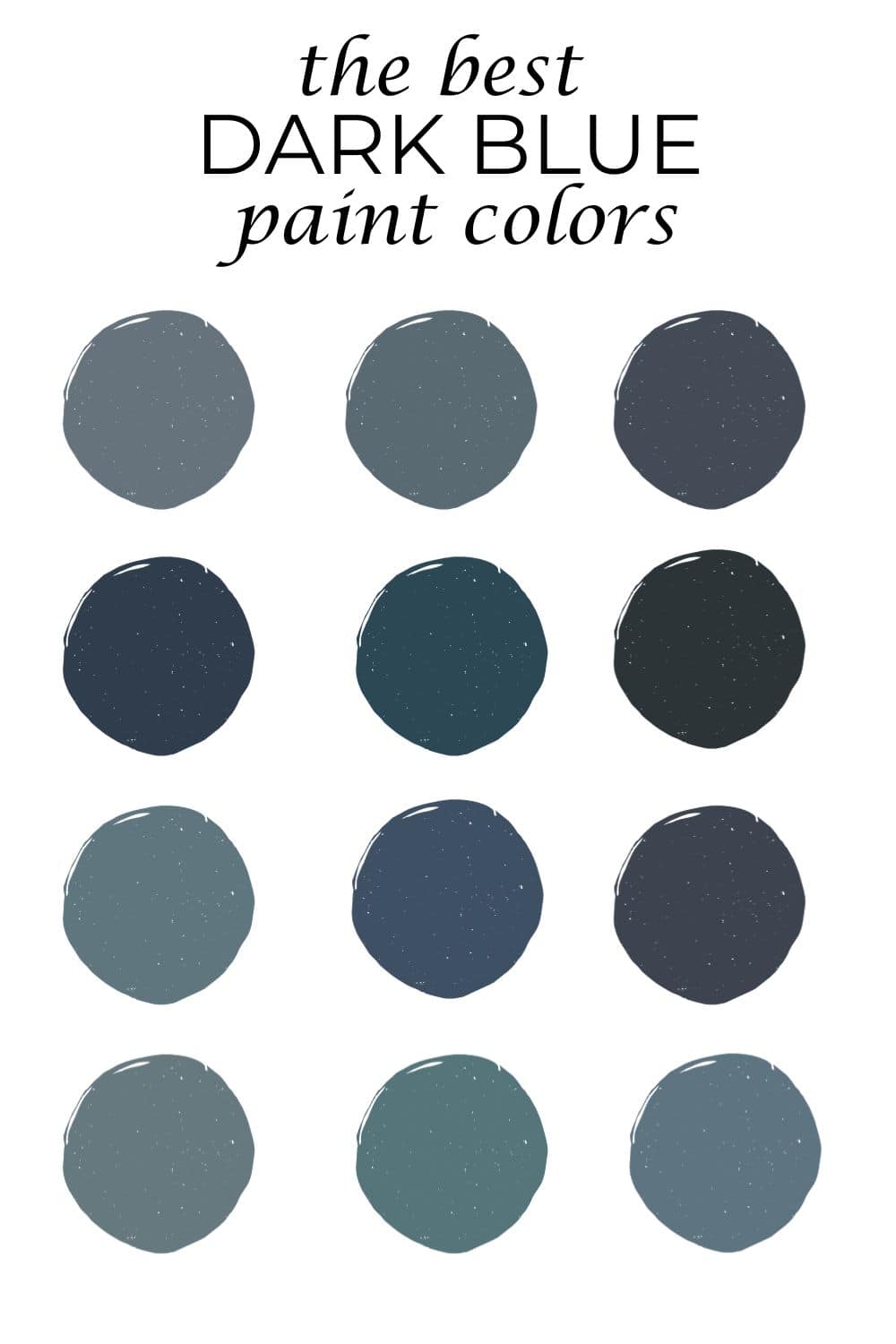
I will always, always recommend Benjamin Moore Hale Navy. If you’re looking for a timeless navy accent color, this is the one. If you want something more green, Newburg Green is a rich, dark teal color and is absolutely stunning. If you need a medium-toned bluish gray tint, Boothbay Gray is really nice and finally, if you’re looking for something in the black paint color family, look at Wrought Iron or Kendall Charcoal.

I used Benjamin Moore’s, Maritime White in my downstairs. I like it. Its “fresh” looking since I didn’t want to use a grey, but it’s taking some getting used to…it’s pretty “buttery”. I am looking for a darker color to coordinate in an adjoining hall and bathroom. Can you suggest a some darker colors that would be beautiful with Maritime White. I searched forever to find this color and now I am having a hard time committing to it. I just need some coordinating color suggestions to go with it. HELP!
Hey Dolly,
Maritime White has a pinky/beige undertone. It will work with beiges with green undertones, grays with green undertones, grays with blue and/or purple undertones and taupes. I have pots on all of these just search 🙂