10 best brown paint colors
Better Homes and Gardens just sent me an email saying brown is the new black, and with more and more designers and popular home bloggers embracing the trend, I have to say I agree with them.
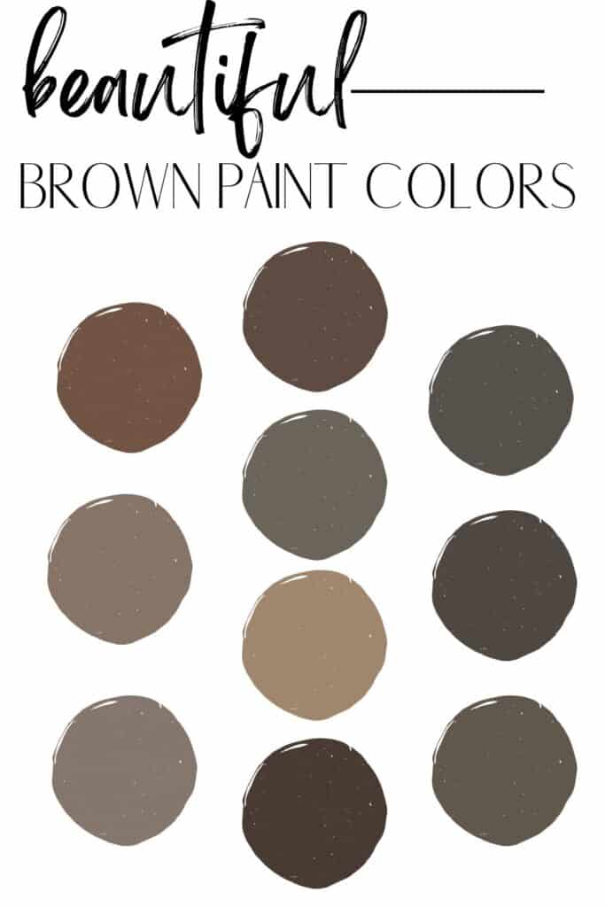
Looking to add some drama to a space, check out these 10 brown paint colors that are simply stunning.
What’s the most popular shade of brown?
London Clay by Farrow & Ball, Urbane Bronze by Sherwin Williams, and Benjamin Moore French Press are the most popular brown paint colors on the market.
Brown paint colors to try in your home
1. Farrow & Ball London Clay
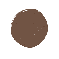
Made famous when Chris Loves Julia used it in their primary bedroom in 2022, London Clay is one of the paint brand’s lightest shades of brown.
2. Benjamin Moore French Press
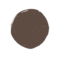
One of their most popular colors, French Press is a fairly dark brown. Described as a brown/black hue, this color definitely has considerably more brown than black.
3. Sherwin Williams Urbane Bronze

Urbane Bronze might technically be a deep gray paint color, but because of its deep brown/bronze undertones, I’m adding it to this list.
If you really want the brown/bronzy tones of this pretty color to stand out, make sure you paint it in an area with a good bit of natural light, as this color tends to just look like a black paint color.
You may find that you actually like colors that lean a little more towards black than brown, and if that’s the case, here’s my list of the blackest paint for walls.
4. Benjamin Moore Beachcomber

Beachcomber is a great brown color to try if you’re just wanting to dip your toes in the brown paint trend. Much lighter than most of the colors on this list, Beachcomber is a pretty brown hue with a taupe undertone.
Remember a color that has a taupe undertone means it will have a flash of pink/violet undertones, and I can definitely see the violet undertone in Beachcomber. The violet in Beachcomber is really becoming and works to warm up this tone.
5. Sherwin Williams Porpoise
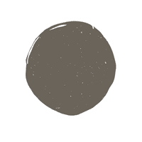
Probably one of my favorite colors on this list, Sherwin Williams Porpoise comes across as a dark brown with just a slight green undertone in a good bit of natural light. In rooms with less light, this hue can look more like a charcoal grey paint color.
6. Sherwin Williams Black Fox

I’d describe Black Fox as the color espresso. The darkest color on this list, Black Fox is definitely for someone that wants almost a black paint color that leans brown. This color will quickly go black in rooms without too much light.
7. Behr Wild Truffle
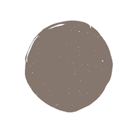
On the lighter side of brown, Wild Truffle is another one to sample if you’re a little worried about going too dark. Wild Truffle has a taupe undertone, which warms up the color significantly.
8. Behr Toffee Crunch
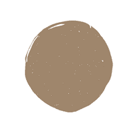
A light (relatively speaking, of course) shade of brown with toasty notes of carmel, Toffee Crunch looks just like you’d think it would.
This is a good color to sample if you want brown but don’t have a lot of natural light, as it won’t end up too dark for the space compared to the darker brown paint colors on this list.
9. Sherwin Williams Tungsten

Looking for a brown paint hue that won’t go black? Give Sherwin Williams Tungsten a try. Tungsten is a pretty true brown with slight green undertones. This is a darker brown, so keep in mind that it will appear almost black in rooms without a lot of natural light.
10. Benjamin Moore Appalachian Brown
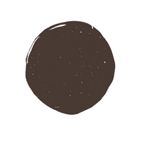
The darkest color on this list, Appalachian Brown is a really pretty chocolate colored brown color with a purple undertone. While the purple undertone isn’t overpowering, it is there and helps to significantly warm up this color.
What accent colors pair well with brown paint colors?
Jewel tones pair best with brown paint colors. Think wine-colored paint or decor items, jade and emerald green.
Which trim colors work best with brown paint?
Trim color should never be an afterthought; especially when working with the color brown. The colors on this list demand a softer white trim color. Here are my choices for the best off white paint colors to use on trim when painting with the brown tones on this list:
- Cloud White
- Greek Villa
- White Dove
- Cloud Cover
- Alabaster
I have full reviews on most of those trim colors (which also work well as wall colors, too) and you can read them by clicking on the links above.
Now, just a word of caution: You may want to pair your brown paint color with an even creamier off white, but before you go into the world of cream paint colors, stop yourself! You never want to choose a cream paint color for trim, as it just ends up making the trim looking like it really needs a good cleaning.
Tips for working with brown paint
The top 3, no-fail tips for choosing a brown paint color for your home:
Understand your lighting situation
Brown paint can go really black, really quickly. Make sure you evaluate how much light you have coming in before you commit.
You can easily do this by getting a large enough paint sample up on the walls and observing how it holds its color, given the lighting in your room.
Commit to decorating
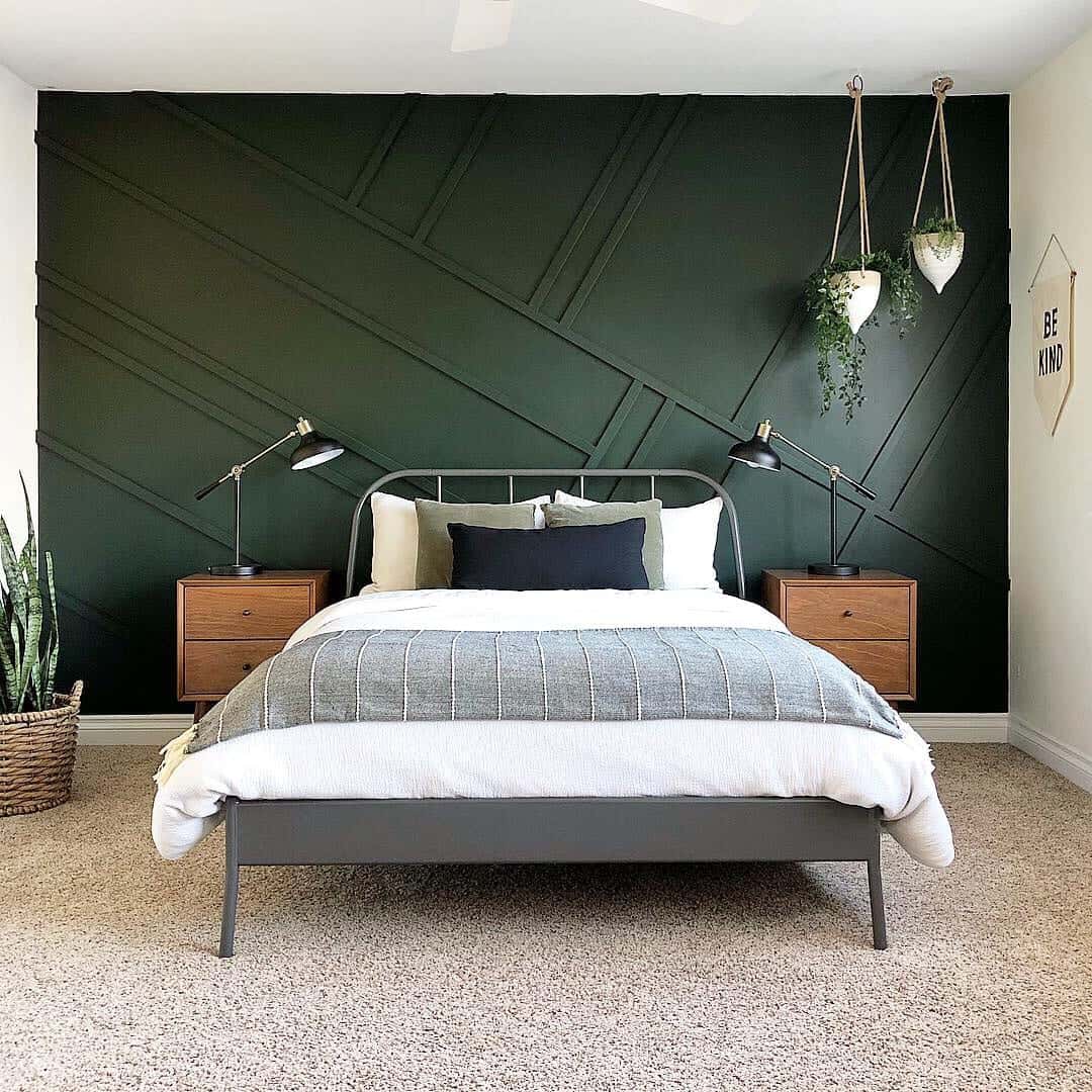
Here’s something I learned early on in my paint career- no paint color will ever save a poorly decorated room. Strong paint colors like brown are fairly hard to pull off if you don’t have a lot going on in the room.
I like using Canva to create a mood board and typically use a rug as a starting point in terms of finding something to set the tone for the room. From there you can add drapes, accessories and furniture that work well with your paint color.
Adding trim work to the room is never a bad idea; especially when going with darker colors. Board and batten, shiplap or craftsman-style trim might be a good idea.
Test out your colors
Here’s where the rubber meets the road! You must test out the colors on your wall before you commit. Besides just testing the one color you deem to be the one after visiting the paint store or reading online, it’s a good idea to test multiple colors at once.
Viewing multiple colors at the same time is really the only way you can see differences between colors. With this list of browns, you’ll be able to see which ones are too light, too dark, too purple or too green when you compare multiple colors at once.

