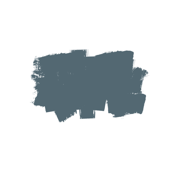
Sherwin Williams Rainwashed: a complete color review
Is there anything prettier than when blue and green get together and create just a dynamite color pairing?
Today we’re going to look at one of my favorite blue/greens, Sherwin Williams Rainwashed.
These sea-glass colors are super popular for bedrooms, bathrooms, and kitchens, and in this post I’ll unpack everything you ever wanted to know about this beautiful color.
Is Sherwin Williams Rainwashed blue or green?
Rainwashed is one of those colors that won’t commit to a one single color! It’s technically belongs to the category of blue green paint colors.
This post contains affiliate links. Read our policy here.
What are the undertones of SW Rainwashed?
Technically speaking, Rainwashed is a blue/green color with slight undertones of gray. You could easily say it’s a blue/green/gray hue and I’ve also included it in my ever-expanding list of popular gray green paint colors.
Because of the gray undertones in Rainwashed, when you compare it to other bluish green tones, you’ll notice that it’s more understated and a bit more neutral-looking than some of the more saturated hues.
For this reason, many people tend to gravitate towards a blue green with some gray in it, if they don’t feel too comfortable diving in with a color that has more tint to it.
Psst! Here you can order a large, real paint sample of Rainwashed!
is SW 6211 Rainwashed a cool color?
Thanks to it’s blue/green hue and notes of gray, Rainwashed is definitely a cool-toned paint color.
What its LRV?
LRV stands for Light Reflectance Value and has to do with how light or dark a paint color is. LRVs are based on a scale of 0-100, with 0 representing pure black and 100 representing pure white.
The LRV of Rainwashed is 59, which is in the medium to light paint color category. If you’re searching for a light paint color, you want to look to something with an LRV of 65+.
Off the top of my head, SW Opaline would be a color to sample if you find this one to be too dark.
Which white trim color should I pair with it?
I love Rainwashed with true white trim colors. True white tones do not have any undertones and look really sharp when paired with colors like Rainwashed.
Oxford White is a pretty good true white tone that’s going to give you that pretty pop. High Reflective White is just a smidge brighter and will give you even more of a contrast.
In terms of soft white or off-white colors, I really like SW Rainwashed with Pure White, as it’s a really good bright, softer white. Simply White is also pretty. White Dove works, but not my first choice.
Pairing Rainwashed with softer whites like Alabaster or other off-whites that have more yellow in them is not going to give you the prettiest result.
Now, would I repaint my trim in my entire house because it didn’t work amazingly well in one room? No, unless it just bugged me so much that I could not get past it.
Pairing Rainwashed with a warmer white won’t be the end of the day, so don’t worry if you can’t replace your trim color.
Similar colors
It’s so important to try out many colors within the color family you’re considering. It’s really the only way to see the undertones, as looking at a color in isolation is a huge no, no!
If you love the lighter blue/green paint color family, you should also sample Opaline, Quiet Moments, Sea Salt, Pearl Gray, Oyster Bay and Palladian Blue.
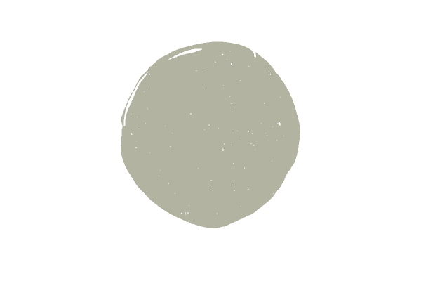
Rainwashed vs. Sea Salt
Sherwin Williams Rainwashed is frequently compared to the ultra-popular Sherwin Williams Sea Salt. As you can see above, Sea Salt has considerably more gray than Rainwashed.
This is a good color to try if you want that green/blue look but you want something just a little more muted. Sea Salt is a little bit lighter than Rainwashed, with a LRV of 64.
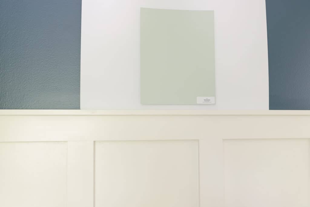
Rainwashed vs. Opaline
Opaline is one of the lightest bluish green hues I will recommend to someone looking for that type of color. It’s a good bit lighter than Rainwashed, with an LRV of 72.
While it is lighter, it’s definitely not quite as blue. Opaline is a beautiful color for bathrooms or guest bedrooms.
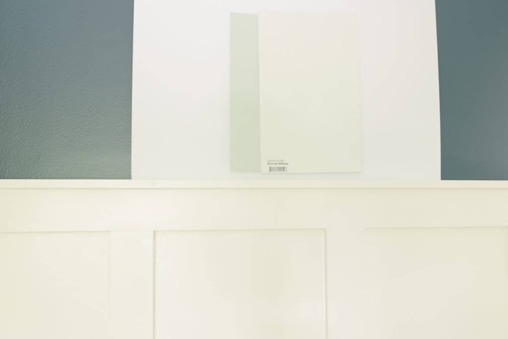
Rainwashed vs. Silverpointe
SW Silverpointe is a pretty choice if you’re searching for a blue/green that’s just a little more muted. With a strong gray undertone, Silverpoint is technically a neutral paint color, not a saturated hue.
It’s fairly easy to work with since it’s technically a gray paint color with blue/green undertones. With an LRV of 64, it is lighter than Rainwashed.
Still deciding if Rainwashed is for you? Watch my full color review below:
How to decide if SW Rainwashed is for you
Choosing saturated (non-neutral) tones is definitely much easier than neutral colors, but there’s still a lot that goes into picking the right color for your space. Here are my three best tips to help you pick the right paint color the first time.
Evaluate your light
Don’t just look at a bunch of photos in magazines or online where the color was used, but rather evaluate a large enough sample in your own home to accurately tell how it will appear given the light in your room.
When you only look for inspiration photos to guide your decision process, you’re really doing yourself a disservice.
Photos in magazines and online have mostly been color corrected and highly edited. I always feel torn when I show photos of the color used in real homes on my posts, but people want to see that. I say, just take it with a grain of salt.
You also have no idea how light or dark the room in the photograph is.
With Rainwashed, if you have a north-facing room, where little natural light is getting in, you might find that the color is just too dark. And if that’s the case, you should really check out Opaline or even SW Silverpoint
Of if you want to get more into the gray/green world and are looking for lighter hues in that category, you can try BM Gray Mist.
On the opposite end of the spectrum, if you have a south-facing room with a ton of natural light you might find that Rainwashed gets too washed out for the look you were going for. That’s when ou should try Ben Moore Palladian Blue or Mount St. Anne.
Pay attention to your decor
Blue green tones are pretty easy to pull off, as most people love to decorate with blue and green colors. Just keep in mind here, with these tones that have blue and green in them, you can play up both of the colors or just one color with your decorating.
Ideally, the rule of thumb is to choose one neutral and no more than three saturated tones for your room.
You then want to repeat your saturated tones at least 3 times in various sizes throughout the room.
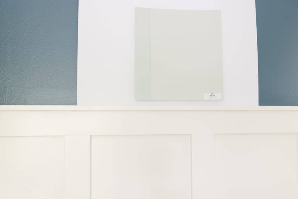
Test it out the way the pros do
See the photo below for the exact way to test out your paint color. No more slapping small paint samples right onto the current wall color. Testing out the paint colors this way will ensure the current wall color doesn’t impact the one you’re sampling.
You can either take a white poster board and paint a large paint sample right on to the poster board and place on the wall or use those peel and stick samples.
During this phase of the paint picking process, you also want to sample multiple other colors in the same or close to the same color family.
So if you like Rainwashed, sample other grey/green/blue hues and other grey/green hues.
Looking at colors in isolation gets you into trouble, as it’s really hard to see what undertones a color has without comparing to other colors.
Still on the fence about Rainwashed? You really can’t go wrong with this versatile color, but if you still want to browse, go ahead and check out some of my favorite green-grey colors or some more blue green paint colors.