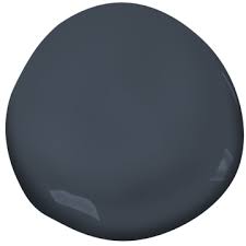
Sherwin Williams Waterloo
I’ve been eyeing Sherwin Williams Waterloo for years, just waiting to use it somehow, someway, because, wow, this color is just gorgeous.
This post contains affiliate links. Read our policy here.
What color is Waterloo?
While Waterloo is described as a blue, I really think it’s a deep blue with some teal undertones.
Take a look at the photo below. Waterloo is in between two similar Benjamin Moore colors.
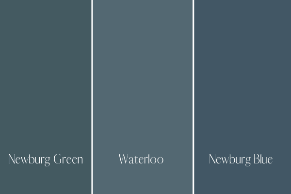
Do you see how the blue on the right looks much more like a blue than Waterloo? Waterloo looks more like a color in between Newburg Green and Newburg Blue. Even getting out my physical large paint samples of all three of these colors, I can see that Waterloo has a bit more depth to it than a typical blue.
This is why it’s so important to evaluate colors with other colors. By itself, Waterloo looks blue, but when compared with other colors, you can tell it’s more of a deep blue/green.
Now, I will say, Waterloo tends to read more blue than green, and the mix of blue and green isn’t going to be as apparent as say, Aegean Teal.
Test out Waterloo in your home with a peel and stick 12 x 12 paint sample!
What goes with Waterloo?
Waterloo is very versatile and will go with a number of decor schemes. You can pair it with monochromatic colors or it looks really good with greens, yellows, oranges, reds, and leather tones.
What trim should I use with Waterloo?
Waterloo is versatile in that you can pair it with various white paint shades, but in particular, I really like it with a crisp white like Chantilly Lace (a white that doesn’t have any undertones) or my all-time favorite, White Dove. BM White Dove is technically an off-white, but it’s not really got any major yellow undertones, but rather griege undertones.
How do I know if Sherwin Williams Waterloo is right for me?
It’s hard to go wrong with blue, but here’s how to make sure your choice perfectly complements your home.
Watch the light
As I mentioned above, I firmly believe Waterloo is a blue-green. This means depending on light, it will either look more blue or more blue-green. Low lighting will typically just show blue and a lot of light (ample natural light) will show more of the blue green.
You need to really test out your color and observe it in your space and throughout the day to make sure you like how it changes as the day progresses.
Test it out
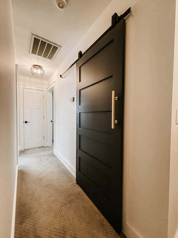
Way too many people fall in love with a color just from a paint swatch or from an inspiration photo. I mean, do you remember the photo above when Waterloo was used on the built in cabinetry and walls in the office. Just gorgeous.
Here’s the thing about online photos though. They’re all heavily edited. Besides this fact, what looks good in someone’s home is not necessarily going to look good in your home…which is why after you fall in love with a paint swatch or Inso picture you must test it out in your home!
You want to either order those peel and stick paint samples or go to the hardware store and get actual samples. If you’re going with the peel and stick don’t peel of the back, instead use painters tape to adhere to a white poster board. Put the poster board right on the floor, laying up against the wall or on various levels on the wall. Observe the color.
If you want to make your own sample, paint a large square on a white poster board leaving an inch of white sticking out all around and place on wall.
Do not, I repeat, do not simply stick the peel and stick color or paint a sample right on your current wall!! This is where a lot of people run into trouble. Your current wall color will impact the new color, which is why the most accurate way to observe color is using a pure white background.
Get several samples in various depths
You might be thinking you like Waterloo only to get it home and realize it’s a bit too dark or it’s not dark enough. Or maybe it’s got too much teal in it. Get samples in various depths in the color family you’re going with and test them out. Comparing colors with other colors is really the only way you can see the differences in tones.
Observe your overall decor
If you’re redecorating or starting from scratch, you can build a mood board with fabric samples and your paint sample to make sure everything is cohesive. I also love using canva to make a mood board too, and this way you can pull in physical products that you’re considering using for the room.
Which paint colors are similar to Waterloo, but darker?

Looking for a deep blue, but don’t feel like Waterloo is quite dark enough? Check out Hale Navy or Van Deusen Blue. Hale Navy is one of my favorite navy blue colors, and it’s got a charcoal undertone to it, giving it a smoky appearance. Van Deusen Blue is just a really pretty solid blue with some pretty serious saturation.
Which paint colors are similar to Waterloo, but brighter?
Waterloo is a really saturated color, and in a room that doesn’t have a lot of natural light, it might come across as a dark, dark blue or even black. If this isn’t the look you’re going for, maybe try either Benjamin Moore Van Courtland Blue or Sherwin Williams Debonair. Both colors are significantly lighter, but will read darker in a room that doesn’t get much natural light.