My favorite exterior house colors for 2024
Most people get their exterior paint color palette completely wrong!
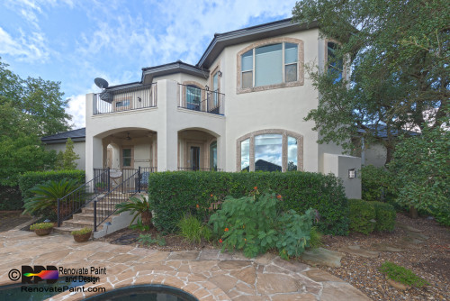
Selecting exterior paint colors is one of the hardest paint decisions you’ll ever make. If you really want to get the colors right and create a harmonious palette, you must consider the many fixed elements on your home.
Choosing the right colors for your exterior will mean you’ve carefully considered the tone of your stone/bricks, trim (if you’re not repainting that) window color and roof color.
With the hundreds of combinations and endless possibilities your head is likely spinning with ideas, so to help you, today I’ve rounded up many of my favorite exterior paint colors.

If you’re building a new house or planning to makeover your exterior, you’ll want to read this article closely.
First things first, let’s talk about all of the different parts of a home that you’ll want to consider as you pull together a cohesive exterior color palette.
Beyond the main body color of the home and any stone or brick work, you also have the soffit the fascia, the roof, gutters (now this is a big one, because the wrong color gutters can really make a home look bad!) and garage doors.
Whoo! That’s a lot. No wonder picking exterior colors is so difficult!
Now, if you’re in the beginning stages of a new build, the possibilities are endless. If you’re painting an existing home, you are somewhat limited by window color, roof (unless that needs to be replaced) and stone/brick.
Alright, now let’s get into some colors!
First up, let’s go over some of the best white paint colors for your exterior. While white homes have been popping up literally everywhere thanks to the farmhouse and modern farmhouse trend sweeping the nation, white exteriors, just like white kitchens will always be timeless.
Now when I say “white”, I put it in quotations, because typically what looks best on exteriors isn’t taking the same off-whites and true whites we know and love for our interiors and using those outside.
The reason here is colors lighten up several times over outside. When you go with say something like SW Pure White, which is a true bright white, you’re left with something that looks like this:

Now, this might be some people’s cup of tea, but in my opinion this is way too bright and way too sterile.
It also sticks out like a sore thumb here because the homeowner completely disregarded the fact that this townhome was plopped right next to two other homes that had more earthy finishes.
A more current color palette could have been achieved by going with a greige or cream, that would lighten up to warm white outdoors.
Pay attention to the LRV of each color I list. LRV stands for Light Reflectance Value and tells you how light or dark a paint color is.
100 is pure white, and 0 is pure black. If you want a creamy white on your exterior, you typically need something in the low to mid 70s, not something as high as White Dove, that has an LRV of 83.
Whites + Creams
China White

If you want a bright white that isn’t too blinding, China White is a great option and probably one of the brightest I would recommend (under normal circumstances and we’ll talk more later about some caveats) go in terms of white paint colors for your exterior.
With an LRV of 76, color ends up looking fairly bright outside as you can see in the inspiration photo, there’s quite a bit of difference between this color and say, White Dove or even Alabaster.
Alabaster

Now SW Alabaster can be very creamy inside, in fact its one of the creamiest off-whites on the market. However, when you put it outside, it looks like a true white color and that softness that we love about this color just completely disappears outside.
Shoji White

Many of us are searching for that classic creamy white, and you’ll find that with Shoji White. This color is a bit darker than traditional off whites used inside, and many people see this paint chip and don’t want to even explore what it might look like outside if they really want a white house.
However, what most people forget is the fact that colors lighten up significantly inside. Technically speaking, Shoji White is a cream with a green beige undertone. Now, this is important because when you are working with neutrals you want to make sure they relate to your stone/brick, roof and windows.
Ballet White

Ballet White is another pretty cream that’s similar to Shoji White, but just a bit darker.
Wallet white is another great cream paint color that looks like a very warm off white on exteriors. With an LRV of 71, this color has some depth to it and appears perfectly warm when used outside. You won’t get blinding white vibes from this color!
Beige
Many people start to get a little antsy when I mention beige for their exterior, as they likely have bad memories of the way to dull and dark beiges that were ubiquitous with the 90s. Two of my favorite beiges that are fairly light and give exteriors a warm and welcoming look are Wool Skein and Manchester Tan.
Sherwin Williams Wool Skein
Wool Skein is a pale beige with a green undertone that works to compliment a lot of stone and brick work nicely. This color has an LRV of 63, which again, is going to lighten up dramatically outside.
Benjamin Moore Manchester Tan
Manchester tan is another beige that’s very similar to Wool Skein, has a green undertone and an LRV of 63.
Greige
Greige colors have been huge for years inside the home, but how do they do on exteriors? Turns out some of the the palest greige colors work just like some of the cream colors I highlighted earlier in terms of lightening up to a very warm and creamy color outside.
Benjamin Moore Balboa Mist

Balboa Mist is a greige with a violet undertone which is really very useful on exteriors as so much stonework actually has purple undertones. This color has an LRV of 65.
Now technically, Balboa mist is a greige paint oclor with a violet undertone, so just keep that in mind as you are thinking of accent colors.
Oyster White

This color has an LRV of 72, so lighter than Balboa Mist, but still not nearly as light as the off-whites that are so popular to use indoors.
Oyster White is technically a greige with green undertone, which is a very easy undertone to work with.
White Duck

SW white duck is a paint color that doesn’t get too much attention, but it’s a great color for both interiors and exteriors. Inside White Duck looks very warm, much warmer than a true off-white. This has an LRV of 73 and is technically a greige paint color with a green undertone, so it’s pretty easy to work with.
Taupe
Sometimes people dismiss taupe colors, but I always include them in lists like this because there are so many fixed elements both inside and outside that have taupe undertones, and especially with stone work.
Think of taupes as this comftable middle ground between gray and beige, it’s that goldilocks of a color that isn’t too cold and isn’t too warm.
Pale Oak

Pale Oak is a beautiful pale taupe paint color with an LRV of 68. Taupes do have pink or purple undertones and Pale Oak has more of a pink undertone. Make sure you consider this undertone if you are pairing Pale Oak with existing stone or brick.
Ranchwood

If you need a darker taupe, Benjamin Moore Ranchwood doesn’t disappoint. With an LRV of 36, this is a much darker look than Pale Oak, but still a timeless neutral color for exteriors.
Greens and blues

To see these colors in action on exteriors, watch my video on top exterior paint colors:
Front door colors
Front doors are for pops of color. Get creative when you try any of these front door colors below. Again, if you’d like to see these in action, click on the link above to be redirected to my YouTube video.

Tips for choosing paint colors for your exteriors
Consider your location
if you live in a neighborhood that was built in the 80s and most homes still look that way, you might not want to paint your home in trendy paint colors that you’ll see in new developments, as your home will just stick out like a sore thumb.
There are many ways to “update” the look and feel of your home using softer creams and griege colors, rather than any stark colors, as we talked about above.
Don’t look at paint samples inside!
Paint samples lighten up several times when they are on exteriors. Don’t make paint decisions for exteriors by looking at a paint sample inside. Always paint a large sample on a white piece of paper or poster board and take that outside to see how the color looks.
You cannot forget your home’s fixed elements
When you have fixed elements on your home like your roof, stone, brick, windows, you must take those into consideration when choosing a body and trim color.
Unfortunately, you are limited by what is already existing on your home, but by choosing the correct neutral that will compliment your fixed elements, you can easily update your home, regardless of your fixed elements.


