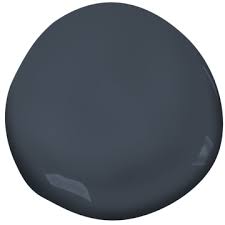
Benjamin Moore Nimbus color review
A medium-light gray paint, Nimbus is a bit of a goldilocks–not too warm and not too cold. While I do really like Nimbus, it doesn’t work for every space and you’ll see what I mean when we go over the undertones of Nimbus.
Find out if Nimbus is right for you with my full color review.
What color is Benjamin Moore Nimbus?

Nimbus is a gray paint color that reads slightly warm, despite its cool-ish undertones.
What undertones does Nimbus have?
Just looking at Nimbus, you can easily tell that it’s a gray paint color, but what isn’t so obvious are the undertones.
While a lot of grays have pretty glaring blues or greens, Nimbus is more reserved. Nimbus has a blue undertone that leans a little bit purple.
These are very soft undertones though, and make Nimbus a bit easier to work with if you need a gray with a blue undertone but don’t really want the paint color to read blue, like a lot of other popular blue grey colors.
Now, at this point you may ask yourself, “are there any grays that don’t have an undertone?” and unfortunately, the answer is no. Gray either has undertones of blue, purple or green and some grays have a blend two or more of those colors, making things even more complicated!
The thing I really like about Nimbus though is the fact that the undertones don’t slap you in the face.
Next up, I’ll fully unpack Nimbus’ undertones and why it might or might not work for your space.
Will Nimbus work in my space?
Now here’s the question you should start with…
Many people, myself included before I started digging into the world of paint, choose paint colors based on recommendations from friends or from inspiration photos they see online. And sometimes you get lucky and select a hue that works with your space great, but more often than not, you don’t.
Start with the undertones in your furnishings/fixed elements
The number one reason why people don’t like the paint color they select is because they fail to recognize the undertones. And that’s where I come in…
So, by now you know Nimbus has blue undertones that lean a bit purple. Here’s what to do with that info:
First, go around to your fixed elements…your floor (unless you’ve got those classic hardwood beauties) your counters, your cabinet color, your couch, etc. Anything that isn’t going anywhere anytime soon is a fixed element and it needs to harmonize with your paint color.
You’ll need to identify the undertones in your fixed elements, and if you’re going with Nimbus, they better be blue/purple. So, Carrara marble that has blue veining would go great with Nimbus. A gray couch that was on bluer side of gray would work well with Nimbus. A brown couch is not going to work with Nimbus, unless it’s got a slight purple undertone. Do you see where I’m going with this?
If you ignore this step, and you don’t have furniture/fixed elements that are on the cooler side, you’ll inevitably say something like, the color makes my couch look bad or the gray turned blue/purple!
Now, as I said earlier, Nimbus is a bit more forgiving than a lot of grays that have blue undertones, as it’s tends to read way less blue, but it’s not totally unforgiving. No paint color is, which is why paint is so complicated and the reason people agonize over paint colors for weeks and months!
Evaluate your light
I’d place Nimbus in the medium-light category. It’s got a good enough depth that it won’t be too washed out in a room with tons of natural light, and it’s not too dark either.
Even still, you want to properly test out your paint color so that you can see how it reacts in your space. When paint colors have multiple undertones like Nimbus, you will typically notice one in low light and the other in more light.
Test it out the right way
The only way to properly evaluate color is to test it out by first comparing it with other hues and properly setting up the swatches correctly.
See the picture below, do you see how I have used those peel and stick samples and placed them behind a white poster board?
That’s because it’s totally impossible to see what you’re working with you put a new color directly on your old wall color. The old wall color will completely skew your analysis of the new wall color. You must put your color behind a pure white board to accurately evaluate its tone.
Don’t forget to compare the color in question with others. A gray paint swatch just looks gray when it’s isolated but when you start comparing it to other grays you very quickly notice some grays have blue tints, some have green, some have purple and some have a mixture.
Have a question about nimbus? Let me know in the comments below!