Will Benjamin Moore Balboa Mist work in your space?
It can be tricky to find a warm gray paint, and if you’ve been on the hunt for a while, you might be plesantly surprised with Benjamin Moore Balboa Mist.
Even though a warm gray might be on your radar, don’t make the decision just yet. Stick around as we unpack Balboa Mist’s undertones and learn whether or not it will work in your space.
What color is Balboa Mist?
I’d classify Balboa Mist as a greige paint color, with slightly more gray than beige, but still a decent blend of the two neutrals.
What are the undertones in Benjamin Moore Balboa Mist?
As one of the top Benjamin Moore greige colors, it might surprise you to know that Balboa Mist has purple/pink undertones. This is exceedingly hard to spot just looking at a paint chip of Balboa Mist by itself, but when paired with grays with green undertones like Edgecomb Gray or grays with blue undertones like First star, you can really, really see the purple!
Now don’t be alarmed with this purple, as every single gray you’ll come into contact with has some type of undertone. You’re either dealing with purple/pink, blue, green or a combination of these. Talk about making things complicated, right?!
Many people are drawn to grays with purple undertones because the grays are actually much warmer, but then reach out to me in a panic saying their room looks slightly purple! You can be very happy with Balboa Mist, you just have to know what you’re dealing with, ahead of time.
Will Balboa Mist work in your home?
Just because Balboa Mist works in someone else’s home doesn’t mean you’ll be able to replicate that in yours. Feel confident in your decision when you follow three these simple tips.
Evaluate your undertones
Want to choose the right color for your room? Make sure the undertones in the paint color correspond to the undertones in your room. Look at this picture below:
Given the fact that you now know that there are purple/pink undertones in Balboa Mist, do you see how this particular color was the absolute best choice to correspond to the furniture/fixed elements. The purple int he rug, and artwork really are made more beautiful by the corresponding purple undertone in the room.
To mimic this in your home, go around and look at the undertones in everything that can’t be replaced easily. Your counters, cabinets, furniture, rugs, etc all must be evaluated. The undertones must correspond to really nail the paint color.
If you now realize that a gray with purple undertones isn’t for you, check out my full review on other light grey paint colors or check out some gray blue tones like Repose Gray or even some grays with green undertones like Gray Mist.
Observe how it reacts in your light
Balboa Mist is fairly light, but it’s not too light that you won’t notice it, except in the case of an overly bright room. Just be sure to test the color and see how it looks with your lighting situation. If it’s too light, go with Collingwood. If it’s too dark, you might try Eider White…a very light gray/greige with purple undertones.
Each color has a Light Reflectance Value, which indicates how light or dark the color is. Balboa Mist sits at 67, which is fairly light in terms of gray paint colors, but it’s not the absolute lightest of the light.
If your room doesn’t get too much natural light you will likely notice the purple undertone more, but you might be able to fix that by adding more light (a good mixture of recessed and lamp lighting might do the trick).
Test it out
Observe how I’ve placed paint samples up against a white poster board, rather than just painting them on whatever wall color I’ve got. Doing so allows you not to be biased by whatever you’re working with in the background.
Make sure to compare the color in question to others, too. That’s how you really see the undertones!
Which white trim color works best with Balboa Mist?
You really need a clean white trim color to make Balboa Mist shine. You know I have a love for warm whites like White Dove and Cloud White, and many of you do too, but if you pair these types of whites with Balboa Mist, you’ll be upset. It just makes both colors look muddy.
Go with Chantilly Lace for the best result. If you’ve chosen Balboa Mist and you are reading this blog to find out why you don’t like it in your home, it could be you picked the wrong trim color!
Balboa Mist Coordinating Colors
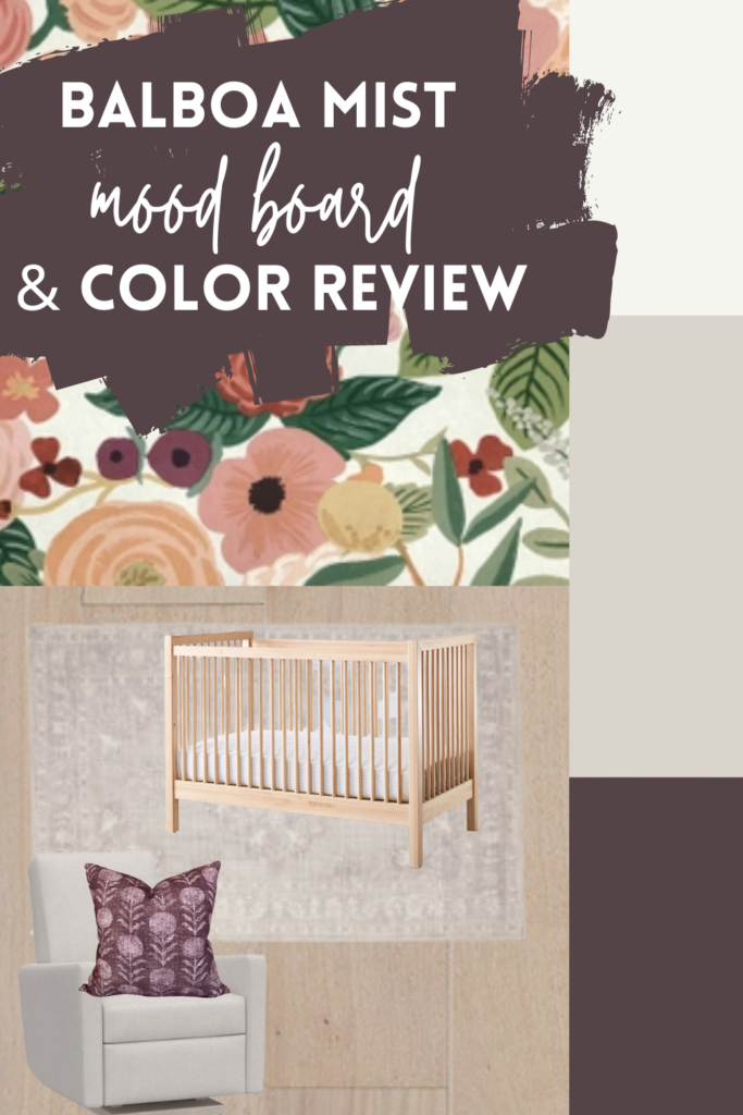
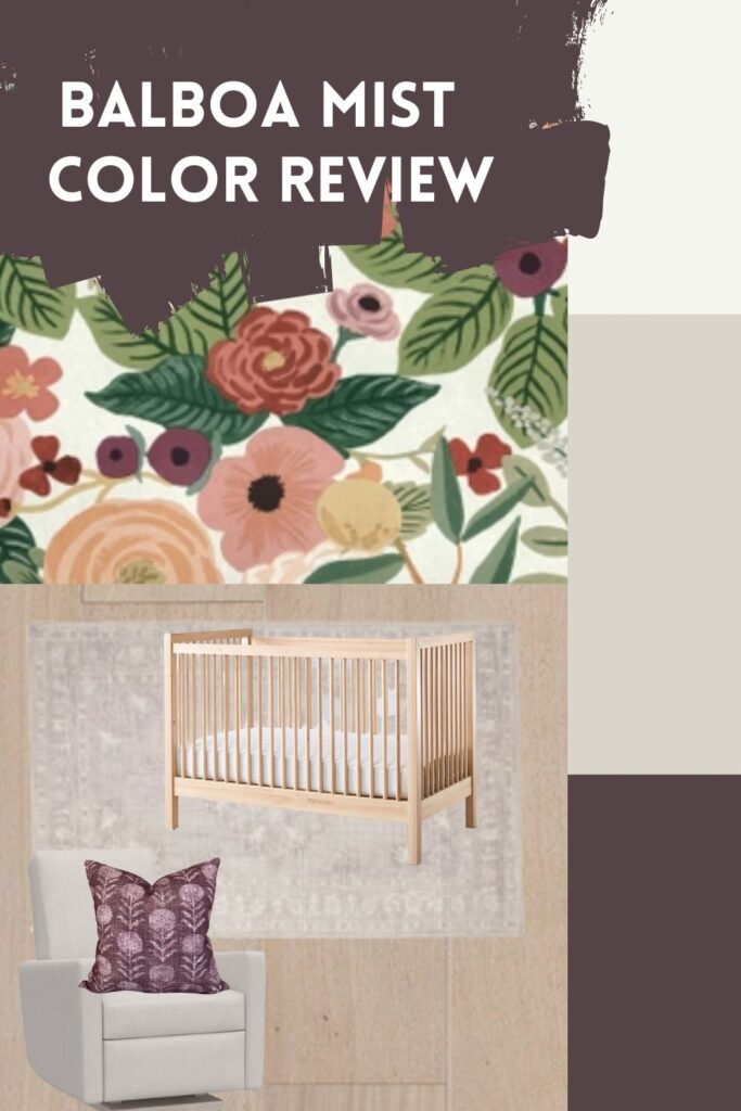
I wanted to walk you through a real world example of using Balboa Mist in a space and understanding how decor undertones should ultimately shape paint color decisions.
Ideally, you’d put together the room first and then pick the paint color, as it is sooo much easier to pick a paint color to fit what you’ve got, rather than to attempt to make a paint color work with furnishings that don’t suit it well.
The easiest way to put together a room is to start with a statement piece. In this case, I used this beautiful wallpaper that had notes of pink and purple (working well with the pink/purple undertone found in Balboa Mist).
The rug on the floor (although it’s hard to see) is a greige that has a violet undertone, again, going back to the undertone in Balboa Mist.
I went as close to a greige color as I could get with the rocker, and you’d want to make sure you weren’t dealing with a blue gray here, as that would strongly clash with the purple gray. I paired it with a purple accent pillow to tie back to the paint color and influence the purple in the wallpaper.
I’d probably also hunt for pretty violet curtains to tie the purple in. With an accent color, you want to repeat it a handful of times in various sizes to make it work well.
The other colors you see on the mood board are the trim I’d pair with Balboa Mist, which is Chantilly Lace (a very clean white) and then the accent color I chose is a deep purple tone which is called Vintage Wine, also by Benjamin Moore, which of course relates back to the main paint color, as well!
Balboa Mist vs. Collingwood
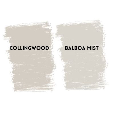
Right off the bat, you can easily see that Collingwood is significantly warmer than Balboa Mist. You’ll also notice that Balboa Mist is lighter than Collingwood, as well. Now here’s where they’re similar: Both colors share a purple/violet undertone.
As you can see, the purple is more apparent with Collingwood. It’s also worth noting that Balboa Mist is technically a greige (blend of gray and beige) while Collingwood is a gray.
Find a full review on Benjamin Moore Collingwood here.
Balboa Mist vs. Pale Oak
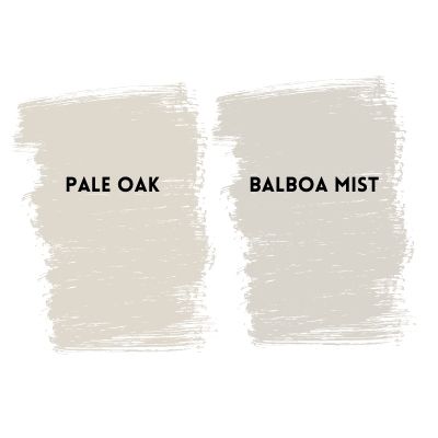
Benjamin Moore Pale Oak is technically a Taupe, which is grey with pink and purple undertones, which is very similar to Balboa Mists’ profile, but as you can see here, it’s a bit warmer and noticeably lighter.
Balboa Mist vs. Edgecomb Gray
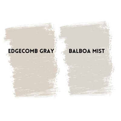
I’ve reviewed the differences of these two fan favorites before, but it bears repeating. Balboa Mist and Edgecomb Gray are both very light grays, but that’s about all they share. Comparing them side-by-side you can easily see the purple undertone in Balboa Mist, compared to the green undertone in Edgecomb Gray.
Not sure Balboa Mist is right for you? Check out some other Benjamin Moore greige colors here.


I recently painted my dining room Balboa mist as a suggestion to pair with my adjoining living room which is painted bm antique pewter (which I really like) The living room and dining room are both 10×10 and my house was built in 1910. I’m not sure if I’m crazy about the color combo, but I also have a terrible eye when it comes to color. Sometimes these colors look really well together and other times the pinkish hues really pop in the Balboa mist. Do you think this was a bad color combo? If I were to re-paint the dining room do you have any suggestions? The dining room is an east facing room and the living room is a north facing room, so both rooms get a fair amount of sun light.
Thank you
Matt
Sorry for the delay on this—I don’t think those are a bad combo at all. But, if you wanted to repaint, you could try grays with green undertones. Sample Edgecomb Gray and see how you like it. If you don’t want to repaint, the solution is almost always decorating! Decorating distracts the eye and often makes a room that seems ‘off’ suddenly work. Artwork on the walls, curtains, a rug, and accessories go a long way.