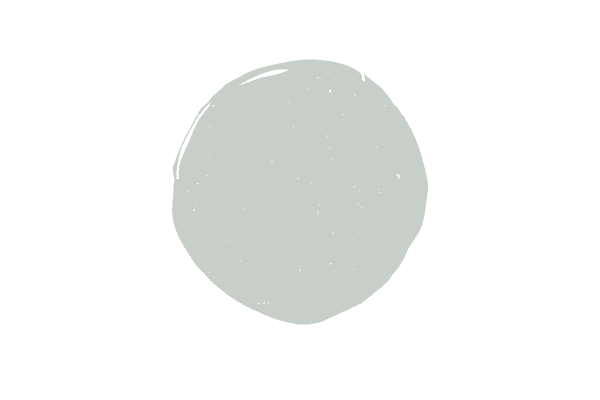
Benjamin Moore Moonshine
One of the lightest gray paint colors without going into the off white paint category, Benjamin Moore Moonshine is a fresh choice. Definitely for more modern aesthetics, Moonshine works beautifully with darker grays, navy, blue green hues and even black!
Wondering if Moonshine is right for your home? Check out my full paint color review!
I really like Moonshine. It’s not as icy as some other grays with blue undertones because of the green undertone that’s also present to balance it out. I also like how beautifully it pairs with darker hues that are super trendy right now like Naval and Chelsea Gray.
What color is Benjamin Moore Moonshine?
Moonshine is definitely a gray color with blue (and just a whiff) of green undertones.
What is the LRV of Benjamin Moore Moonshine?
The light reflective value of Moonshine is 67–much higher than many popular grays like Coventry Gray, Passive or Nimbus.
Light reflective value tells you how dark or light the paint color is. Zero is the darkest black and 100 is ultra bright white.
When the gray color trend first emerged, people wanted to paint walls in every shade of gray and colors like Coventry Gray (LRV of 48) were popular. Now, with the move to go lighter and brighter, homeowners are warming up to light blue gray paint colors like Moonshine.
What are the undertones of Moonshine?
Every paint color has an undertone; gray is no exception. Moonshine doesn’t just have one undertone, but two! A gray with a blue-green undertone, Moonshine is a chameleon of a color. Depending on your lighting it will read either more blue or green. Typically, if you have a lot of natural light it will look more green and in rooms that don’t face the sun, it will look more blue.
If right away you know that you’re looking for more of a “true gray,” you might be upset to find out that doesn’t really exist! You’re either dealing with blue, blue-green, purple or green in terms of undertones found in gray paint. Some paint colors have a lesser degree of undertones than others, but there’s no “true” gray.
What trim color should I use with Moonshine?
You want to stick with a true white trim color when painting walls in Moonshine. I really do love my creamy whites, but honestly, this is not the time to go with an-off white. Moonshine is already very light, so you really want to create that crisp distinction between the wall and trim color.
I’d suggest either Benjamin Moore Chantilly Lace or Sherwin Williams High Reflective White.
Tips to make sure Moonshine will work well in your space
If you’ve read any of my other paint color reviews, you know the drill–just because you fall in love with a color online or in a friend’s home, doesn’t mean it will work well for your space.
With Moonshine, you must make sure it works well with your fixed elements, first. A fixed element is anything that you can’t easily fix.
So, an expensive couch you just purchased is a fixed element. Your countertops are fixed elements, as are your floors (unless they are timeless hardwood flooring, i.e not gray floor or cherry floor, we’re talking medium-brown wood tone), as are your cabinet colors, etc.
Take notes of your fixed elements. What are their undertones? Will they work with the blue-green undertone in Moonshine Gray? For example, a beige couch isn’t really going to work too well with Moonshine Gray. The same can be said about granite countertops that have a gold/brown undertone–Moonshine Gray would horribly clash in that situation.
You also really need to evaluate your light because of that dual undertone in Moonshine. Remember earlier when I said that in situations where there is a lot of natural light you’ll see more green and then in situations where the room faces north you’ll see more of that blue?
If you need more of a blue gray to make your room work but are planning on painting it in a south facing room, you might need to look at a true gray-blue, rather than a gray-blue-green.
Always test out your paint colors like this! Layer them with other colors to tell the true undertones and put them behind a white poster board.
What colors pair well with Moonshine?
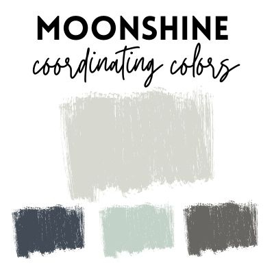
Because Moonshine has that blue-green undertone in it, you have a little bit more leeway than other grays because you can select hues that have blue and green undertones, for the most part.
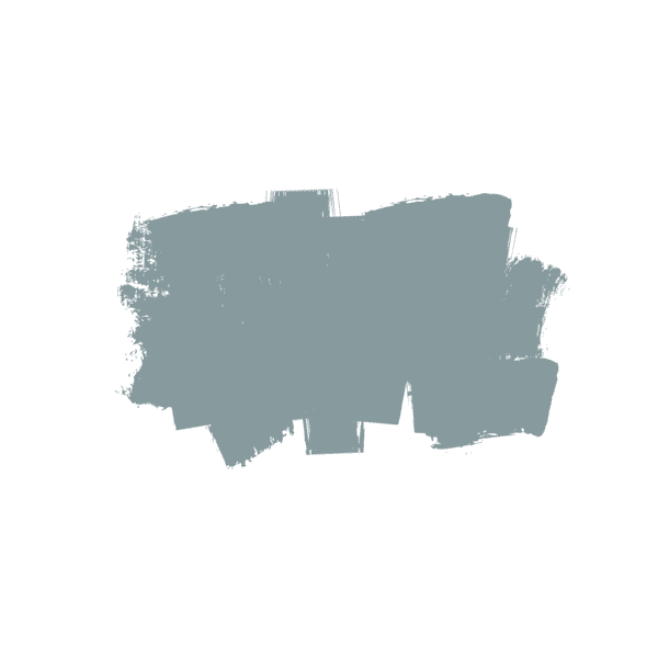
Hale Navy–one of my absolute favorite navy hues is Hale Navy. It’s definitely more subdued than the pretty popular navy, Hale Navy, and for that reason, I think it’s simply stunning. It looks beautiful when paired with Moonshine.
Palladian Blue–If you want a splash of color, I’m partial to Palladian Blue. This soft blue with green undertones is breathtaking!
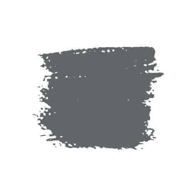
Kendall Charcoal –Who doesn’t like a dark hue these days? Kendall Charcoal is technically not a black but is very, very dark and has a green undertone, that works well with the green in Moonshine.